
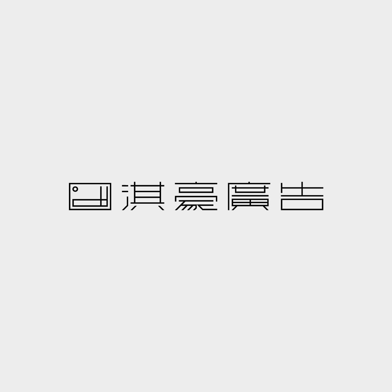
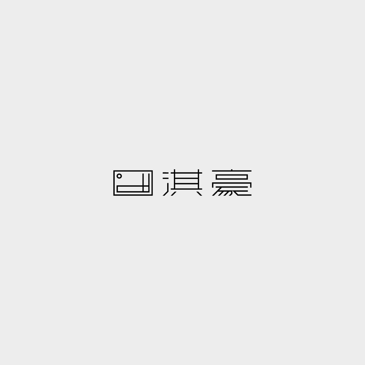
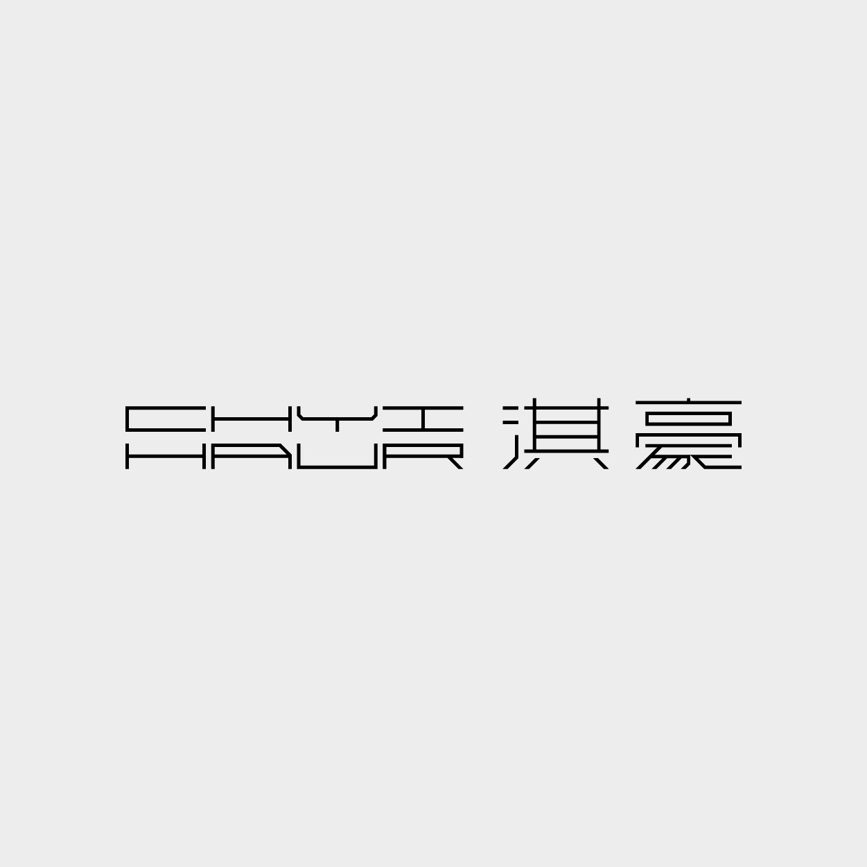
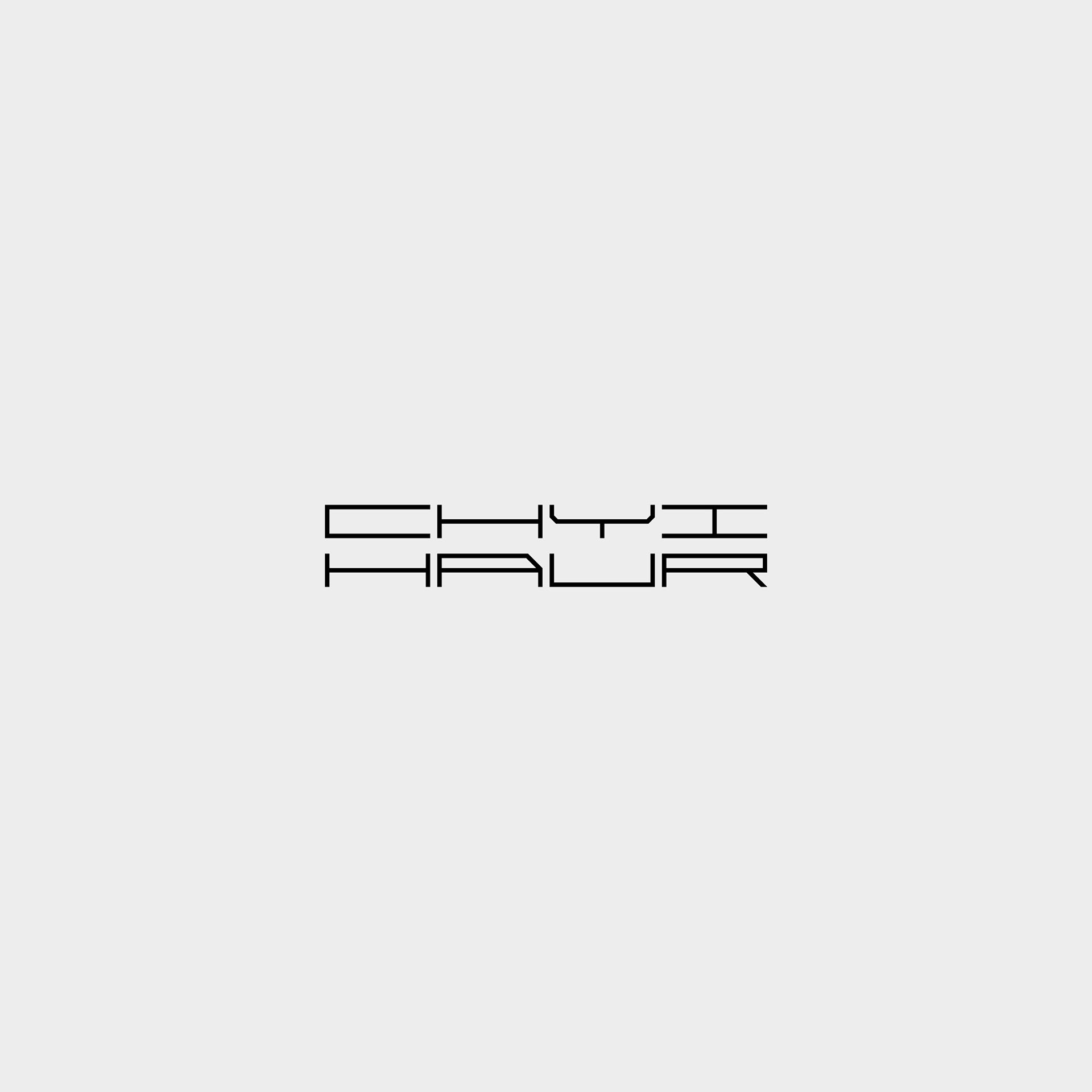
淇豪廣告 Chyihaur Advertising | Branding
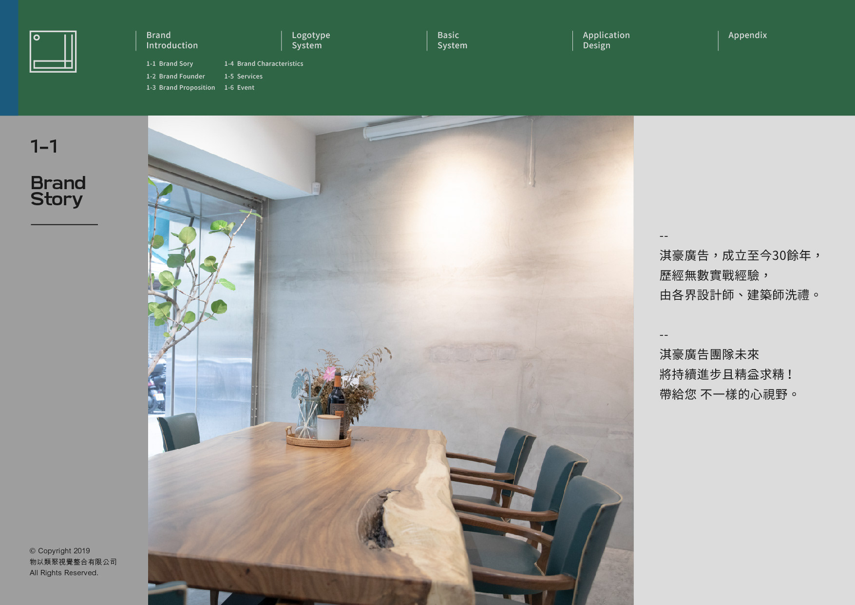
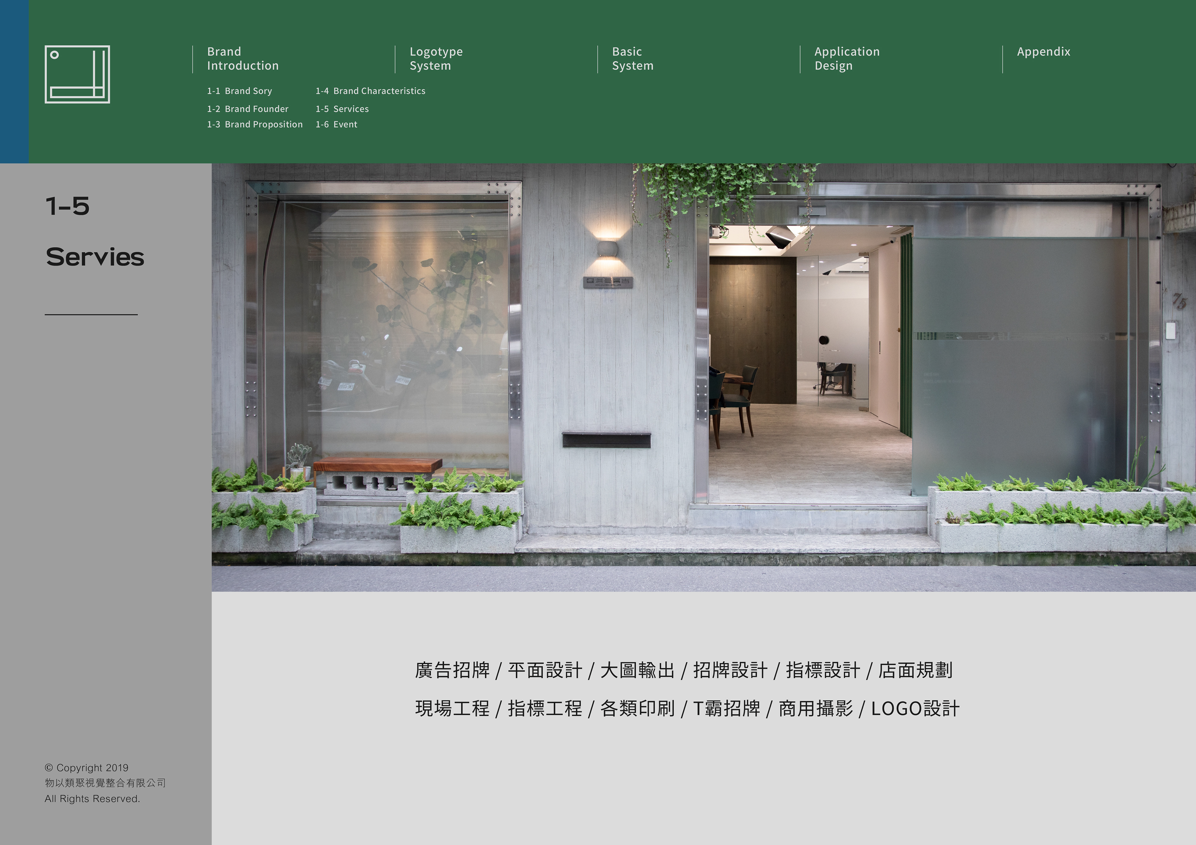
淇豪廣告一直是類聚的好夥伴,成立至今30餘年,執行過海內外各大品牌的招牌標誌設計,以專業的施工團隊、設計及周到的服務聞名。
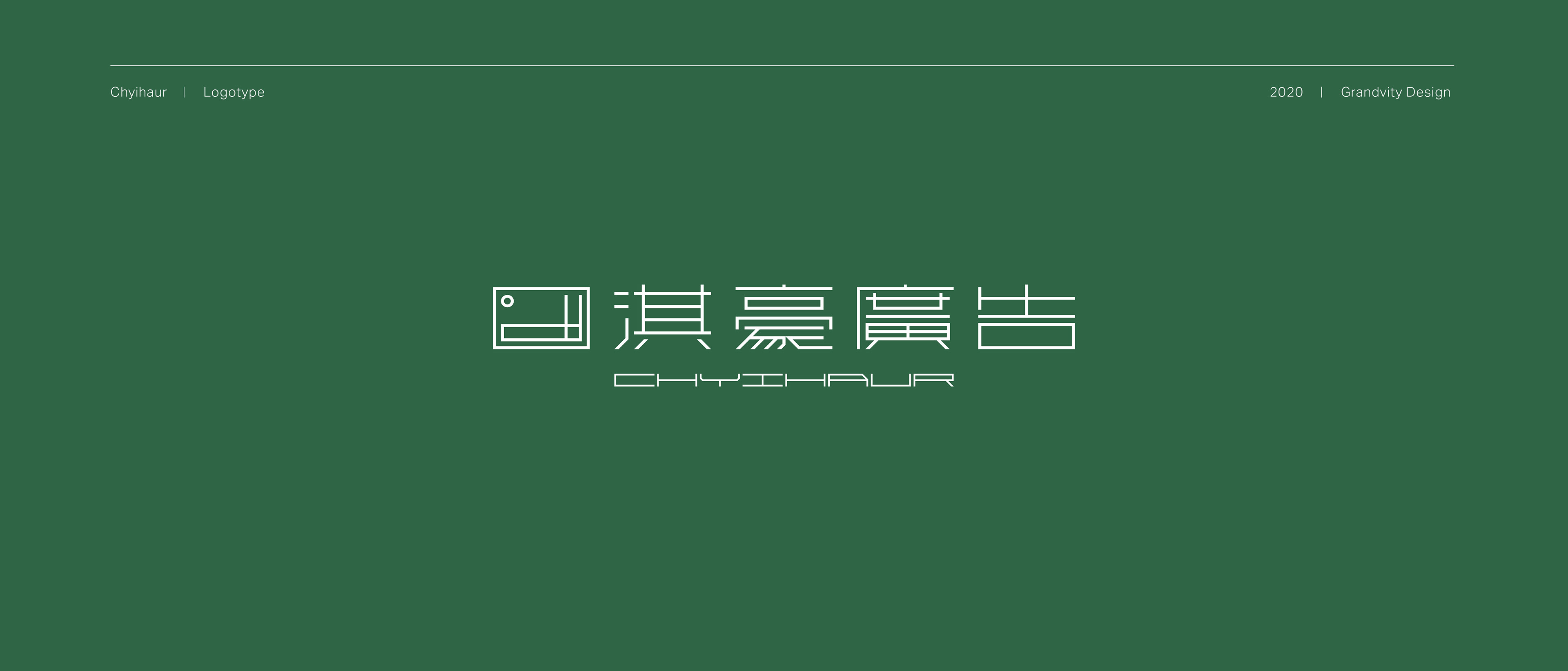
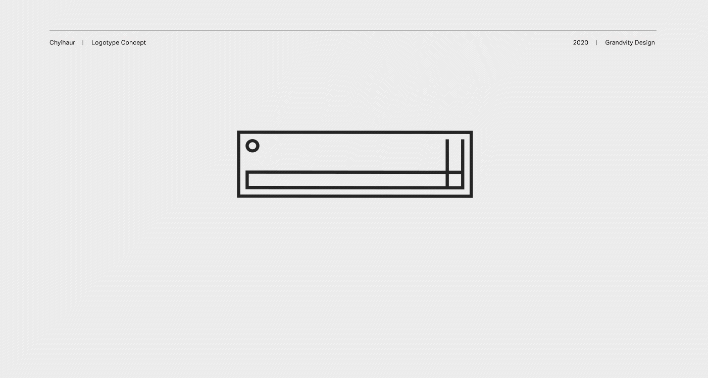
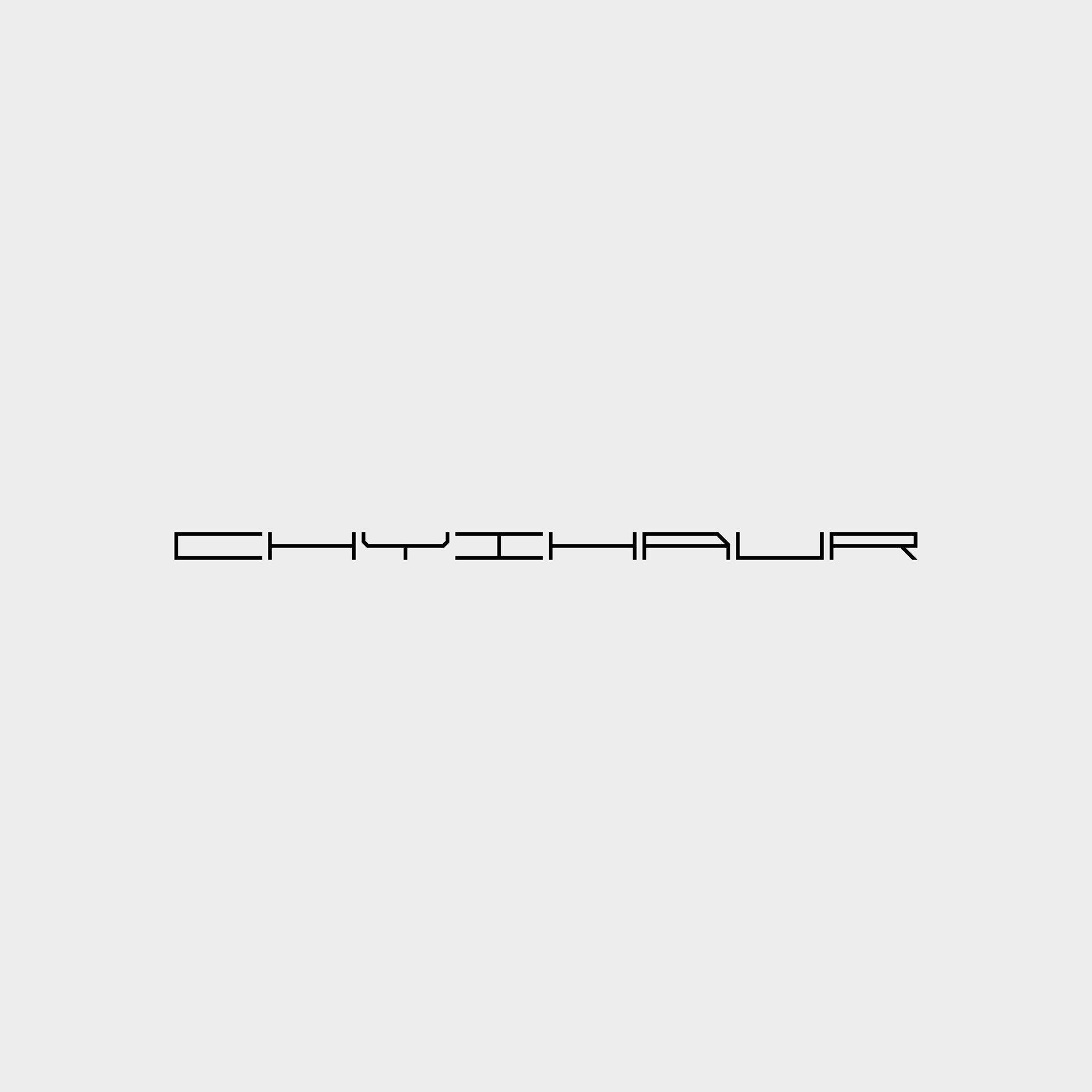
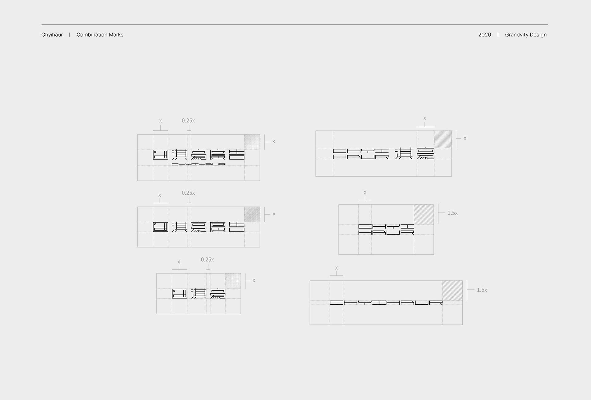
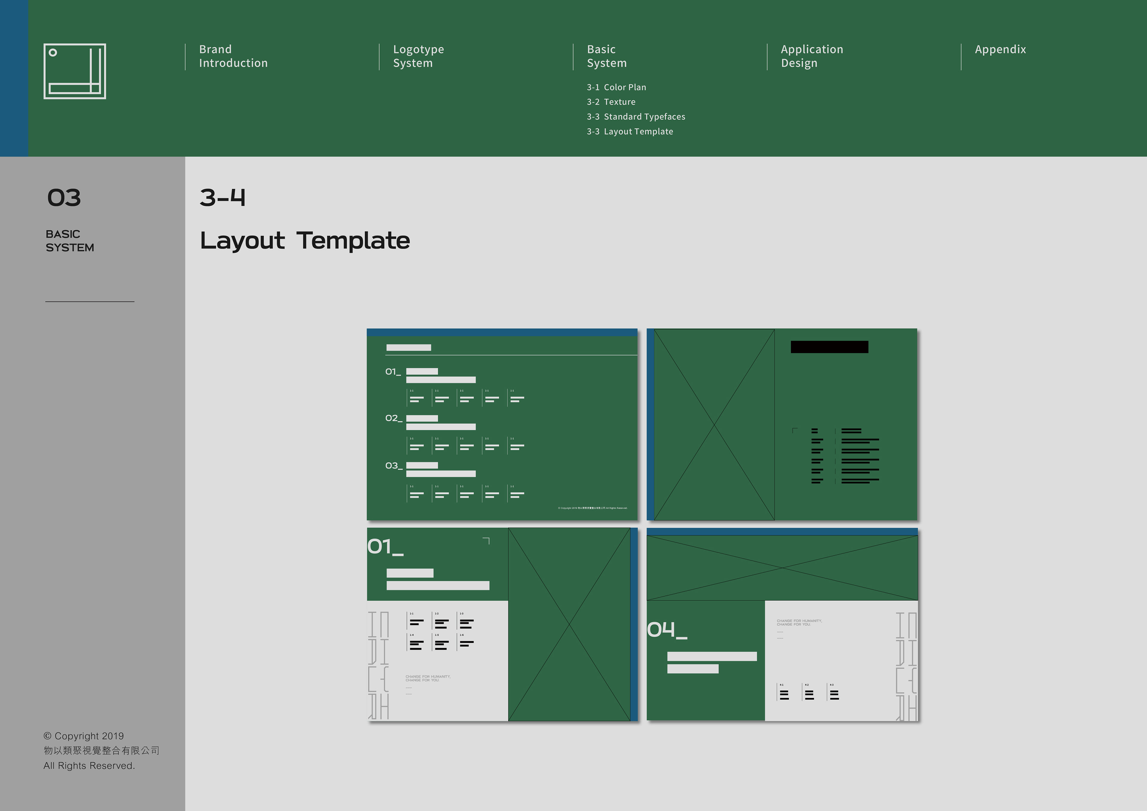
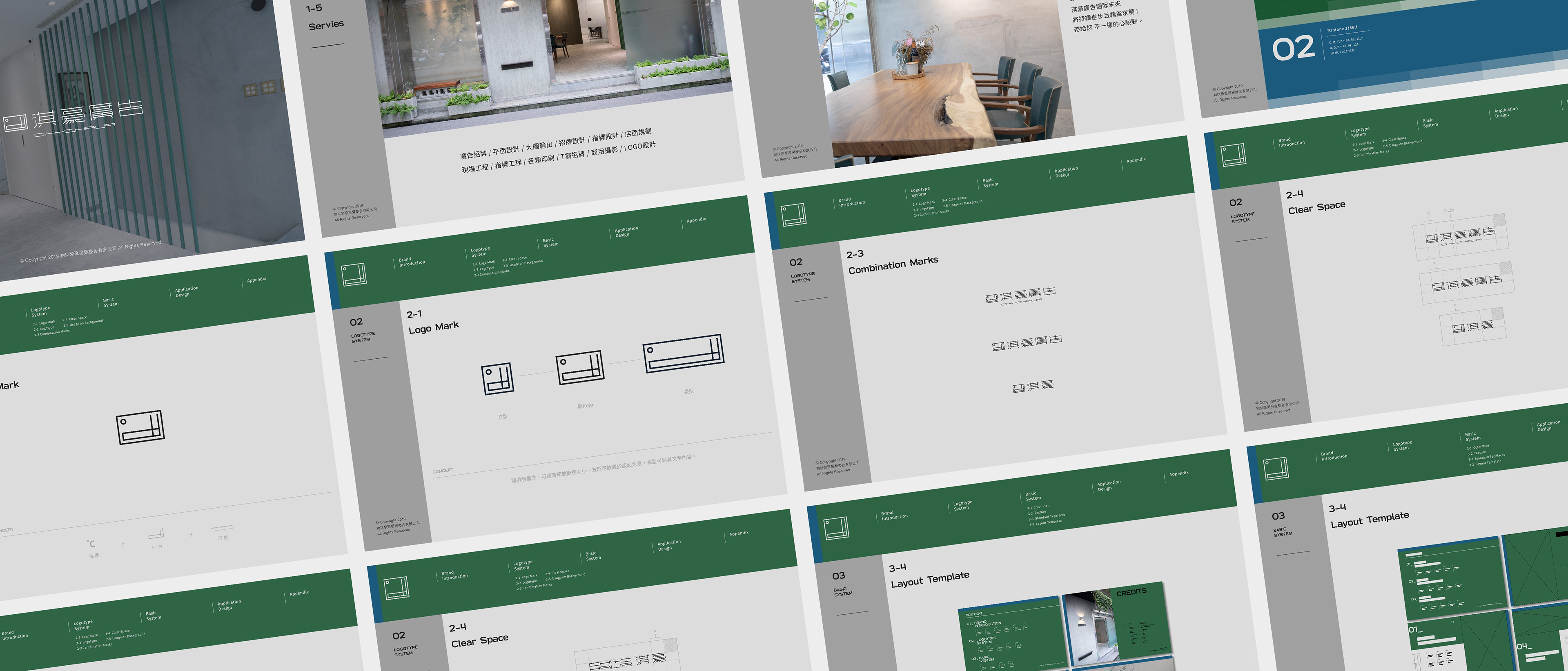
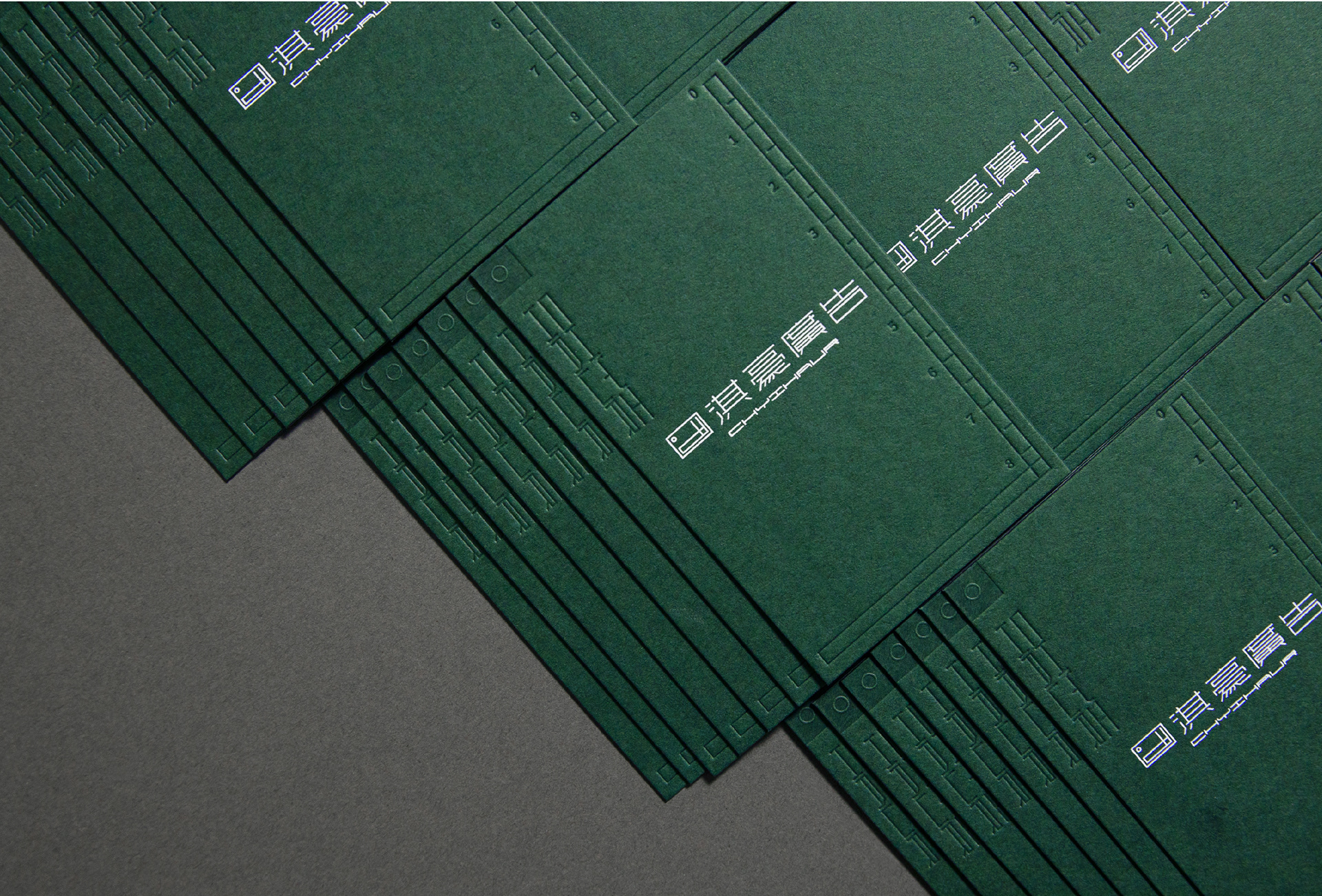
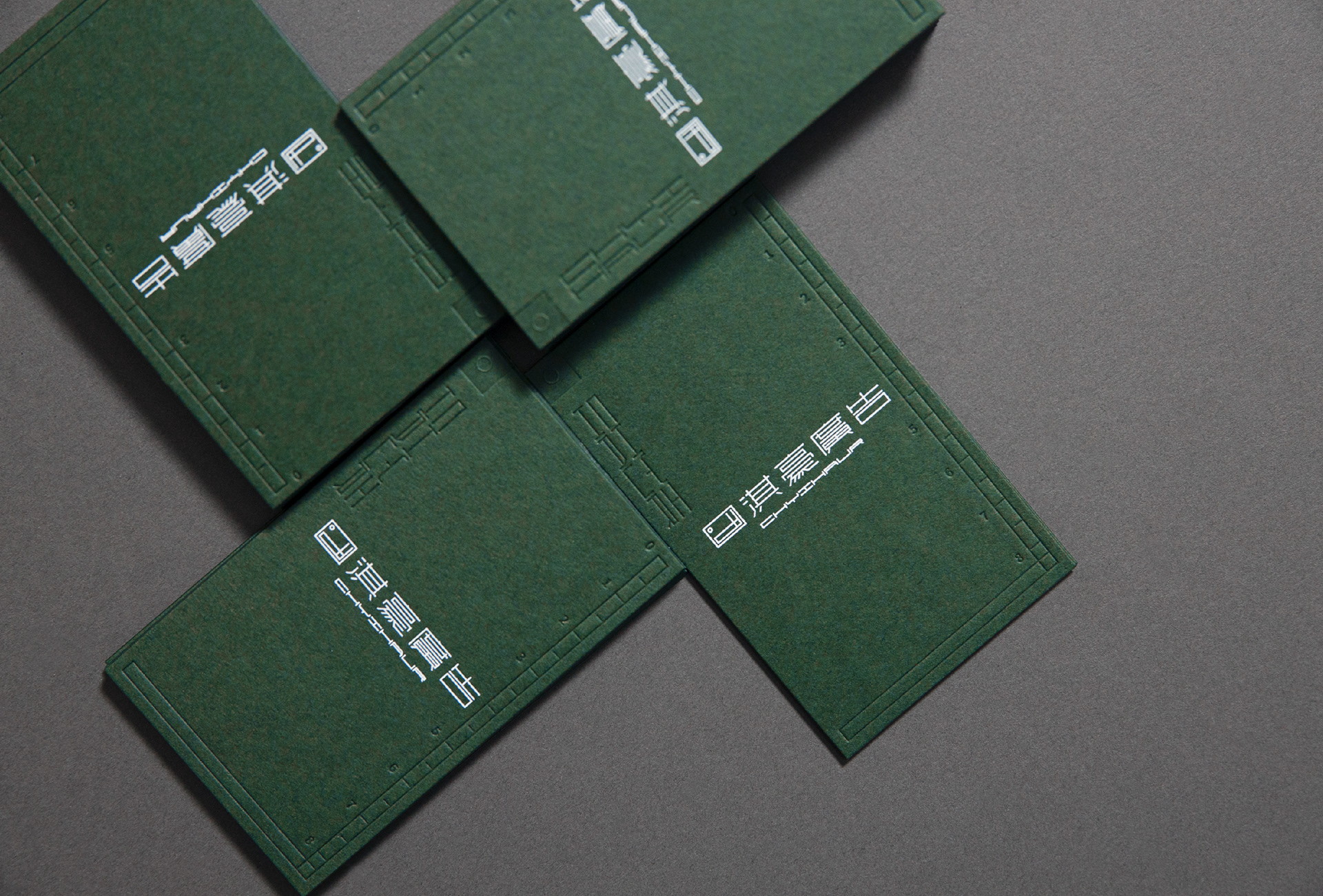
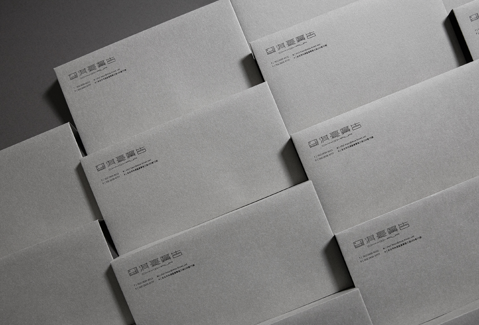
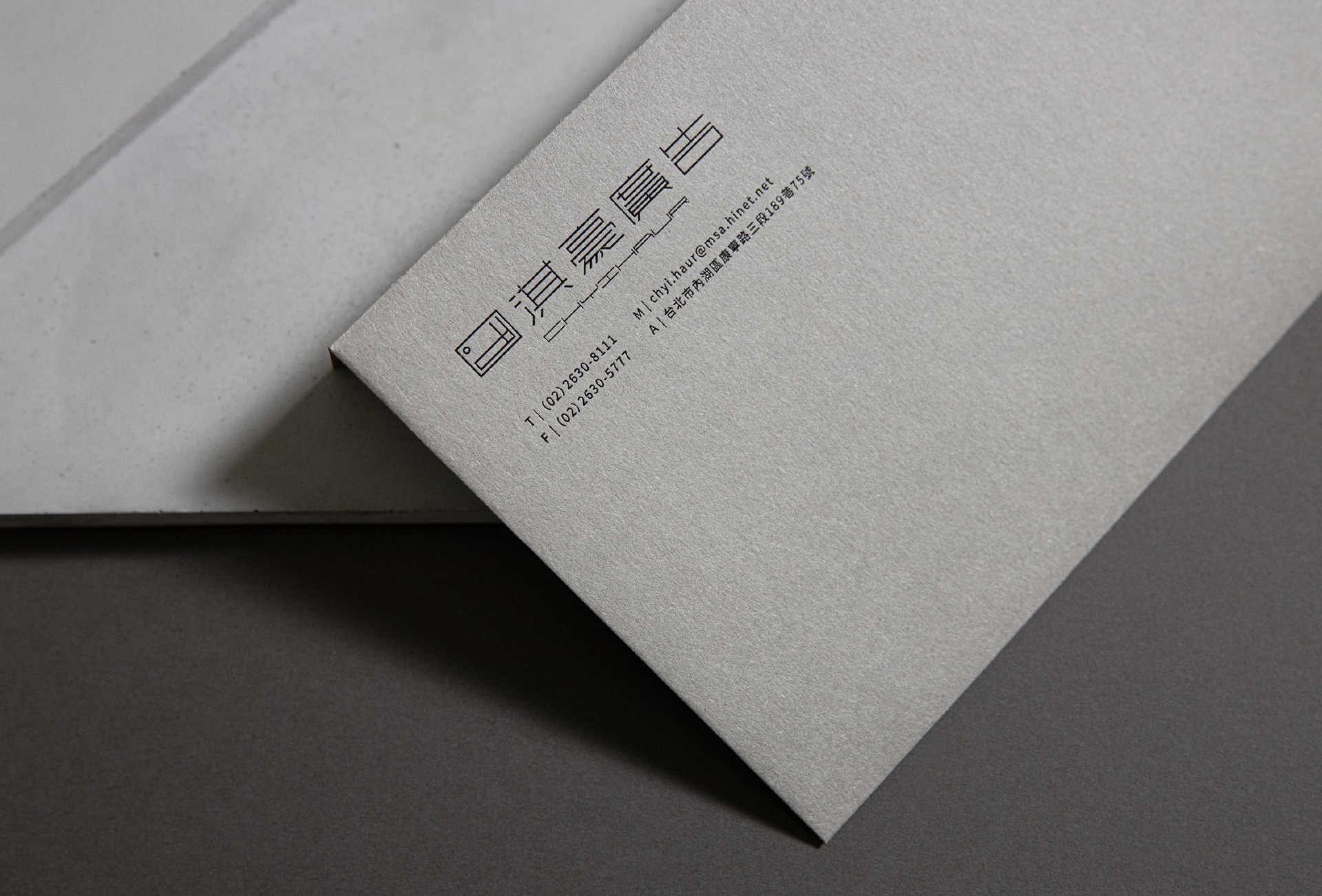
2020年與類聚合作Rebranding品牌更新,商標保留原有的「,」符號,並重新賦予「°C」的象徵,並將CH結合成「尺規」意象,表現「溫度與專業」的品牌形象,更大膽嘗試可四面縮放的標誌規範,讓標誌如尺規的般彈性,隱喻服務皆為客戶量身打造的核心理念。
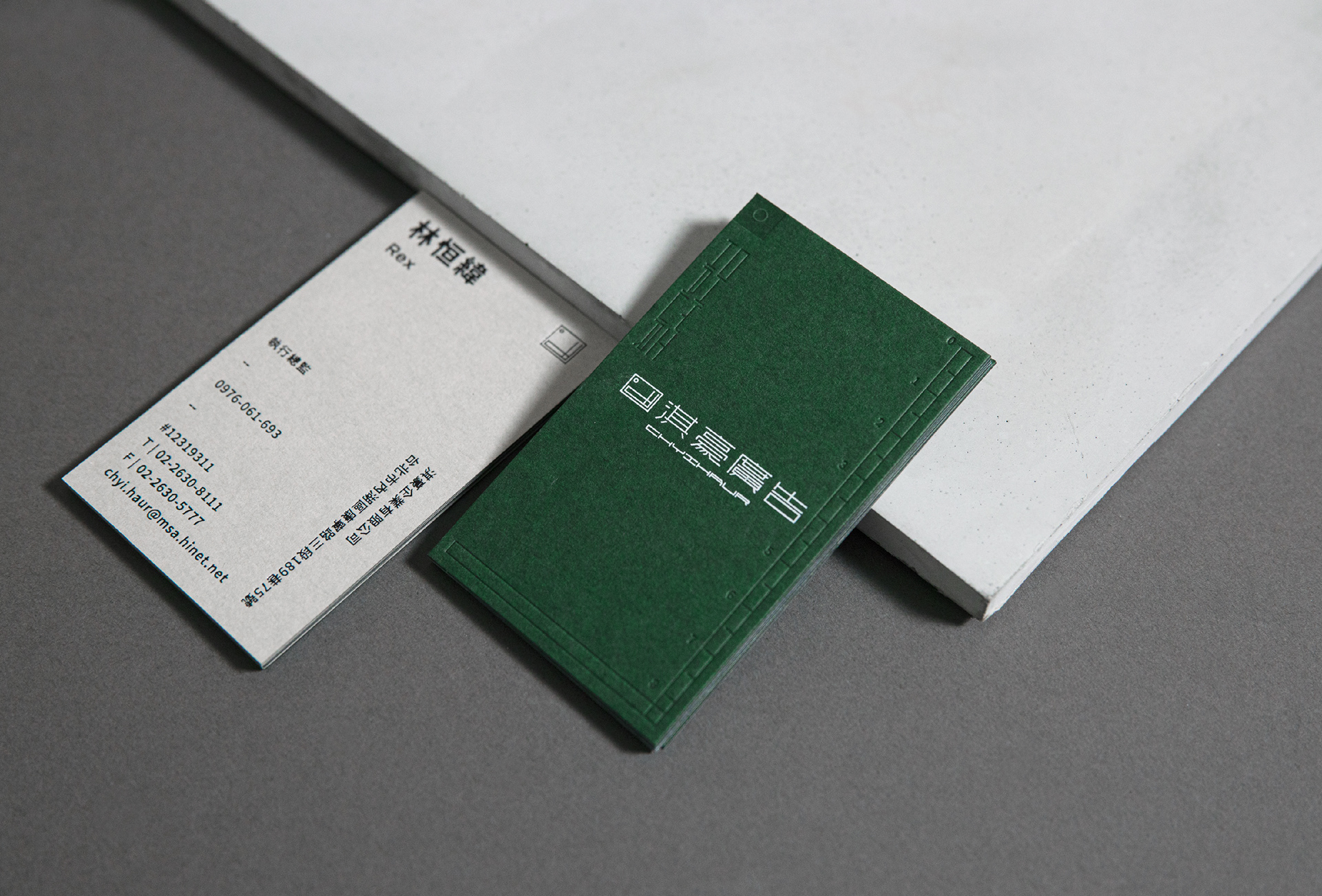
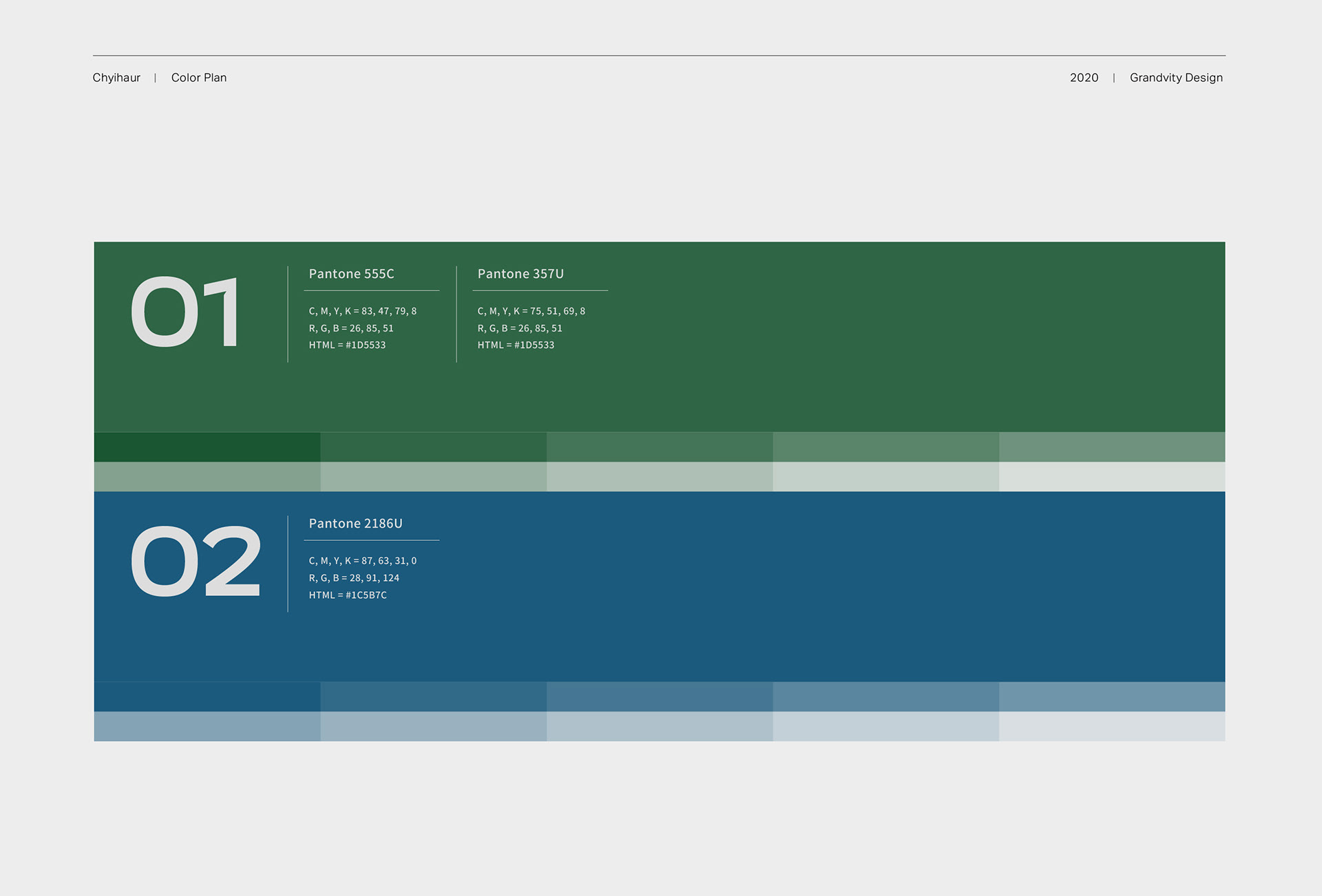
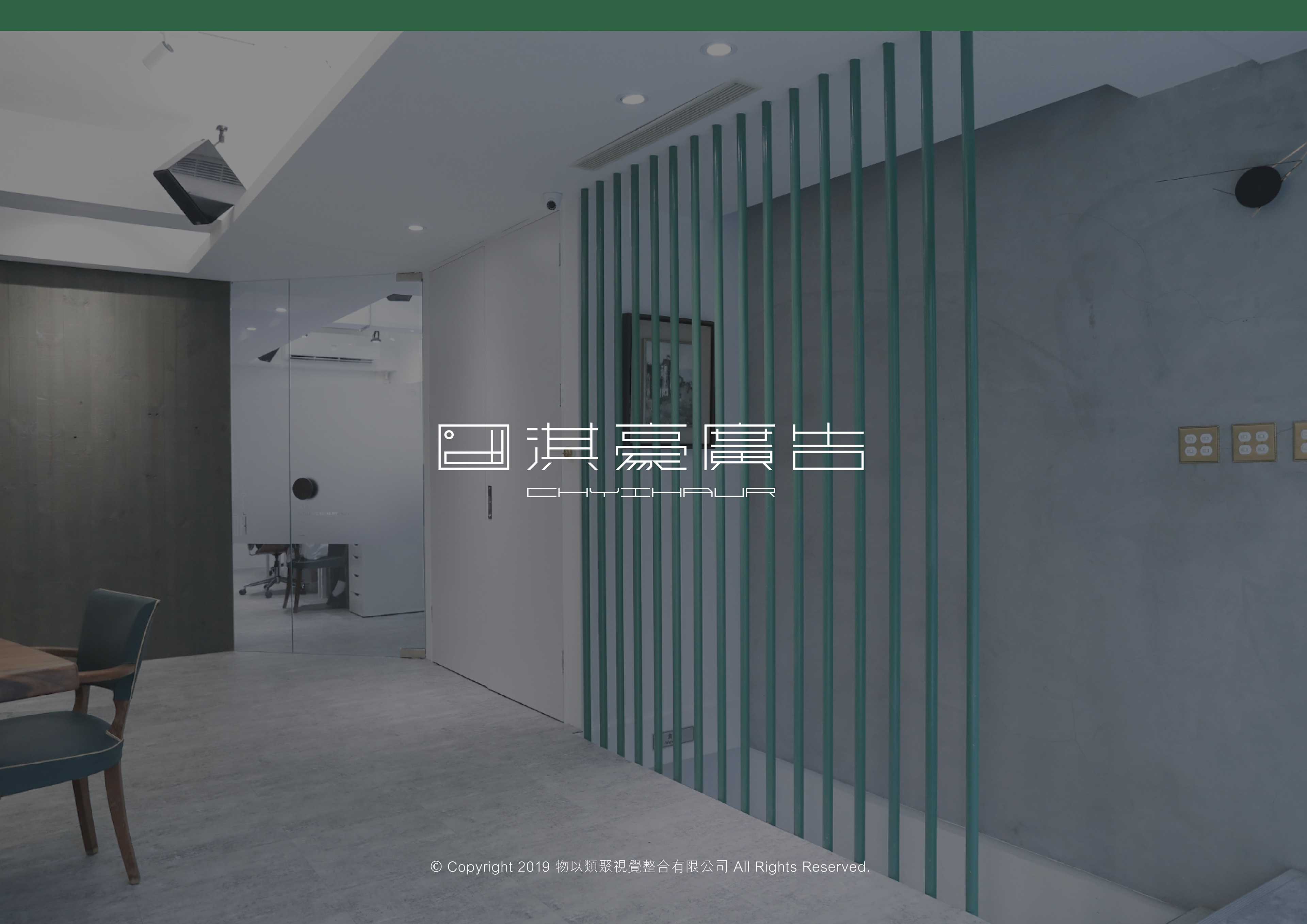
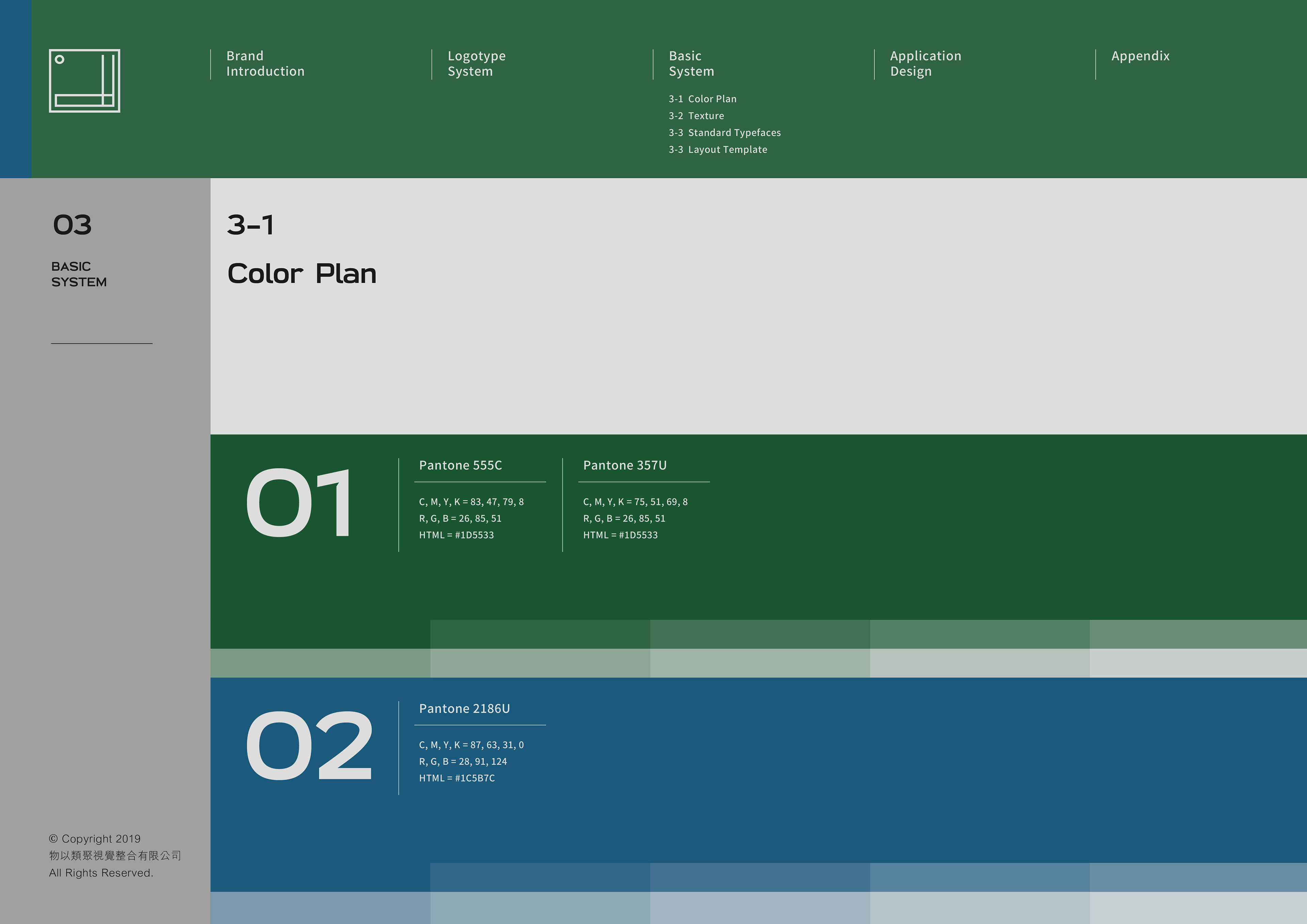
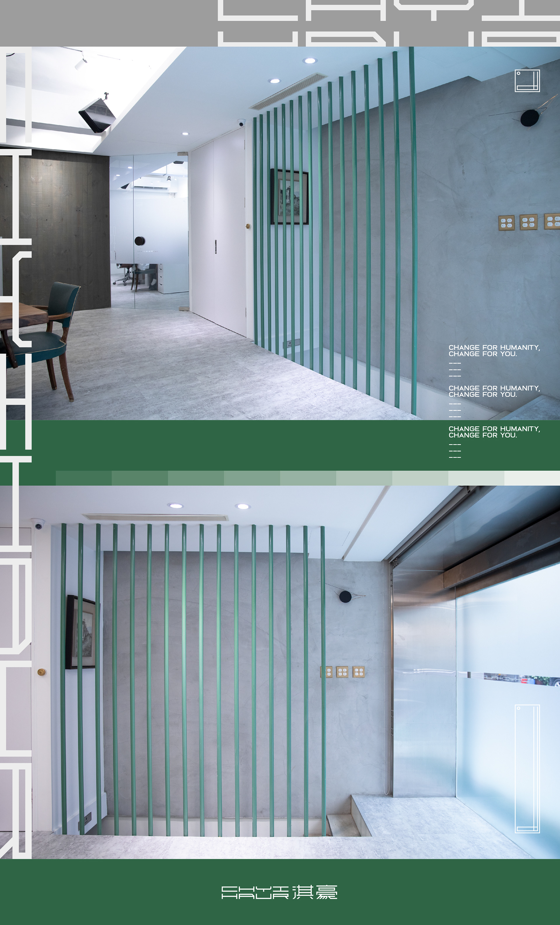
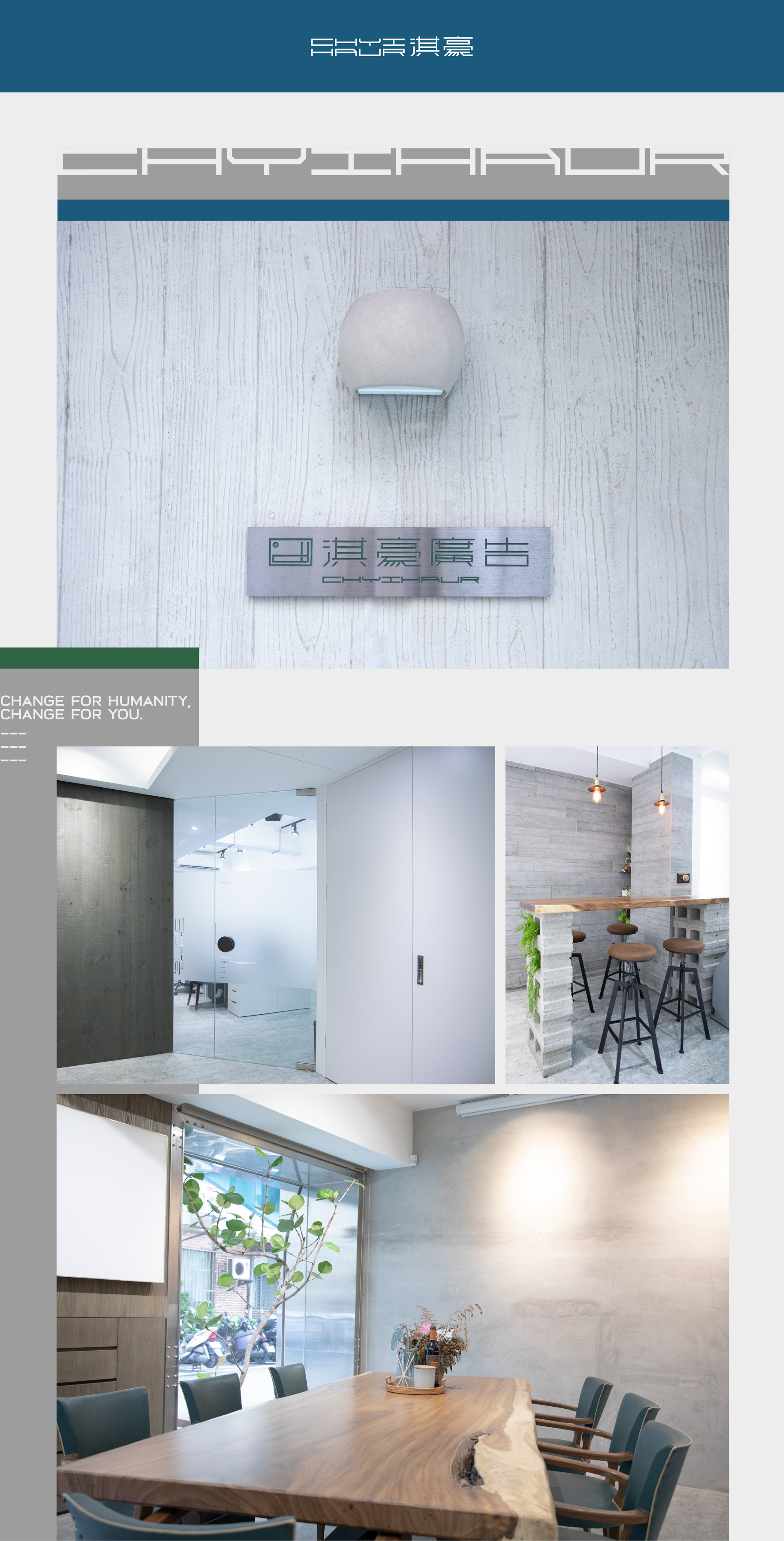
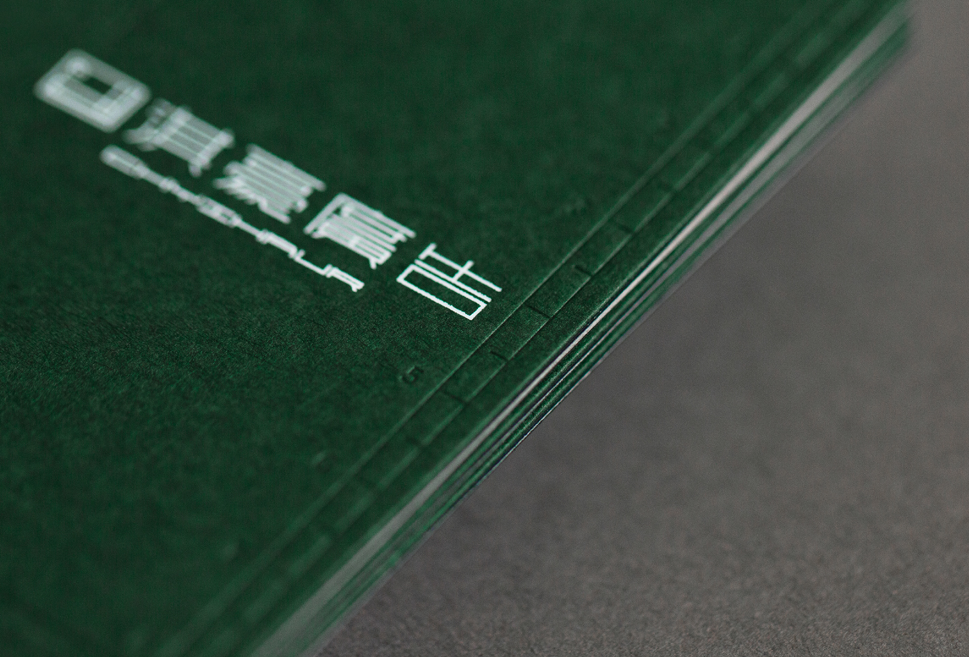
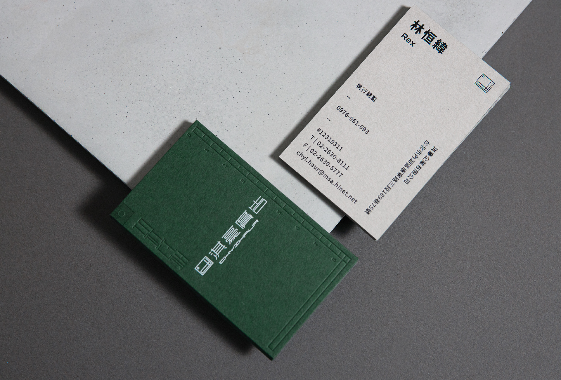
企業色設定為清水模的「大師灰」與植物的「工裝綠」,並選用合適的色紙對裱成名片,以打凸呈現可變式Logo與刻度,讓名片不只是表現品牌質感,更是一支可拿來測量的尺!此配色也應用在辦公室的裝潢與擺設,從細節到環境都能讓團隊沉浸在「溫度與專業」的品牌精神中。
2020年與類聚合作Rebranding品牌更新,商標保留原有的「,」符號,並重新賦予「°C」的象徵,並將CH結合成「尺規」意象,表現「溫度與專業」的品牌形象,更大膽嘗試可四面縮放的標誌規範,讓標誌如尺規的般彈性,隱喻服務皆為客戶量身打造的核心理念。
企業色設定為清水模的「大師灰」與植物的「工裝綠」,並選用合適的色紙對裱成名片,以打凸呈現可變式Logo與刻度,讓名片不只是表現品牌質感,更是一支可拿來測量的尺!此配色也應用在辦公室的裝潢與擺設,從細節到環境都能讓團隊沉浸在「溫度與專業」的品牌精神中。
Chyi Haur Advertising has always been a good partner of Grandvity Design. Famous for its professional team and impeccable service, Chyi Haur has been established for more than 30 years and continues to build store signs for major brands in Taiwan and abroad.
Chyi Haur collaborated closely with Grandvity in this rebranding project. Grandvity took the comma symbol “,” from Chyi Haur's old logo and reinvented it into a degree symbol “°C”. We further incorporated their initials, CH, into a ruler. Together, this new logo accentuates the brand’s warmth and professionalism. The logo’s adaptability further symbolizes Chyi Haur’s tailored service for all customers.
The business card design uses two types of colored paper: "Master Gray'', the color of architectural concrete, and "Combat Green'', the color of plants. After we chose the suitable paper, we embossed the actual ruler scales onto the side to increase usability and quality. The color palette is applied across the office interiors as well. From business cards to the interioris, Chyi Haur is immersed in warmth and professionalism.
The business card design uses two types of colored paper: "Master Gray'', the color of architectural concrete, and "Combat Green'', the color of plants. After we chose the suitable paper, we embossed the actual ruler scales onto the side to increase usability and quality. The color palette is applied across the office interiors as well. From business cards to the interioris, Chyi Haur is immersed in warmth and professionalism.


Credits
Type | Branding
Year | 2020
Client | Chyihaur
Year | 2020
Client | Chyihaur
Production | Grandvity Design
Art Director | Noodlemaker
Project Manager | Grape Chiu
Logo Designer | Noodle Wang
Visual Identity Designer | Jasmine Lin
Name Card Photographer | Si Jia Sun
Interior Photographer | Chun Teng Lin
Art Director | Noodlemaker
Project Manager | Grape Chiu
Logo Designer | Noodle Wang
Visual Identity Designer | Jasmine Lin
Name Card Photographer | Si Jia Sun
Interior Photographer | Chun Teng Lin