
Uzick | Branding
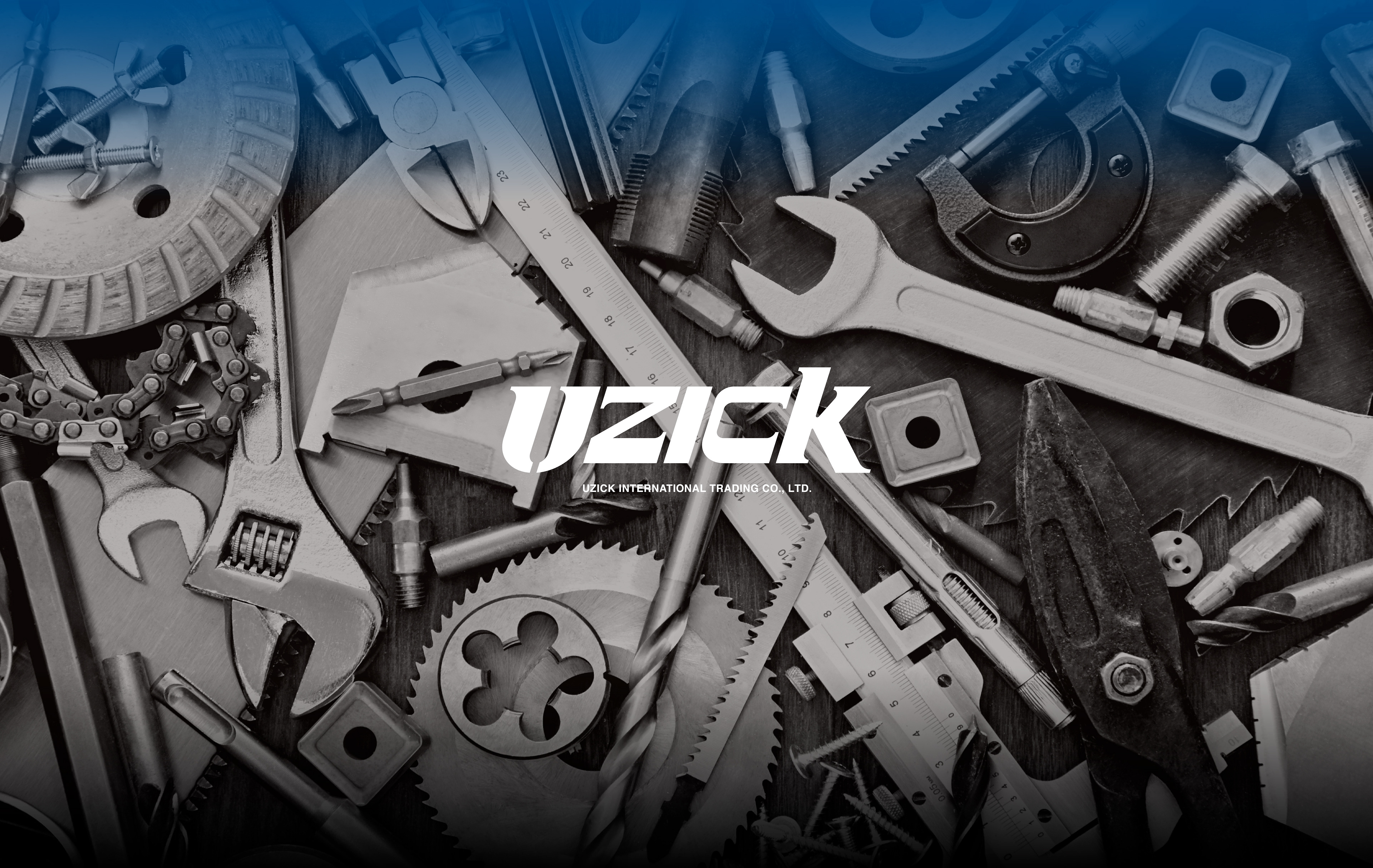
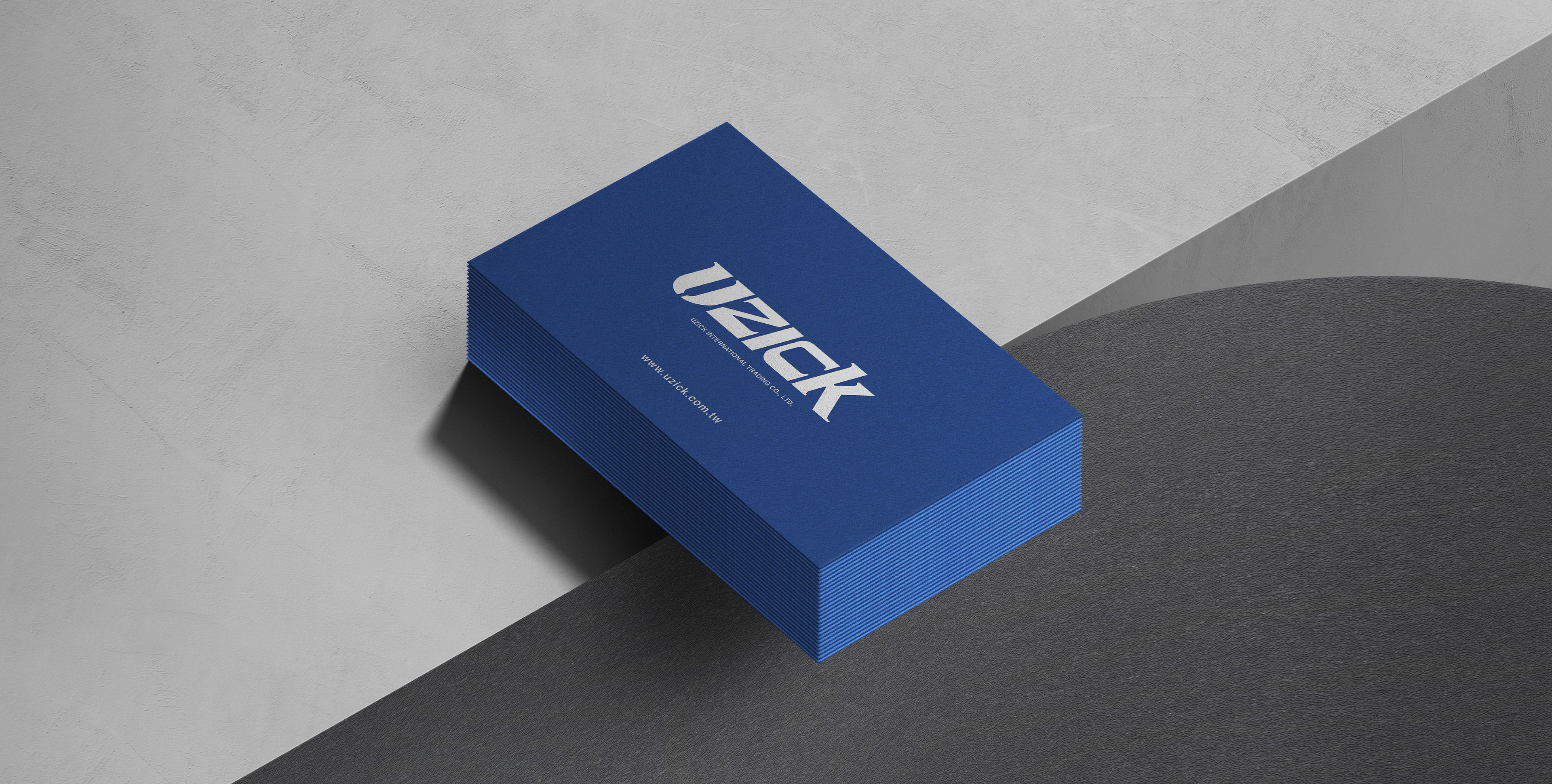
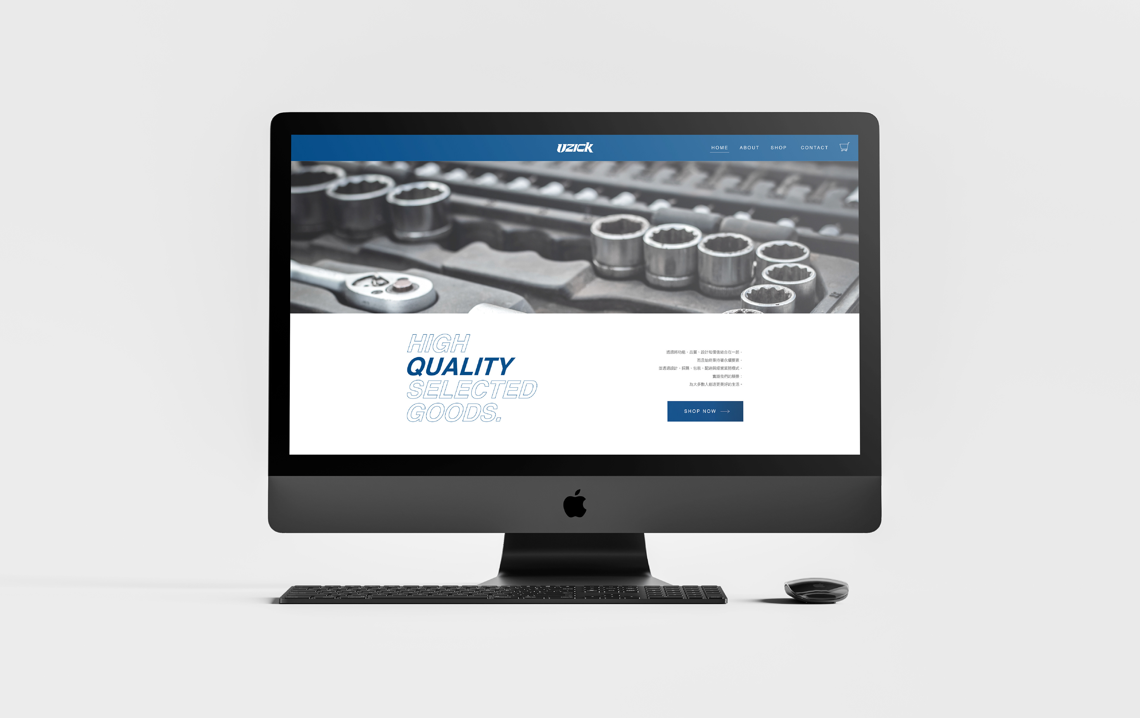
五金在我們的生活中扮演微小卻重要的角色,好的工具就像是手的延伸,讓修繕事半功倍,有澤五金秉持著這樣的理念,提供大家實用、質感、精選的手工具與生活用品。
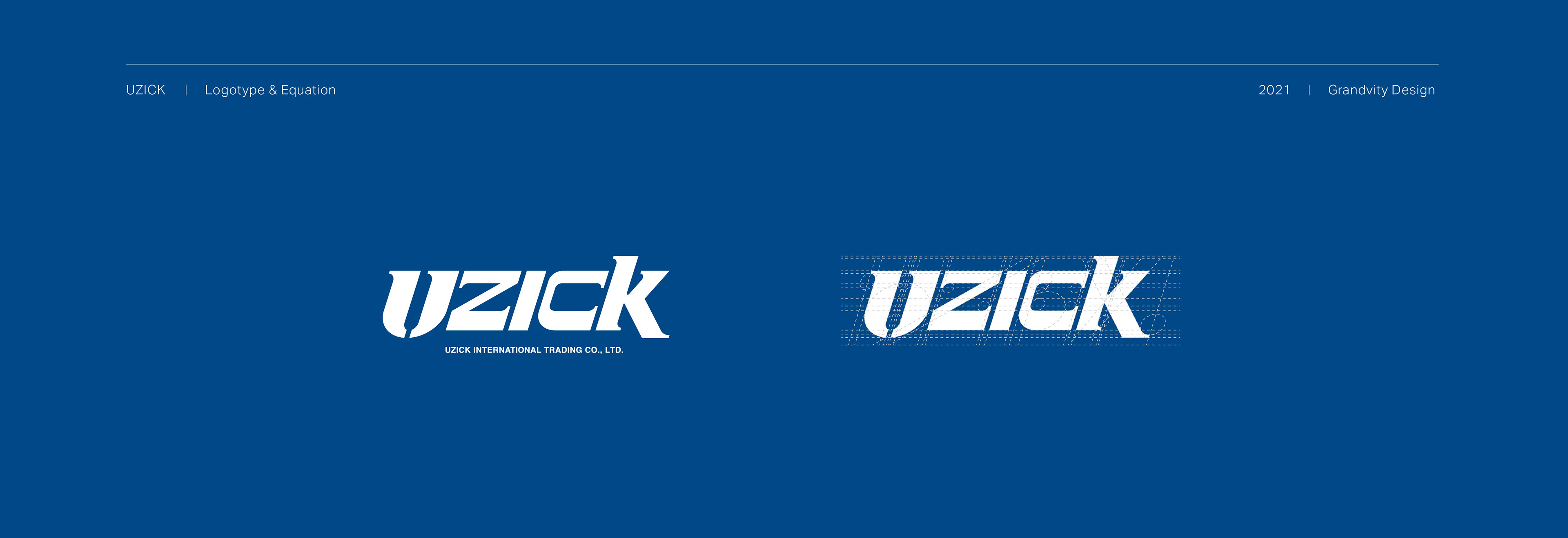
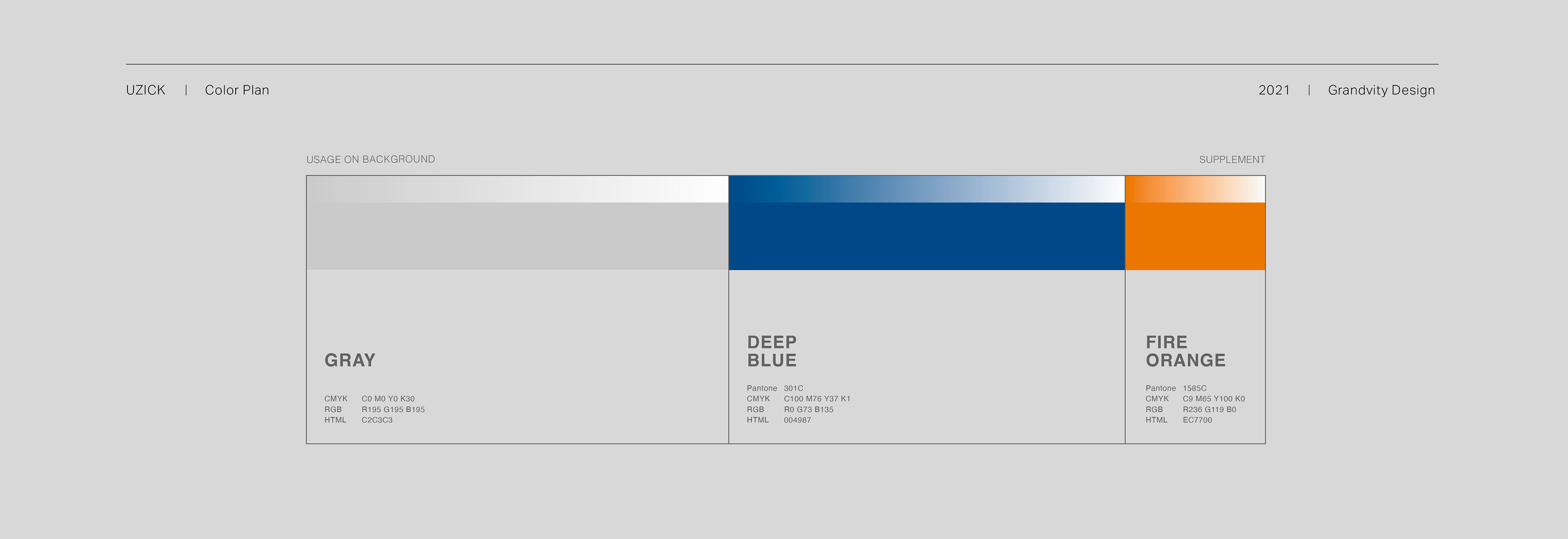
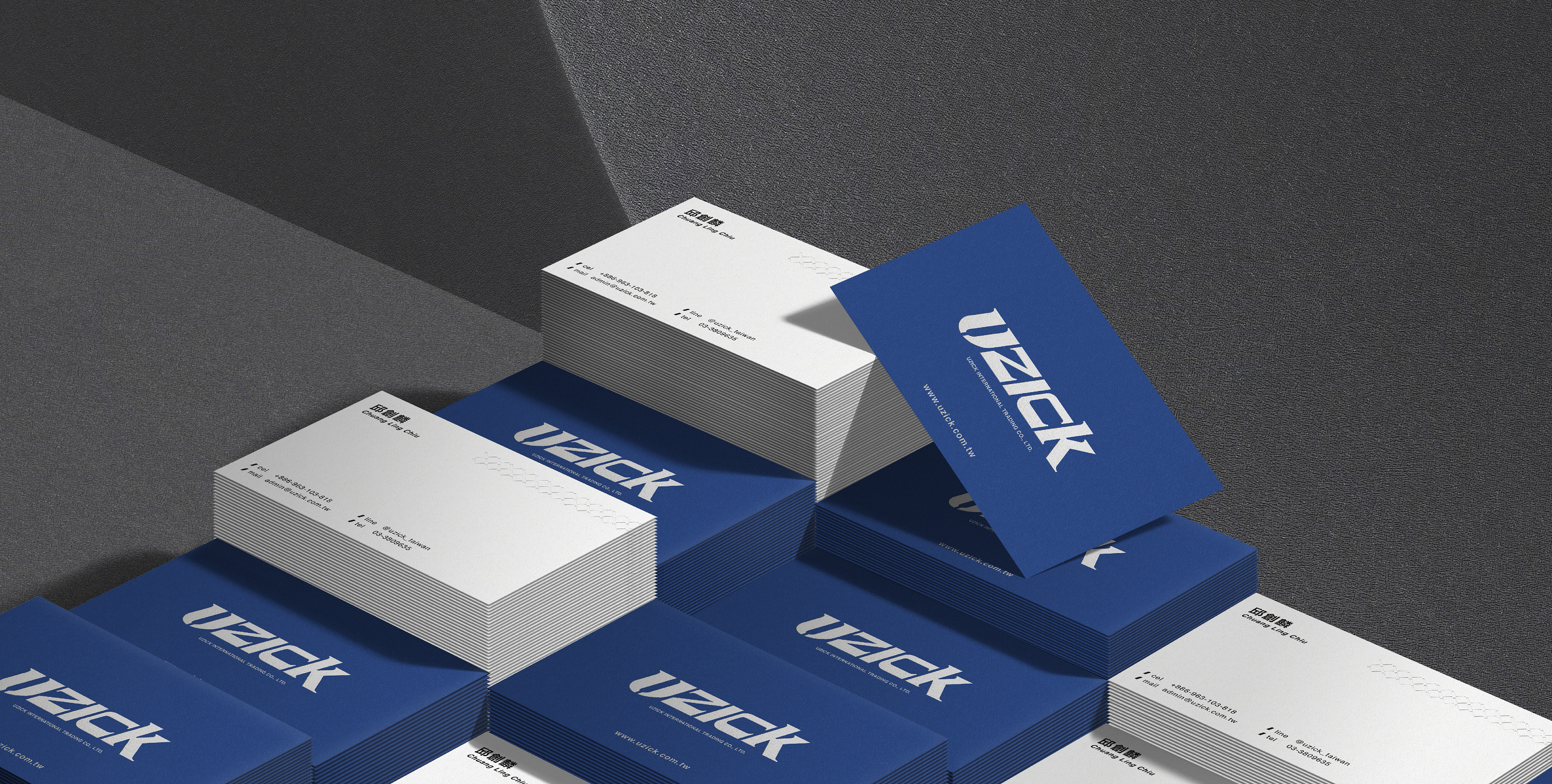
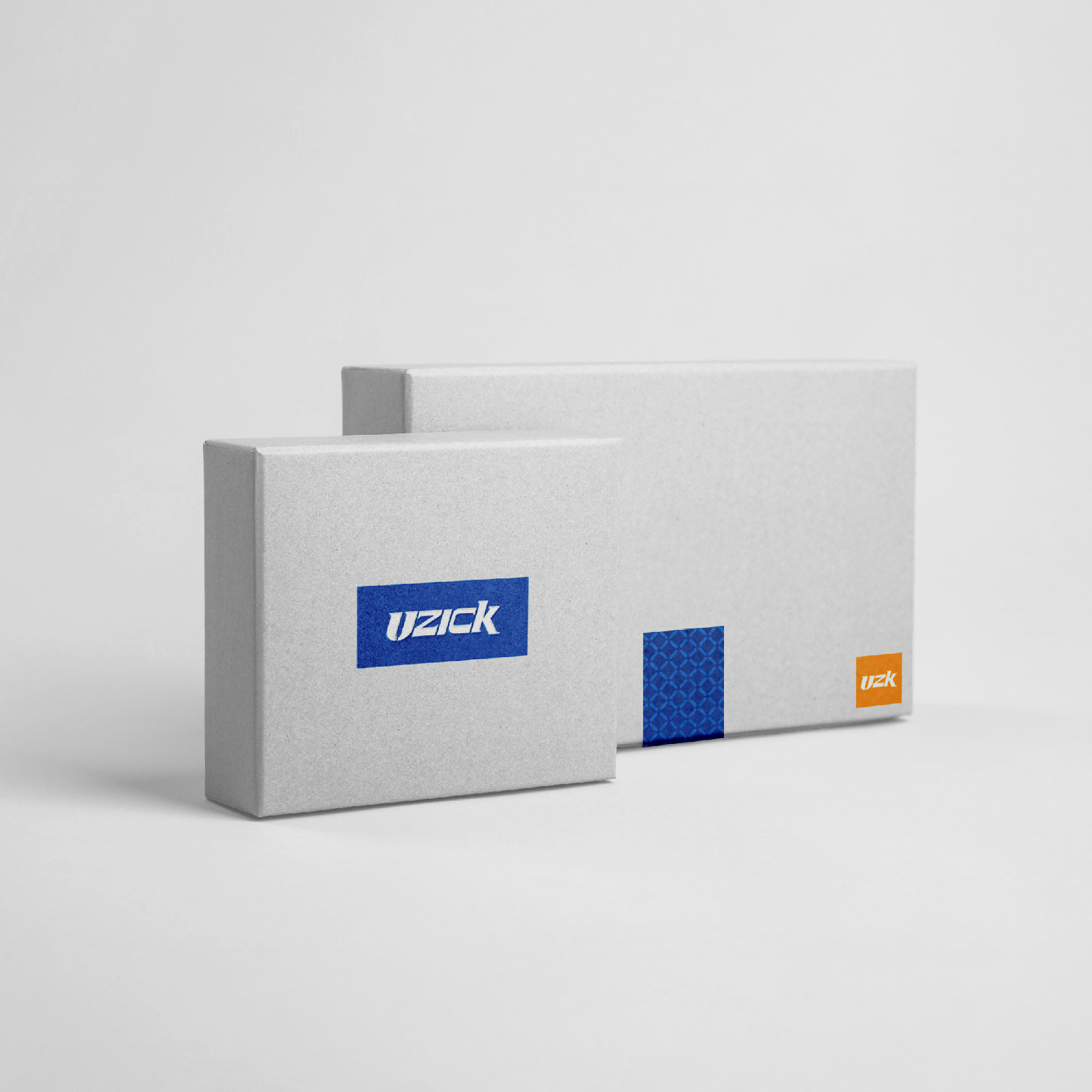
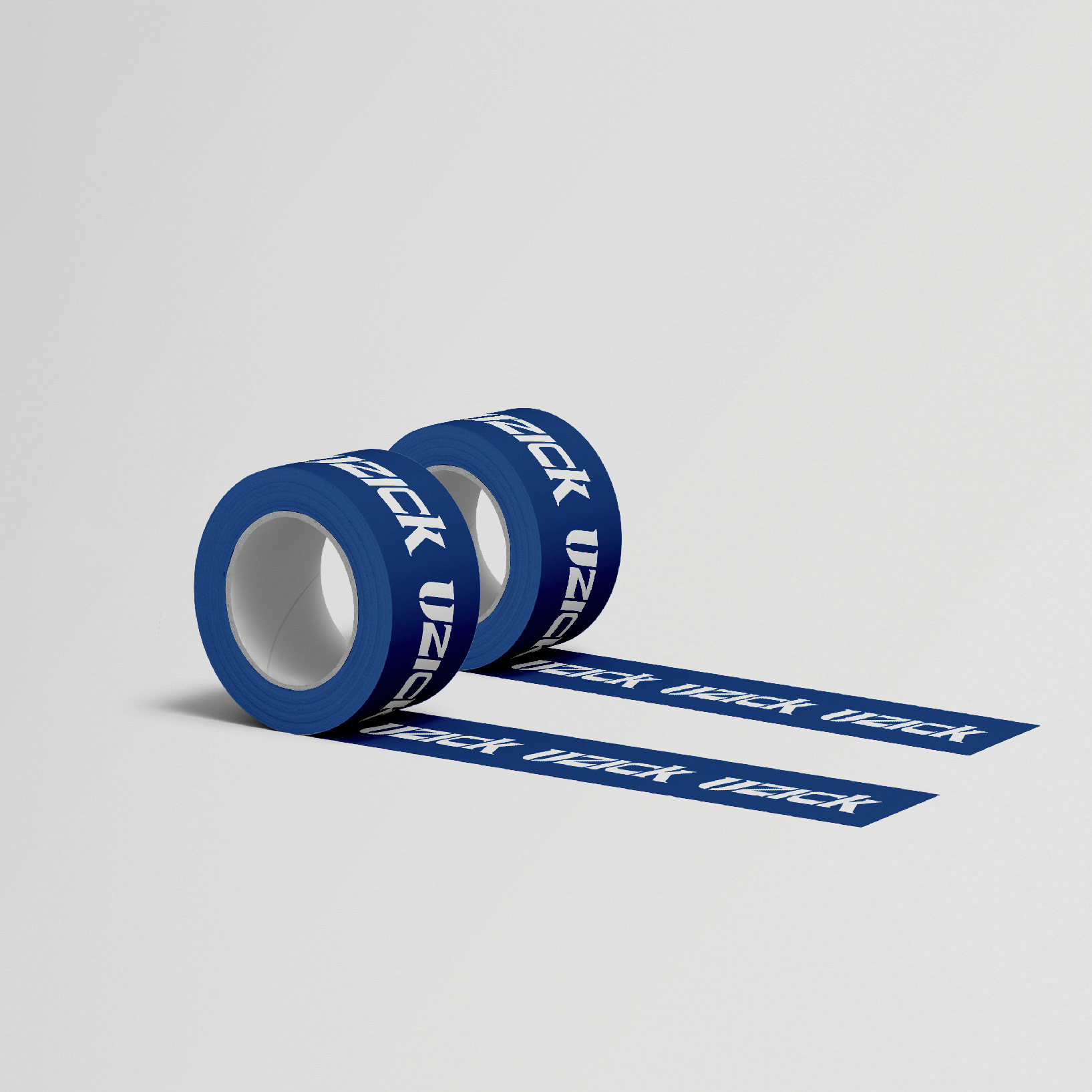
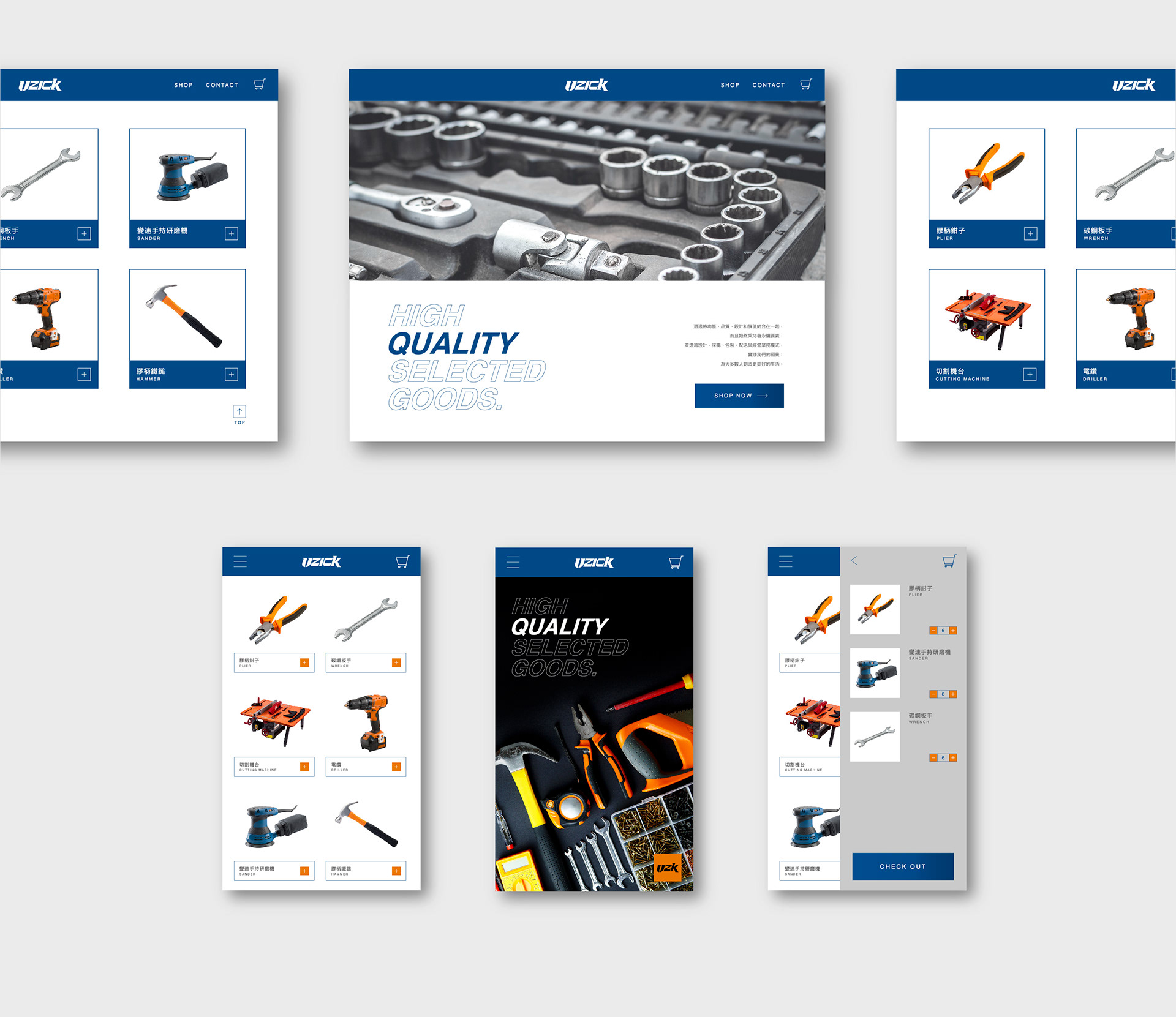
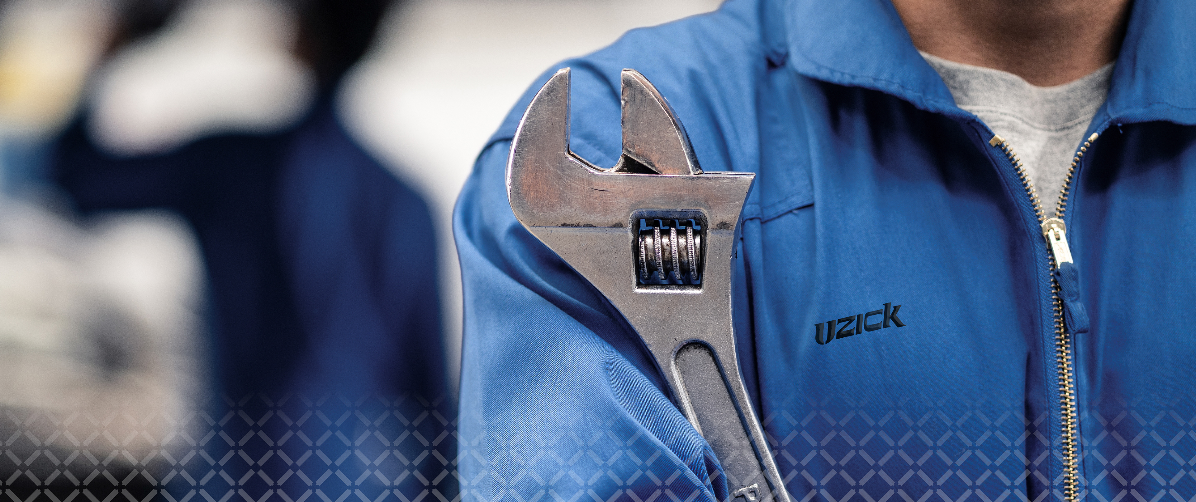
標準字及 Pattern 使用扳手及榔頭的形狀強調工具感,灰色、藍色為主色,搭配橘色點綴,呈現工具正在焊接時產生的火花,像是爸爸在地下室修繕家具的背影強悍而溫柔,默默維護著這個家。
Hardware plays a small but vital role in our lives. Good tools are like extensions of hands, making repairs more effective. Uzick Hardware upholds this philosophy to provide you with practical, high quality, selective tools and daily supplies.
The logotype and pattern incorporates the shape of a wrench and a hammer to emphasize tool’s handiness. We’ve chosen gray and blue as the primary colors, and orange accents to imitate welding sparks. Like a father repairing furniture in the basement, strong and gentle, Uzick quietly maintains this home.

Credits
Type | Branding
Year | 2021
Client|UZICK
Year | 2021
Client|UZICK
Production|Grandvity Design
Art Director|Noodlemaker
Project Manager|Sarah Peng / Grape Chiu
Designer Director|Si Jia Sun
Logotype Designer|Noodle Wang / Tai Jiang Lin
Visual System Designer|Jasmine Lin
Designer|Claire Jen
Art Director|Noodlemaker
Project Manager|Sarah Peng / Grape Chiu
Designer Director|Si Jia Sun
Logotype Designer|Noodle Wang / Tai Jiang Lin
Visual System Designer|Jasmine Lin
Designer|Claire Jen