

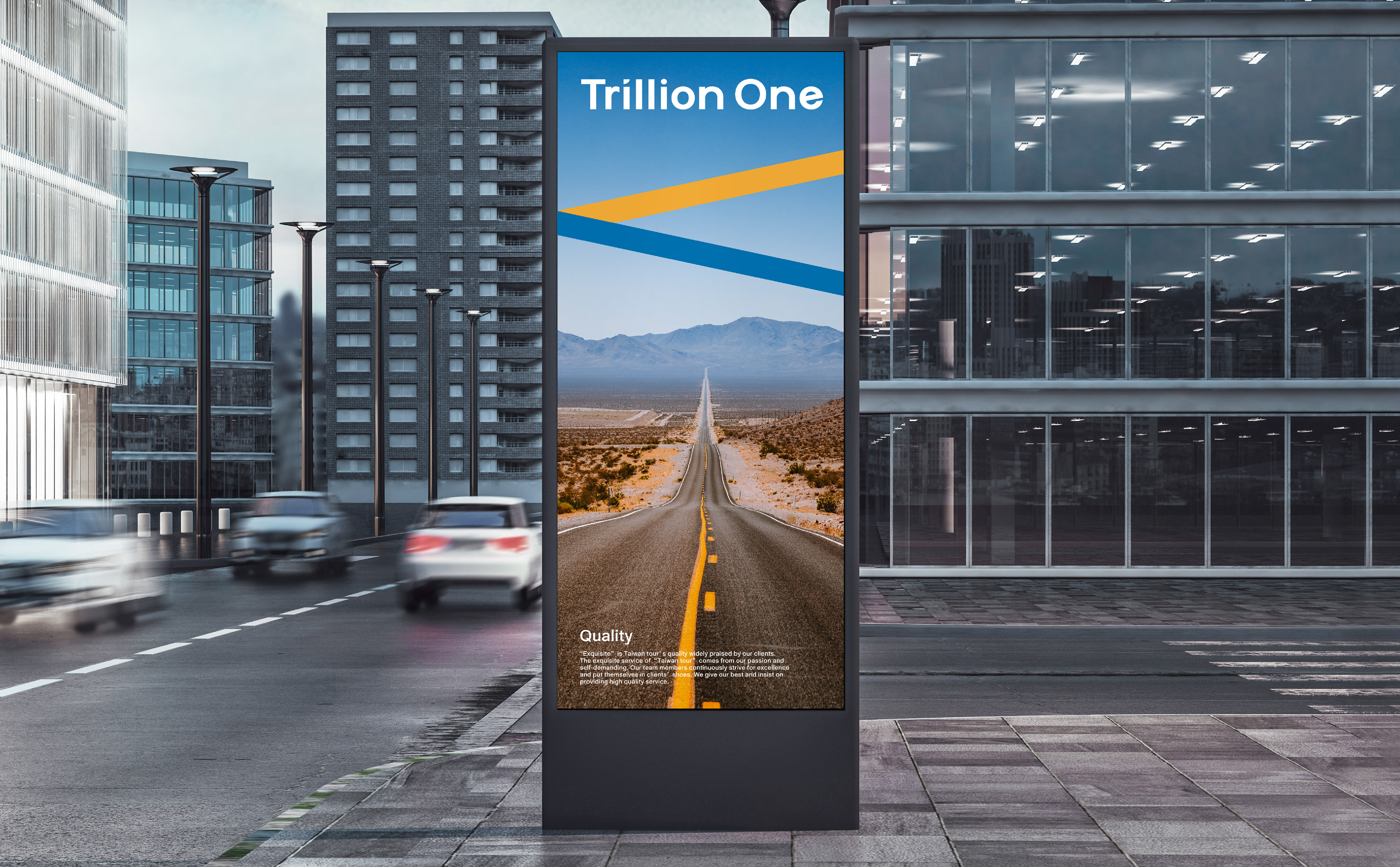
Trillion One | Branding
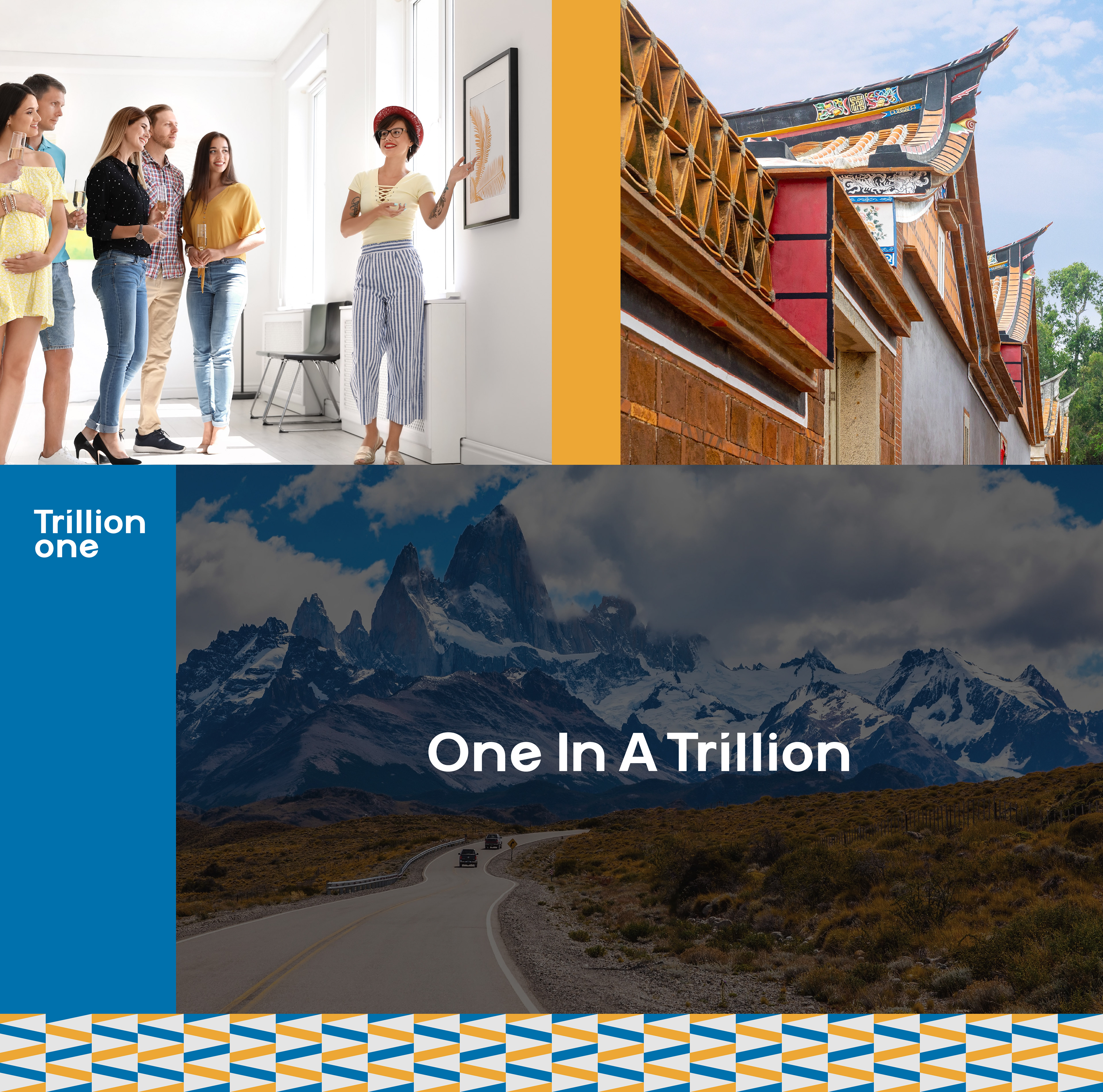
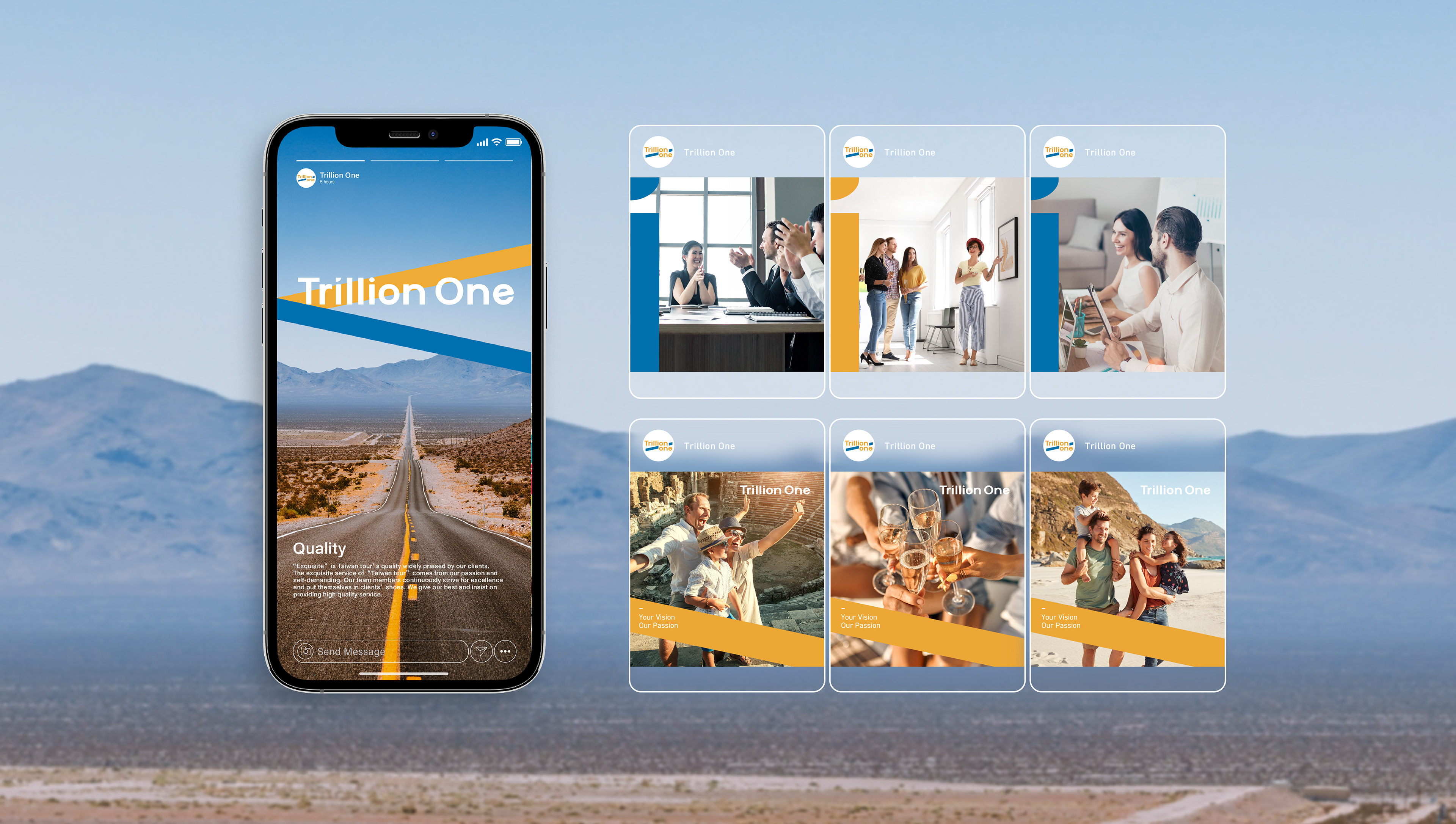
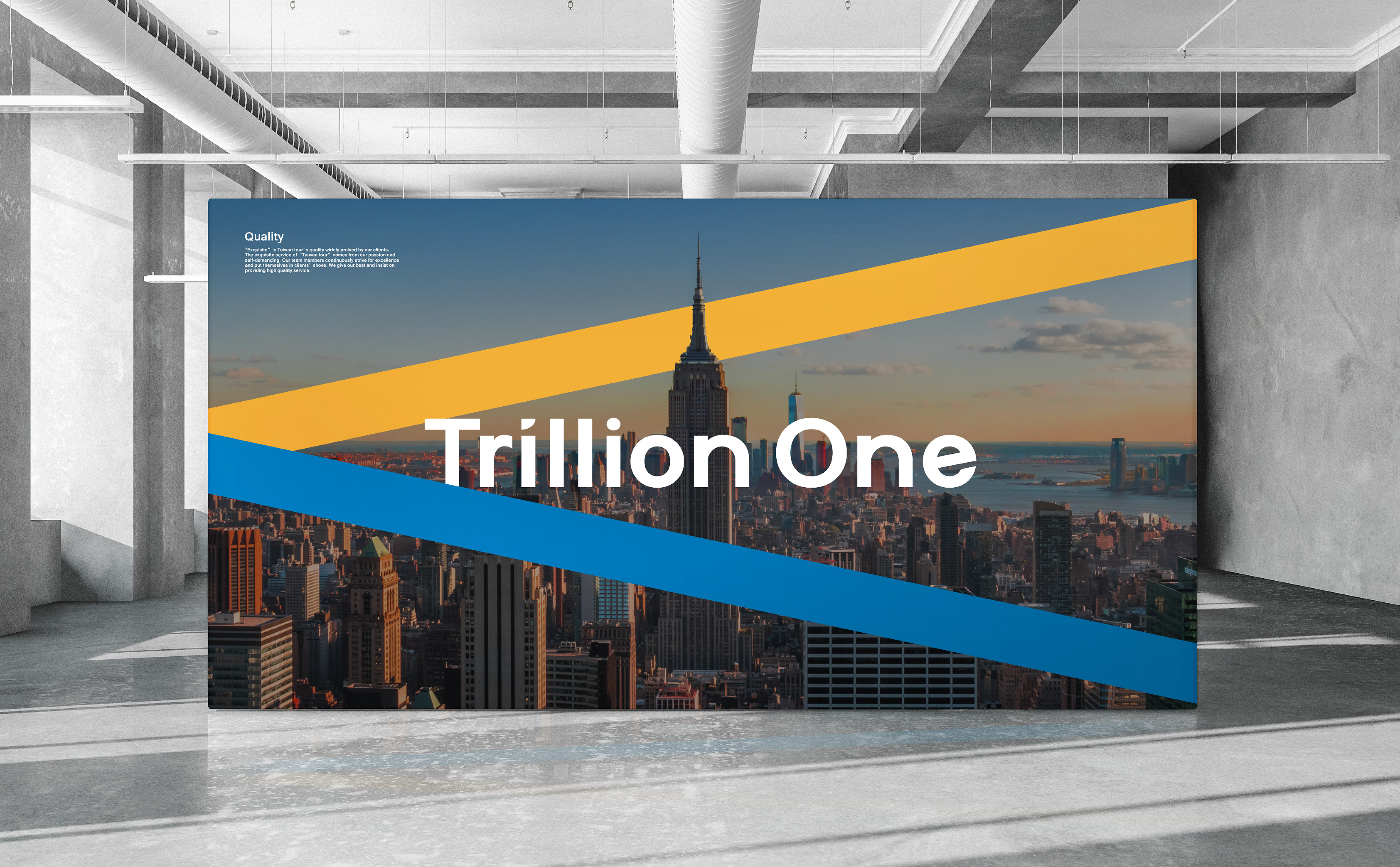
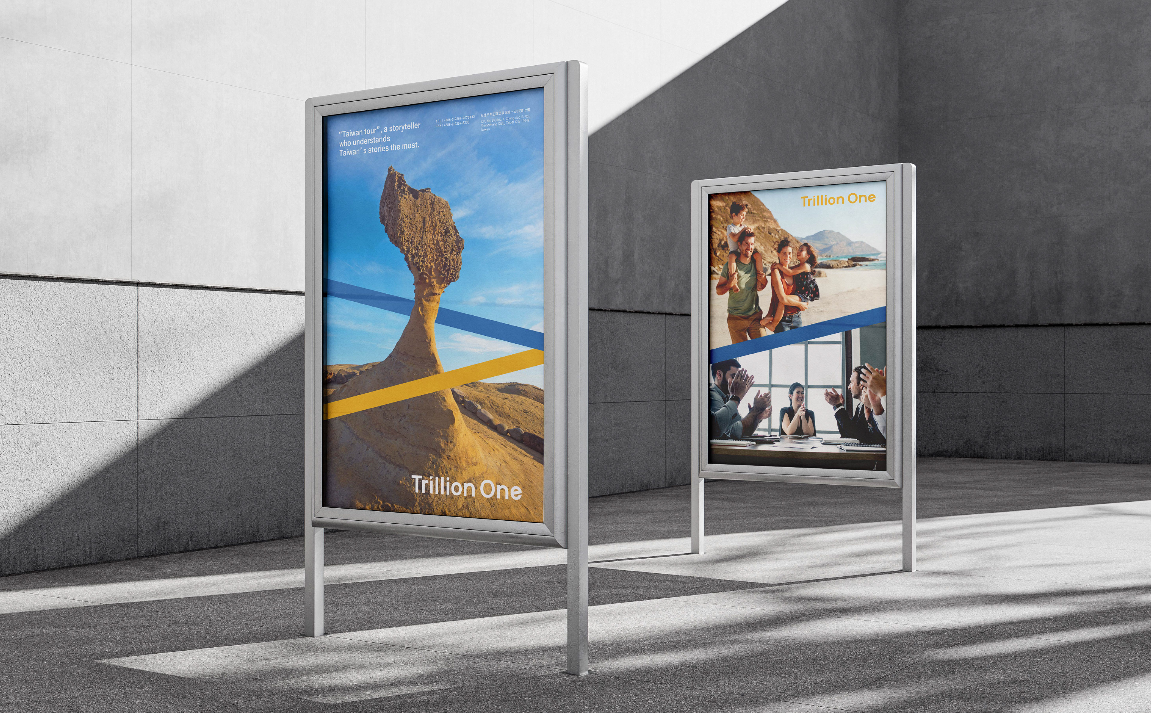
Trillion One, the parent company of Taiwan Tour, is an experienced travel agency that underwent a transformation in 2022. It integrates "travel planning" and "event curation" to offer an integrated marketing service.
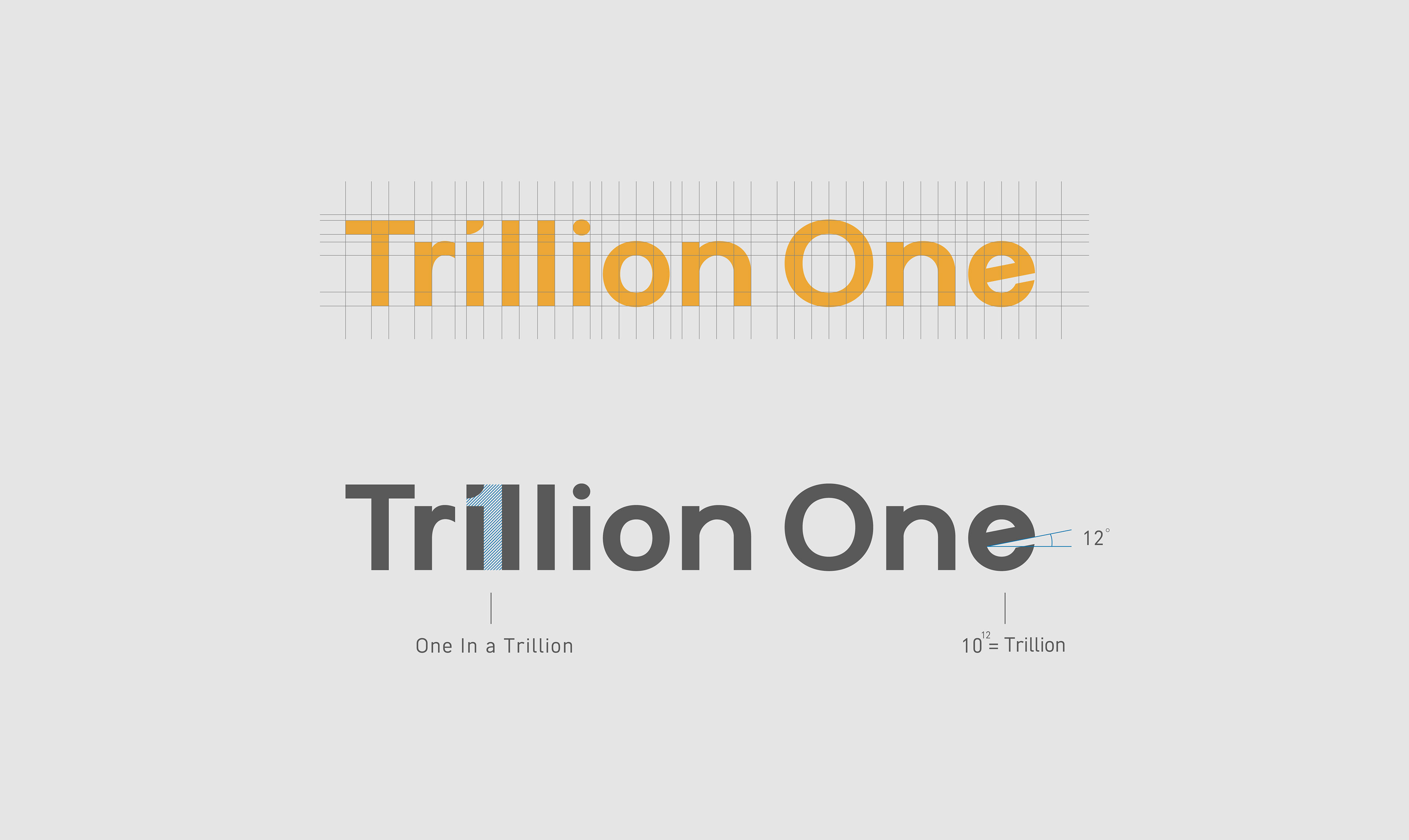
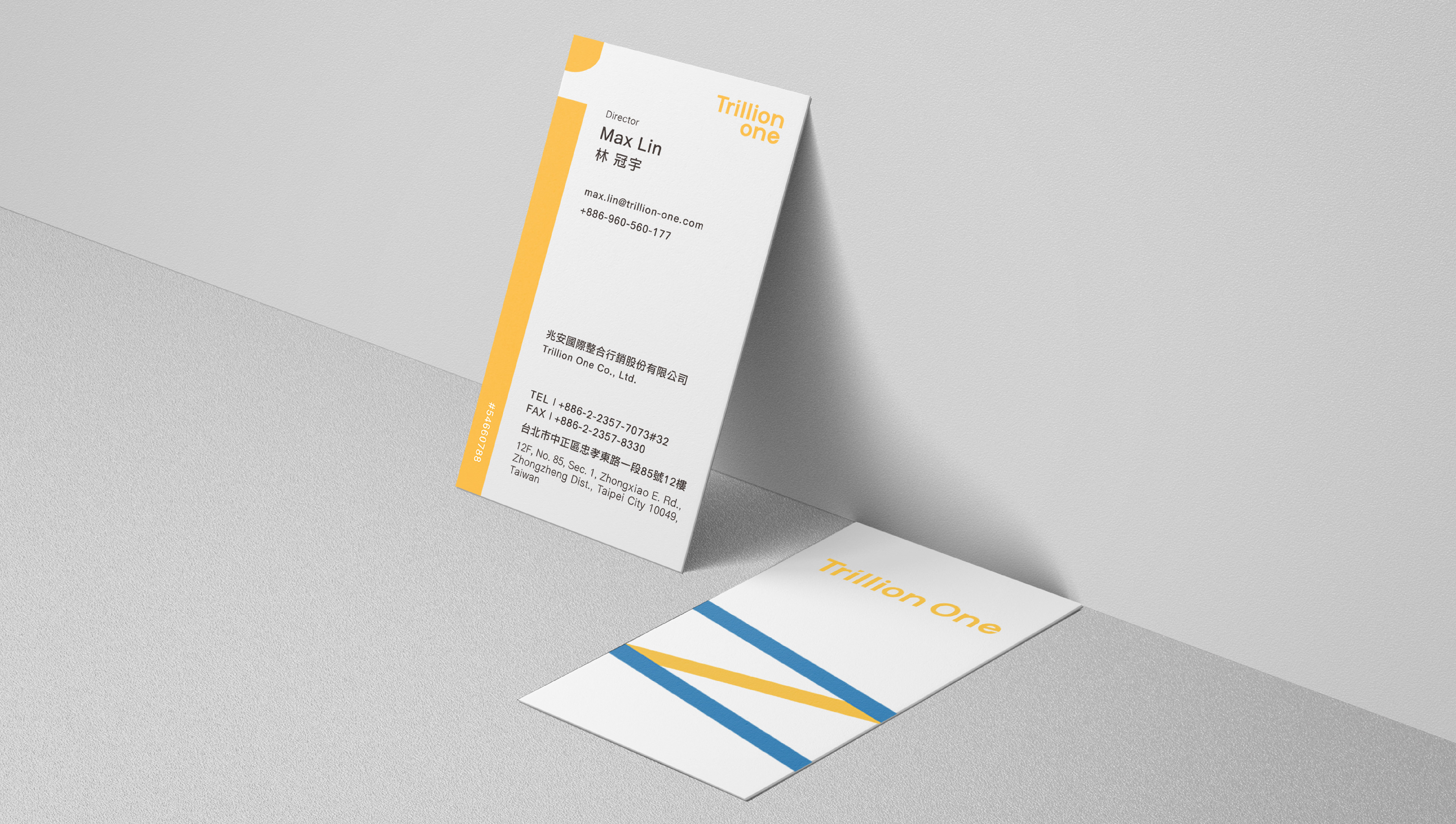
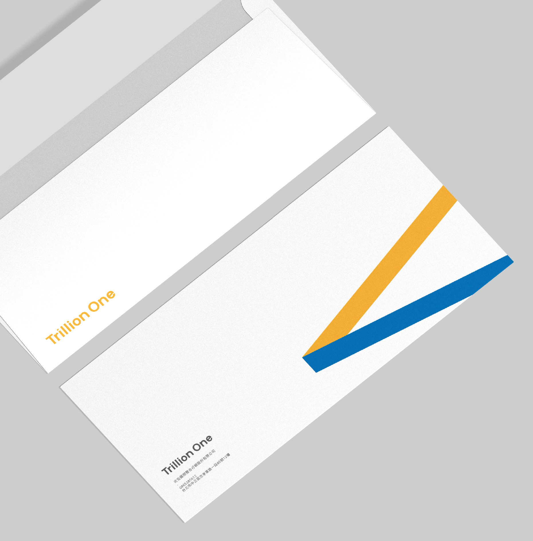
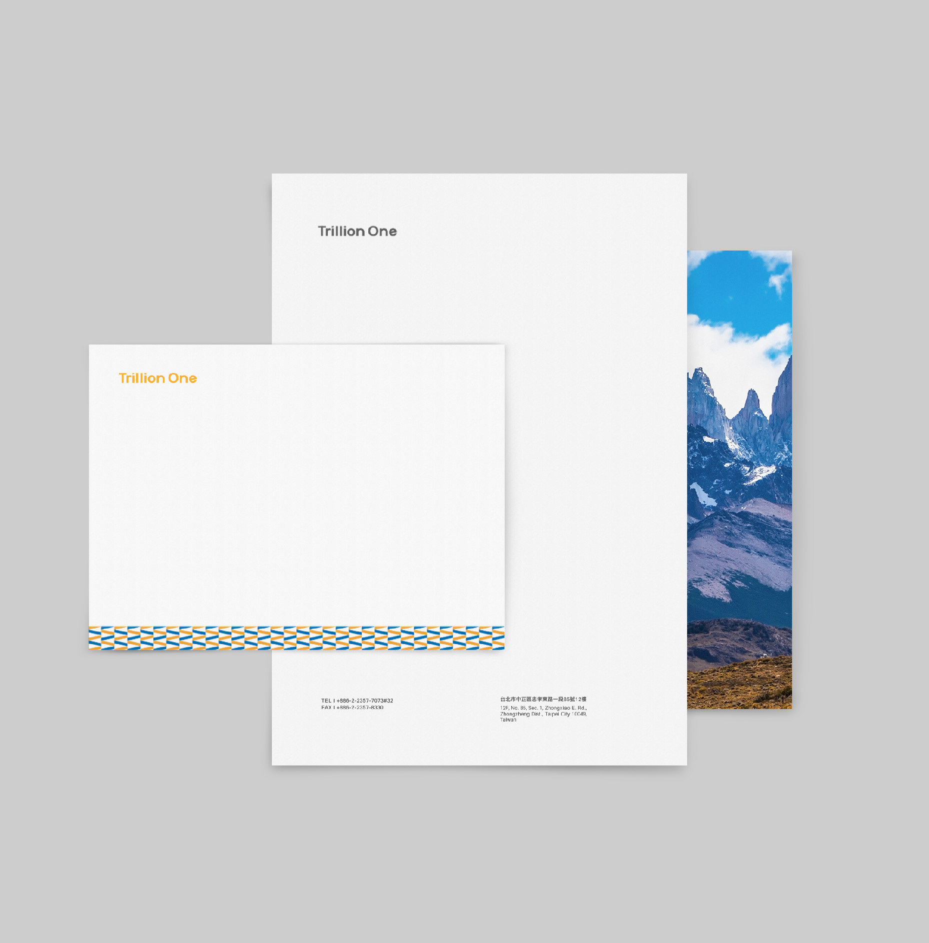
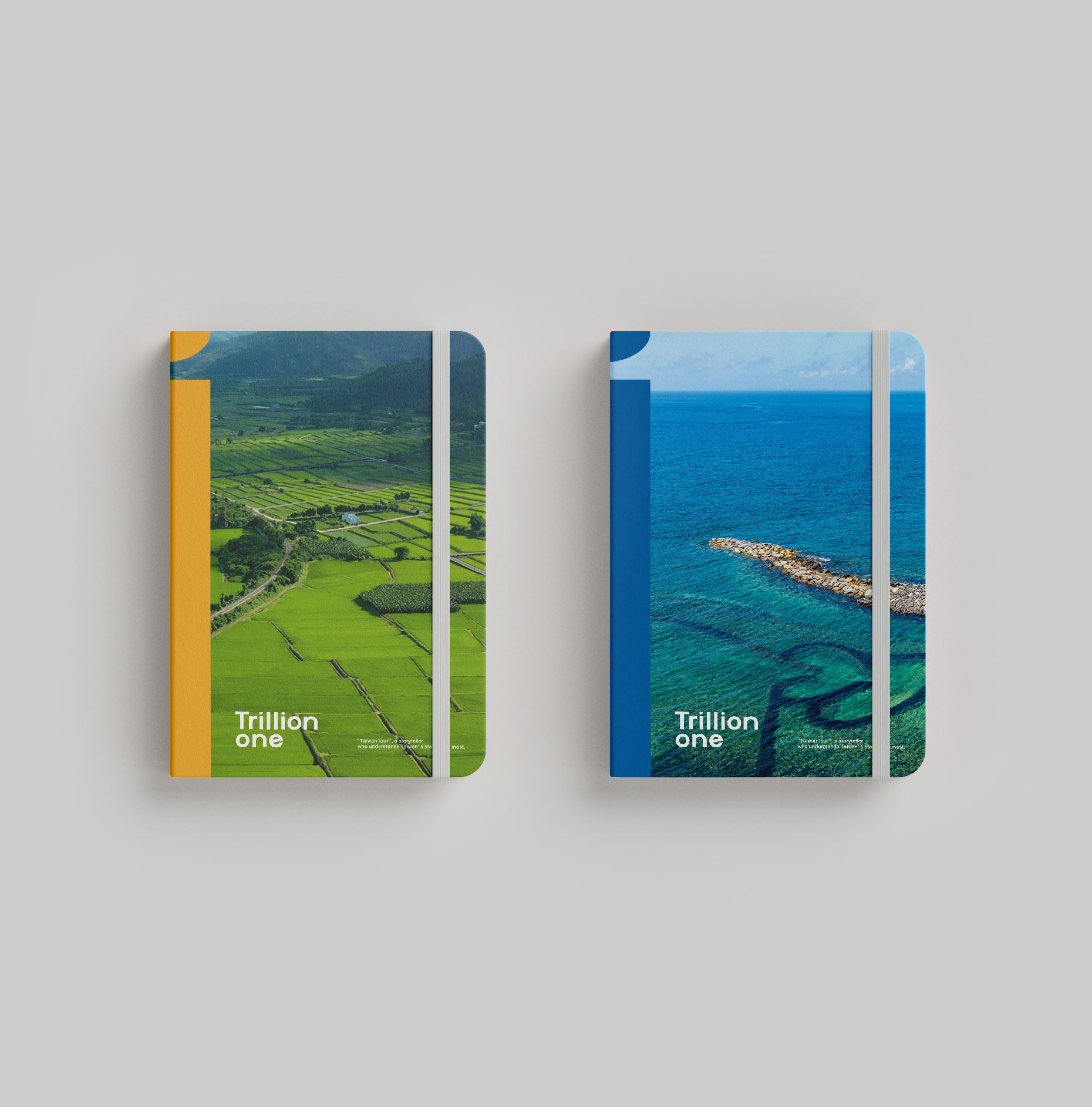
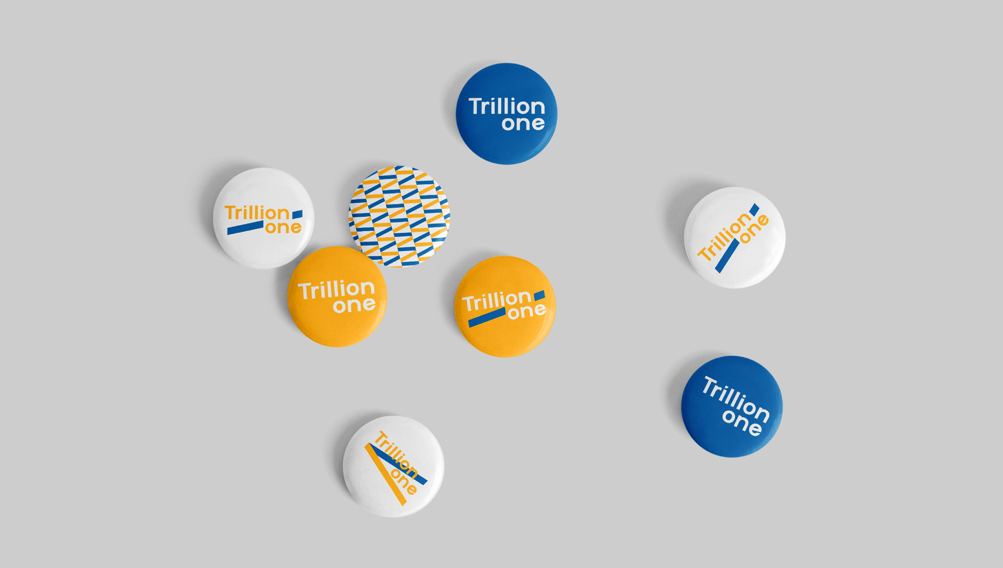
Grandvity Design handled the visual identity and naming for Trillion One. We chose "trip" and "vision" to capture their brand concept and used the letter "i" to symbolize customer relationships. By expanding "i" to "illi," we seamlessly integrated 兆 (trillion in Mandarin) into "Trillion." Additionally, we added "One" after "Trillion" to communicate the service philosophy of being "One in a trillion."
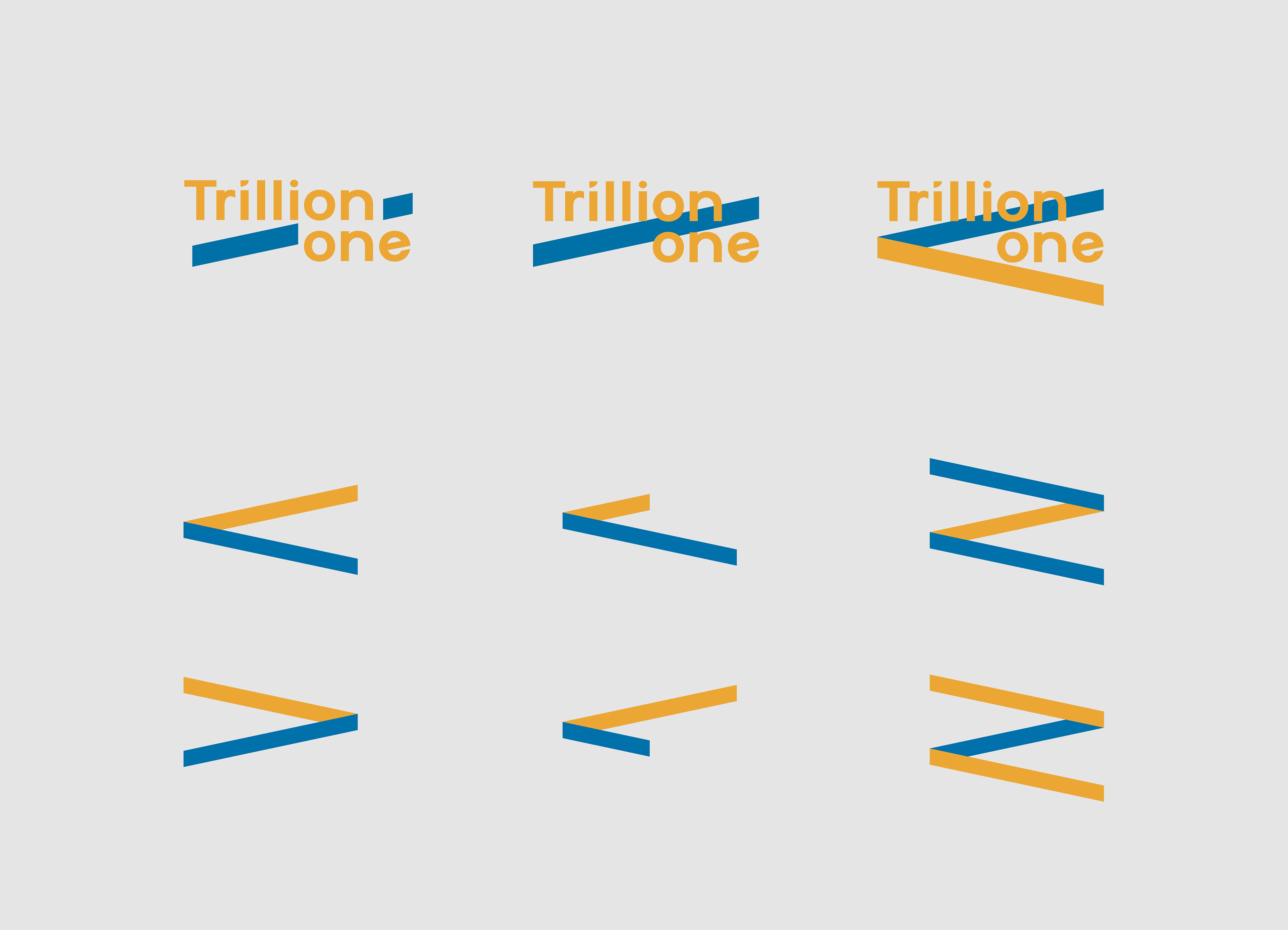
In addition, the logo cleverly hides "1" within the negative space of the letter "il”. The letter "e" is slanted at 12 degrees, referencing that a trillion is 1012, and a plane taking off as a symbol of traveling.


Credits
Client | Trillion One
Production | Grandvity Design
Art Director | Noodlemaker
Account Manager | Grape Chiu
Project Manager | Sarah Peng
Design Director | Si Jia Sun
Logotype Designer | Noodle Wang
Visual System Designer | Jason Lee
Portfolio Designer | Jason Lee / Hugo Tseng
Font|Arphic Font