
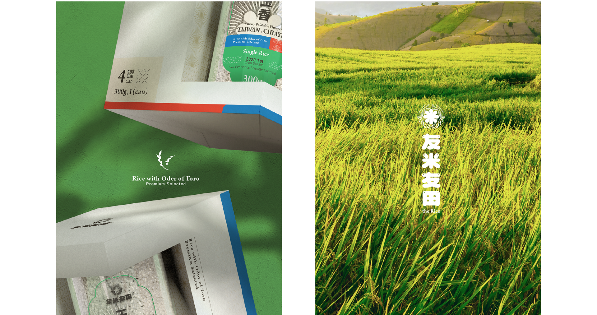
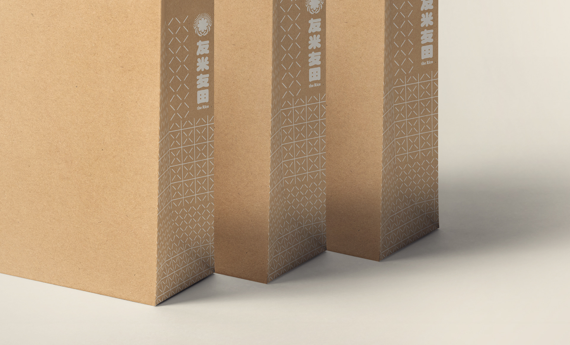
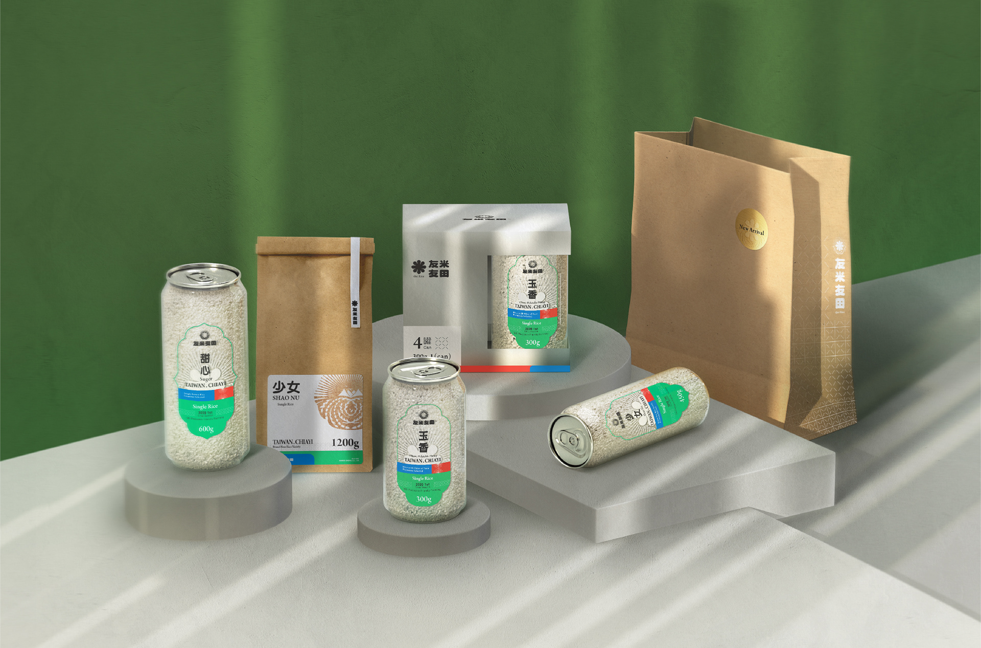
友米友田 the Rice | Branding
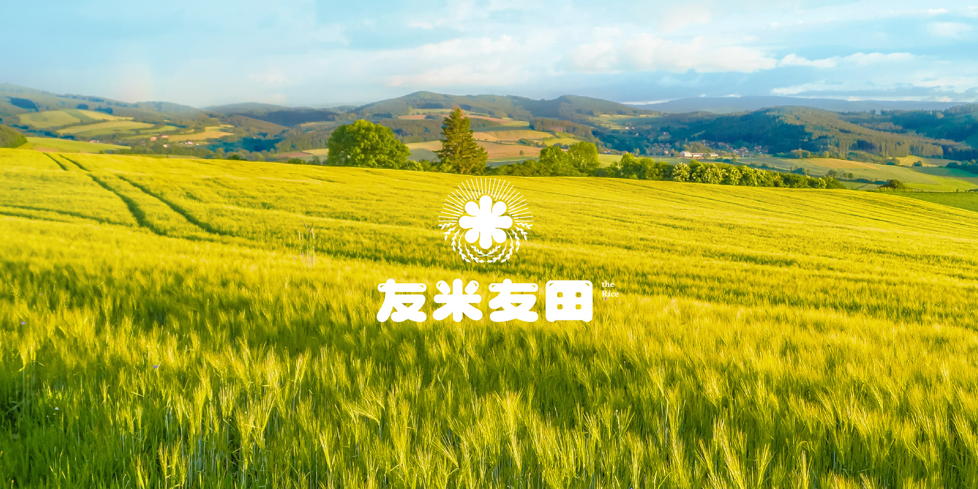
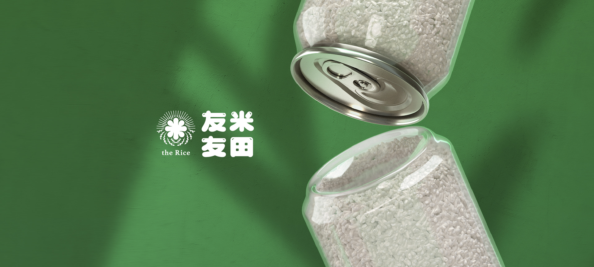
食慾的滿足是最直接的快樂,台灣在地稻米品牌友米友田,透過對稻米的層層把關與挑選,期望每個吃到他們米飯的人,都能獲得真實的幸福感。
Satisfaction of appetite is the easiest way to happiness. Taiwan’s local rice brand “the Rice” (友米友田) oversees their rice with utmost quality and selection in hope that everyone who eats their rice will experience a simple happiness.
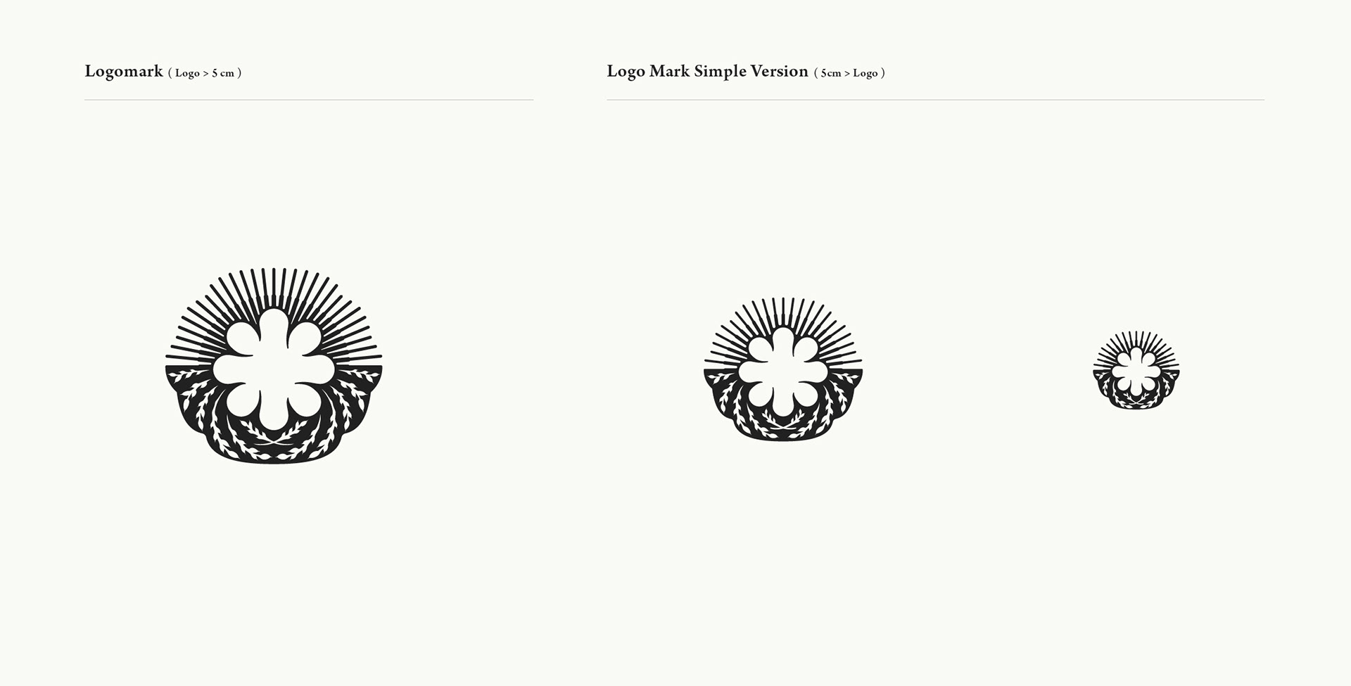
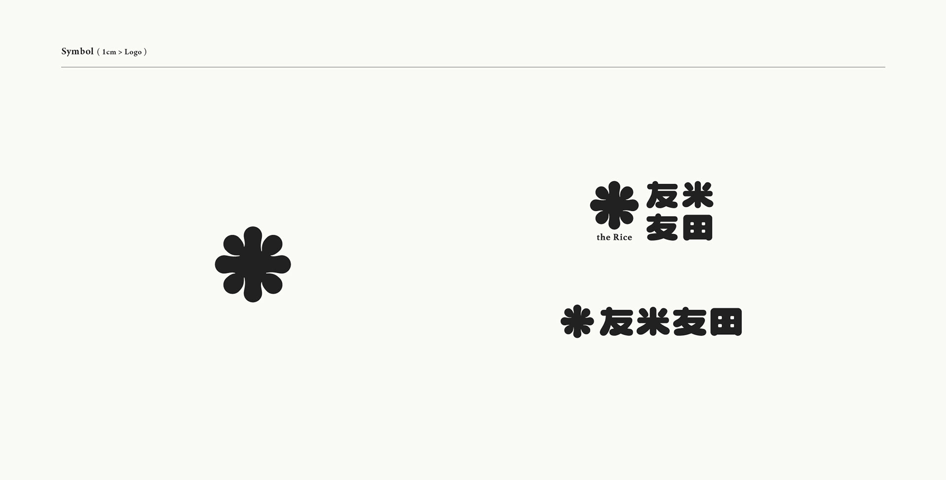
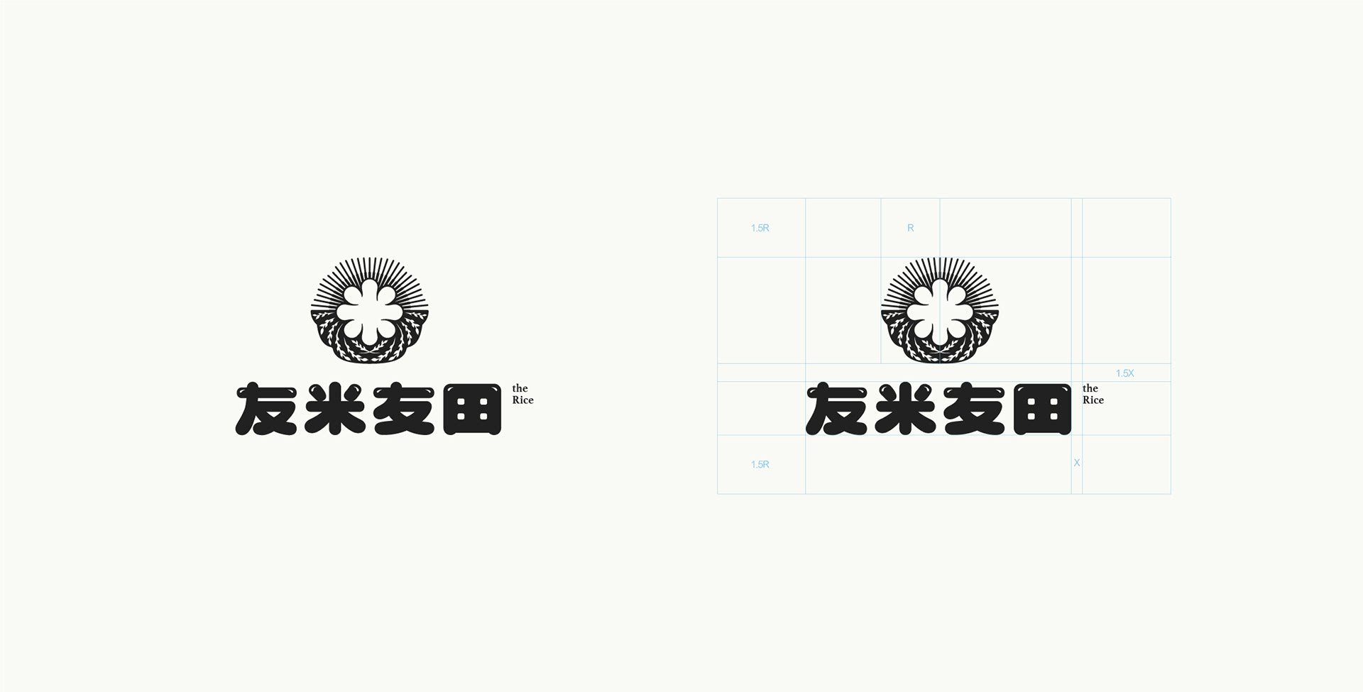
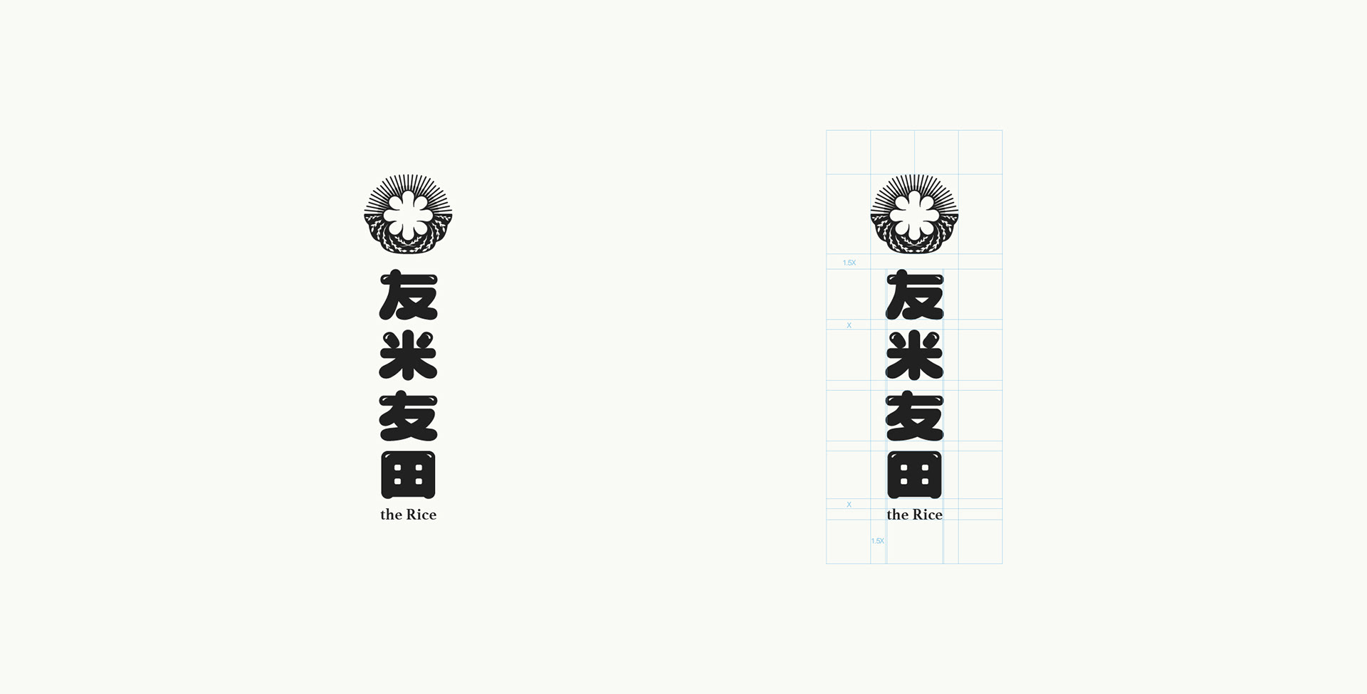
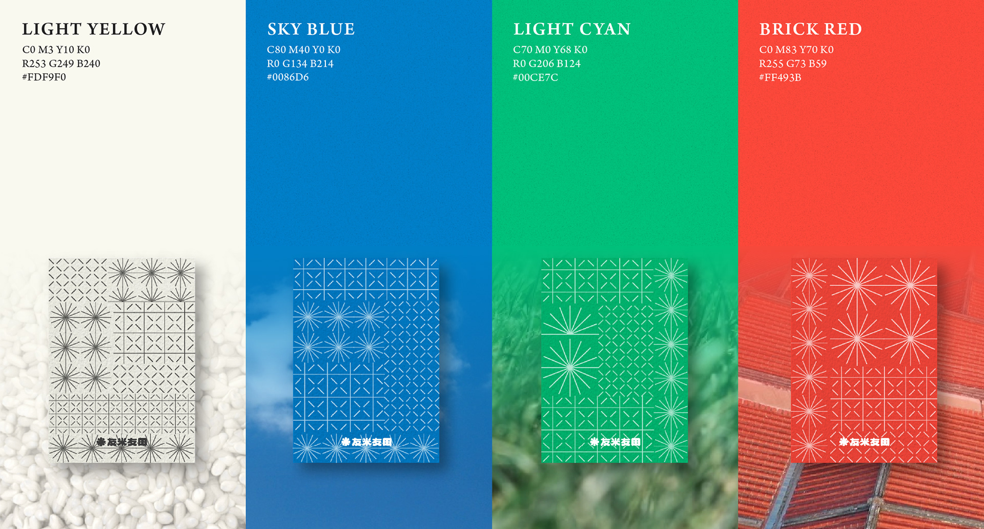
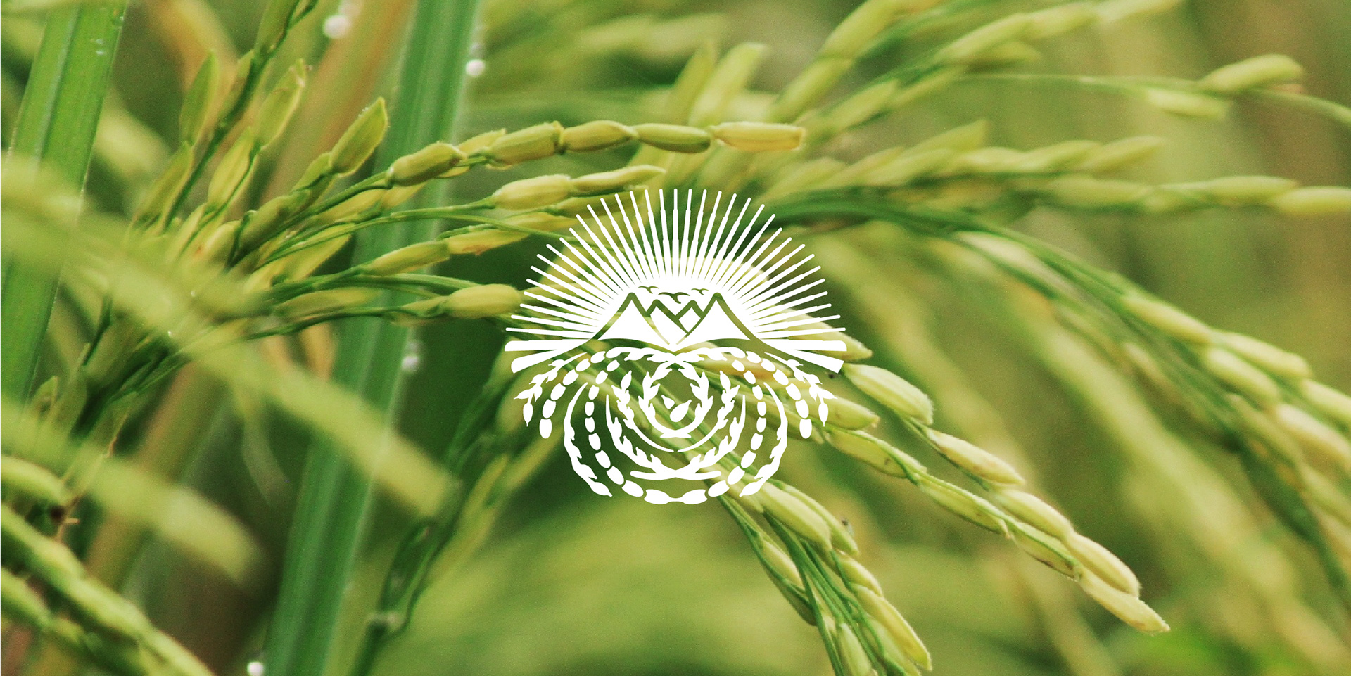
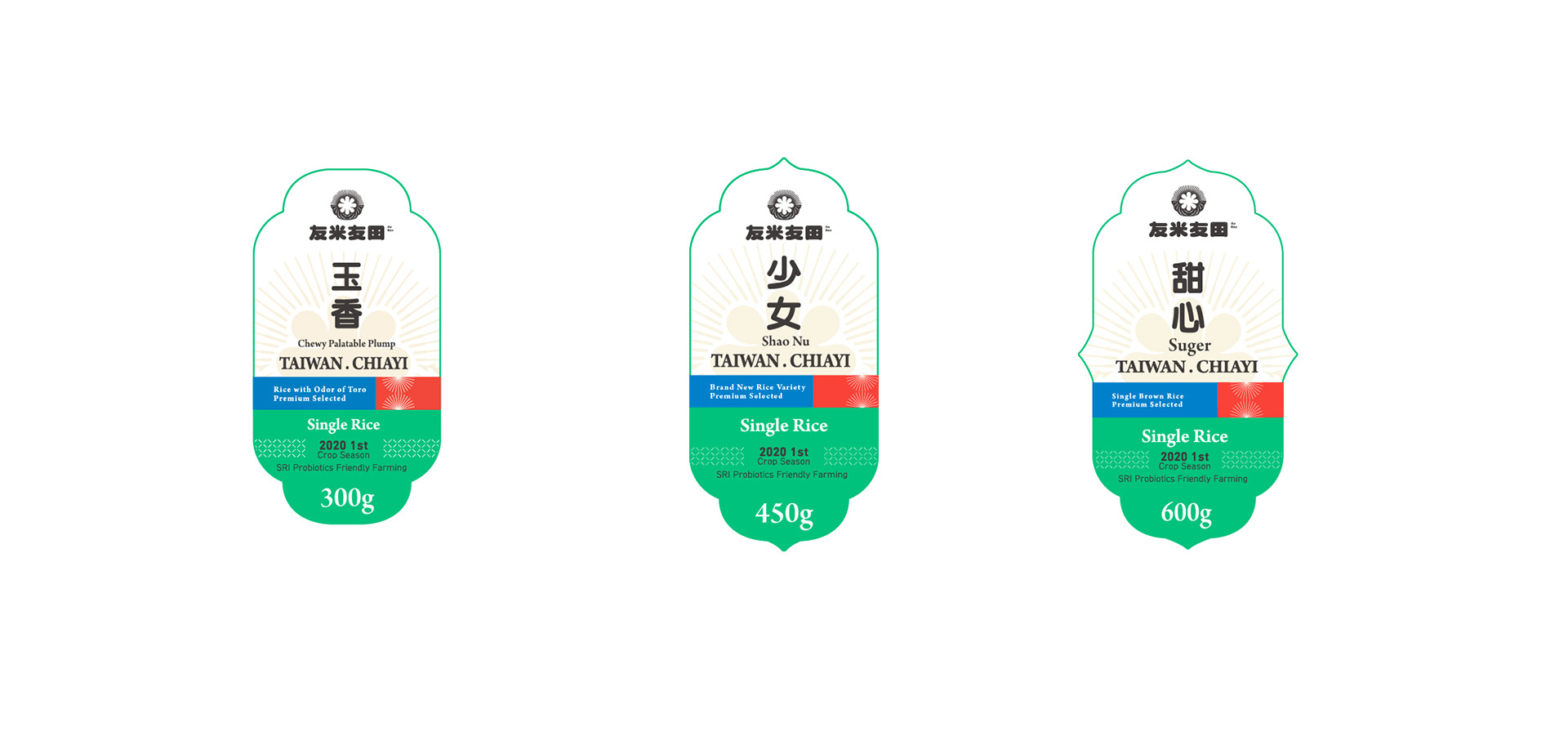
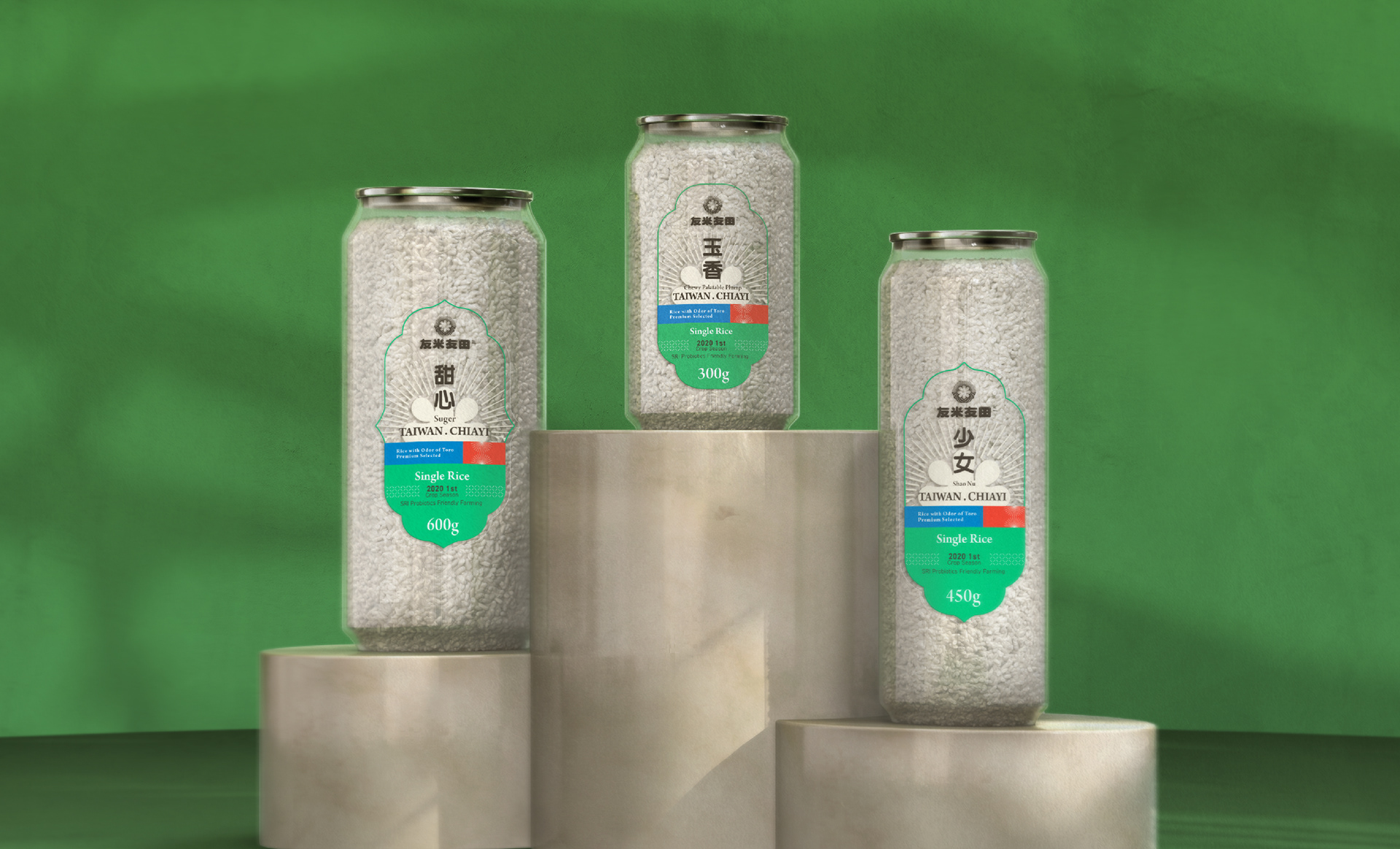
The logo adopts the rich and sticky texture of rice and forms into the Chinese character "米", which means rice. Behind "米" are streams of lights, imitating the sunlit rice field during harvest. The logo is accompanied by a retro color palette, displaying authentic Taiwanese characteristics.
Credits
Type | Branding
Year | 2021
Client|the Rice 友米友田
Production|Grandvity Design
Creative Concepnt|Andy Kao
Art Director|Noodlemaker
Project Manager|Sarah Peng/Grape Chiu
Typography Designer|Si Jia Sun
Designer|Jason Lee
Year | 2021
Client|the Rice 友米友田
Production|Grandvity Design
Creative Concepnt|Andy Kao
Art Director|Noodlemaker
Project Manager|Sarah Peng/Grape Chiu
Typography Designer|Si Jia Sun
Designer|Jason Lee