
Remo | Branding
Remo 由一群熱愛影像的人組成的創意整合團隊,擅長將生活中美好片段濃縮在影像中的每一幀。
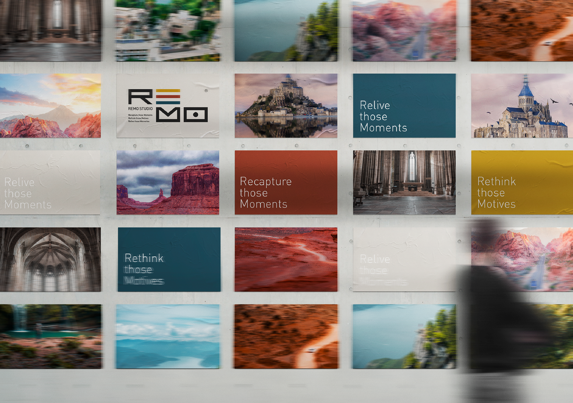
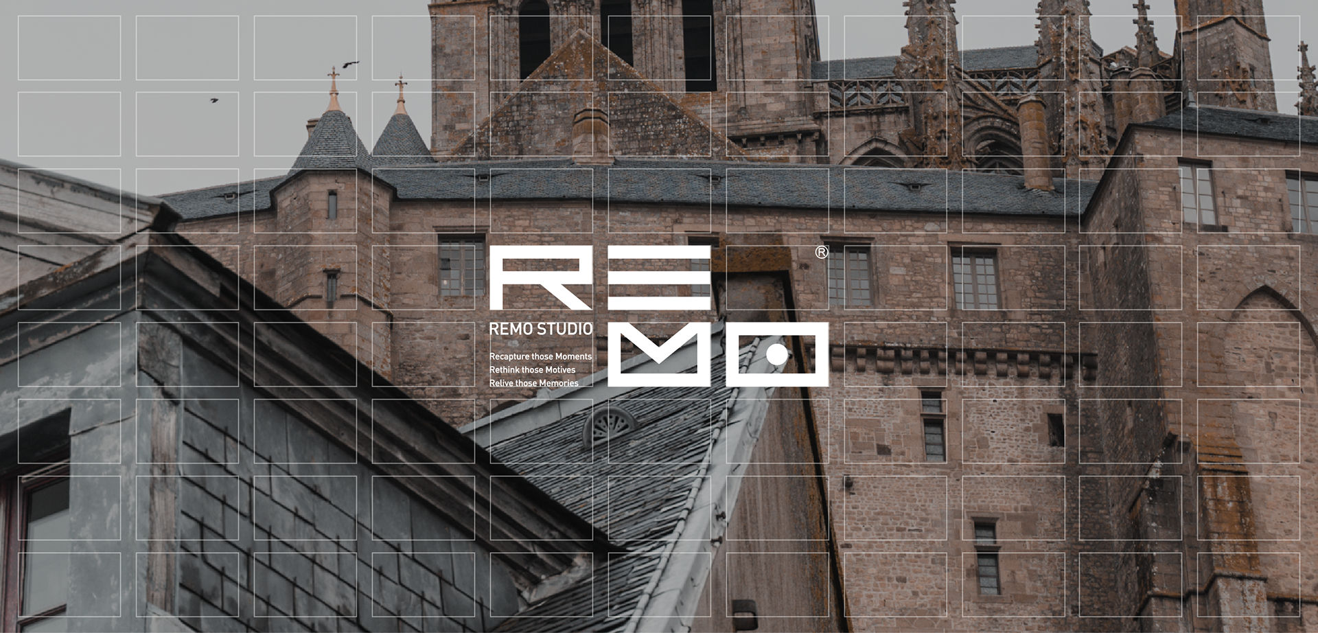
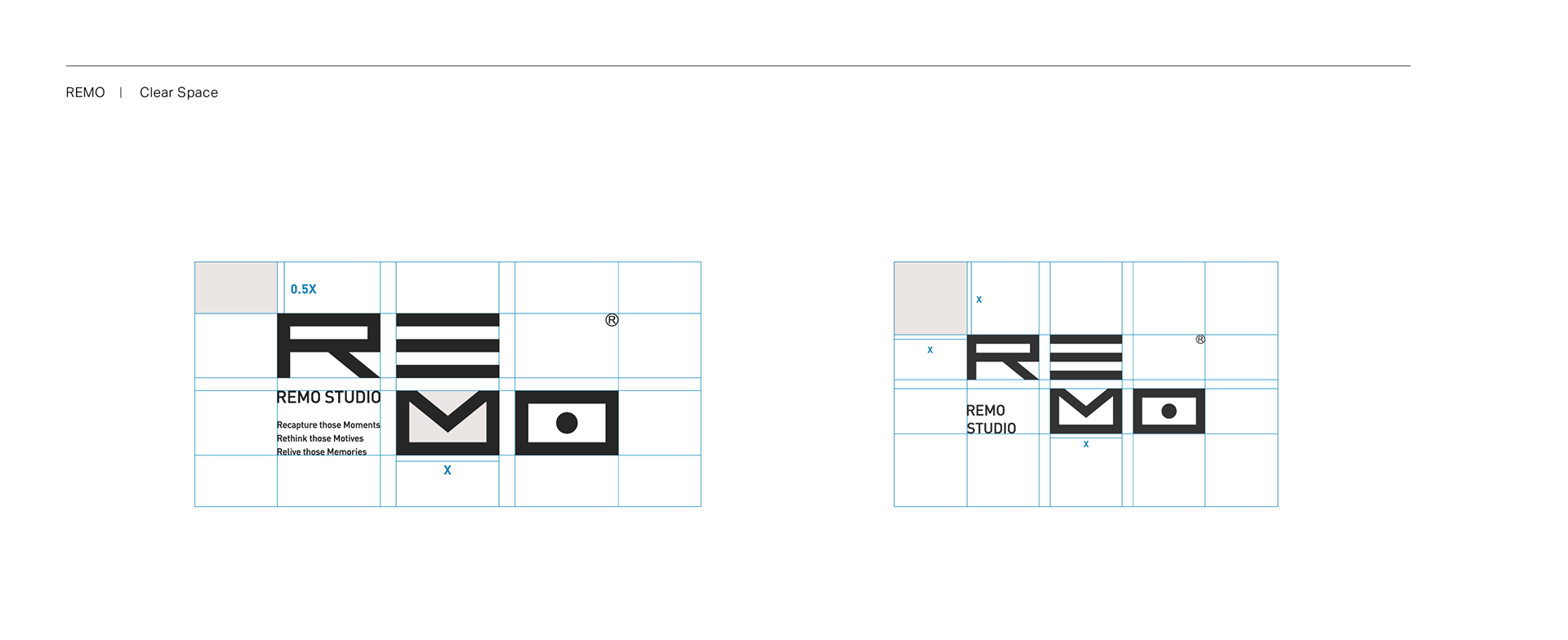
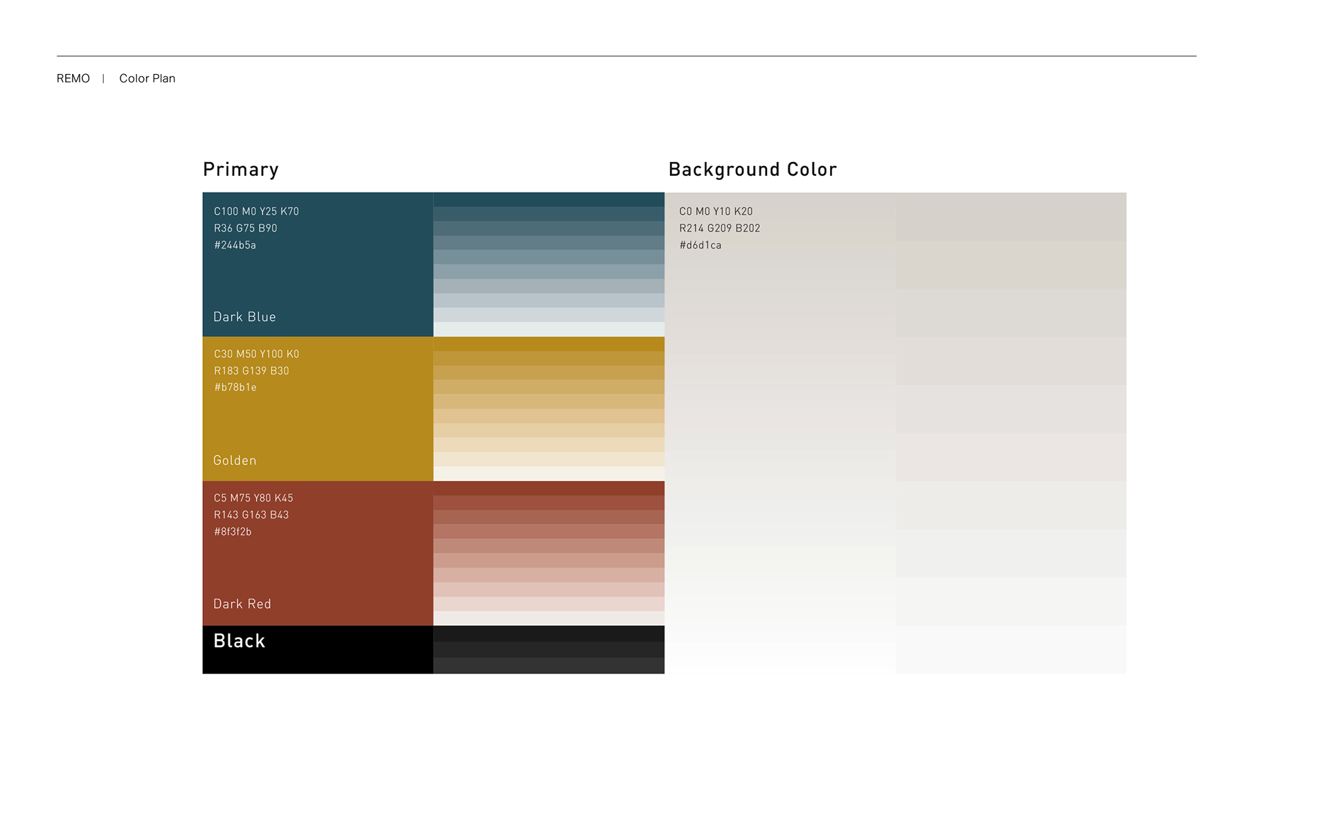
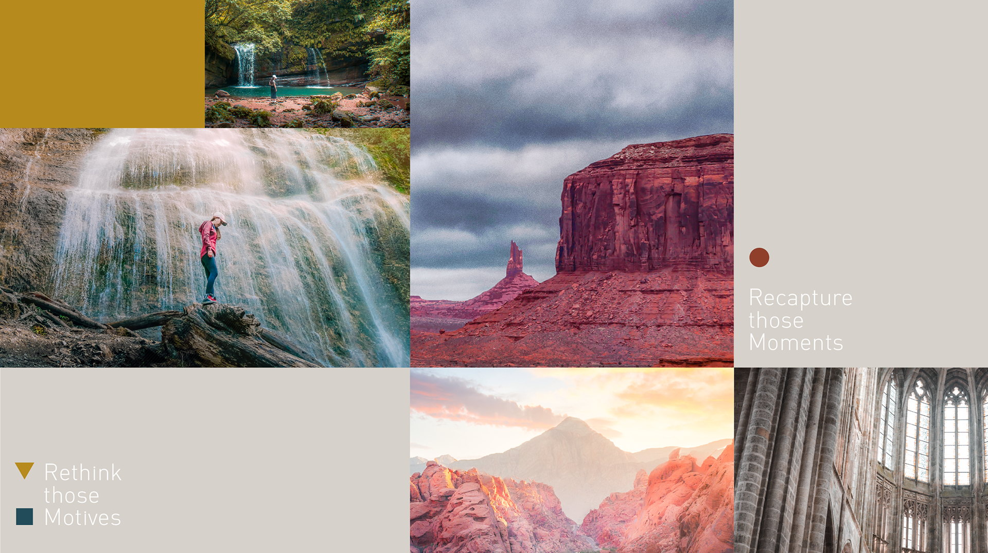
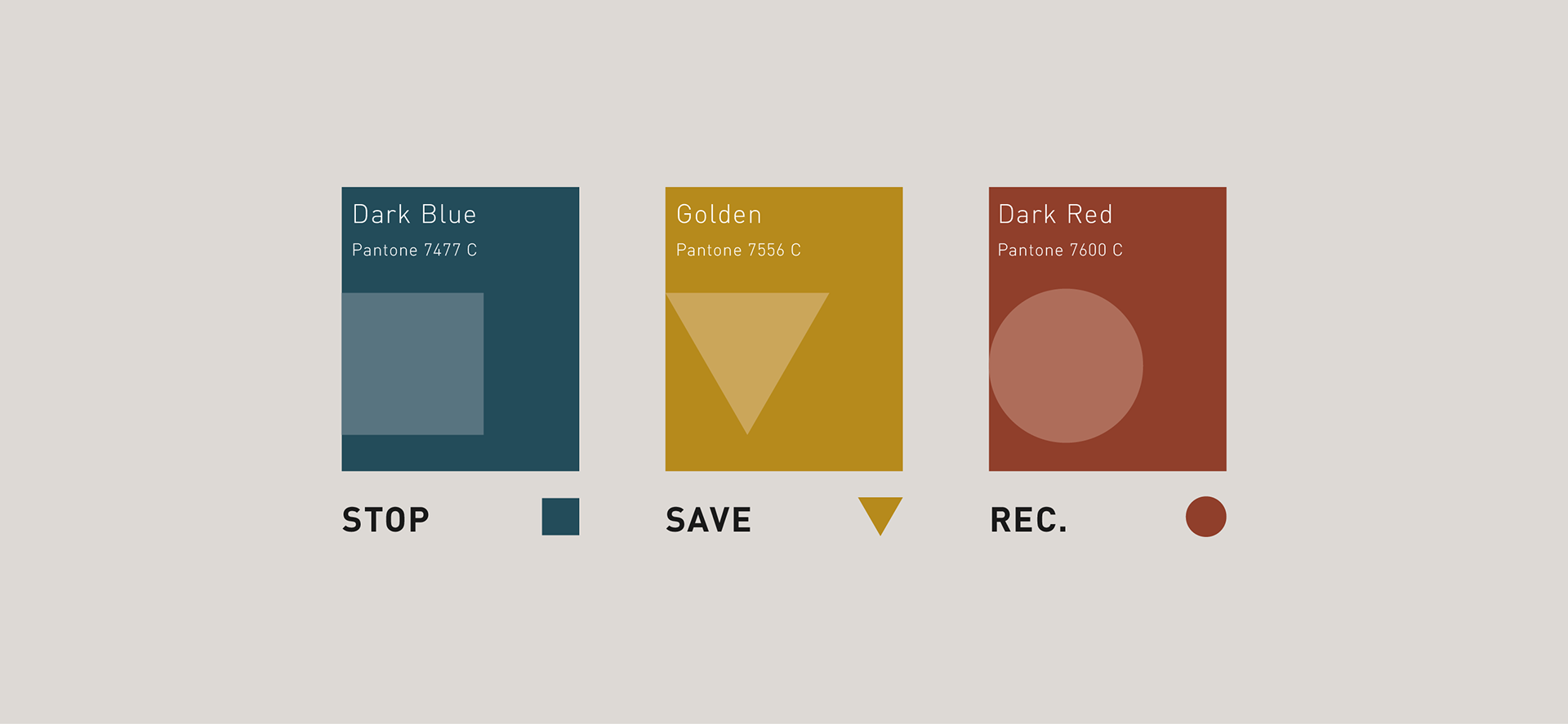
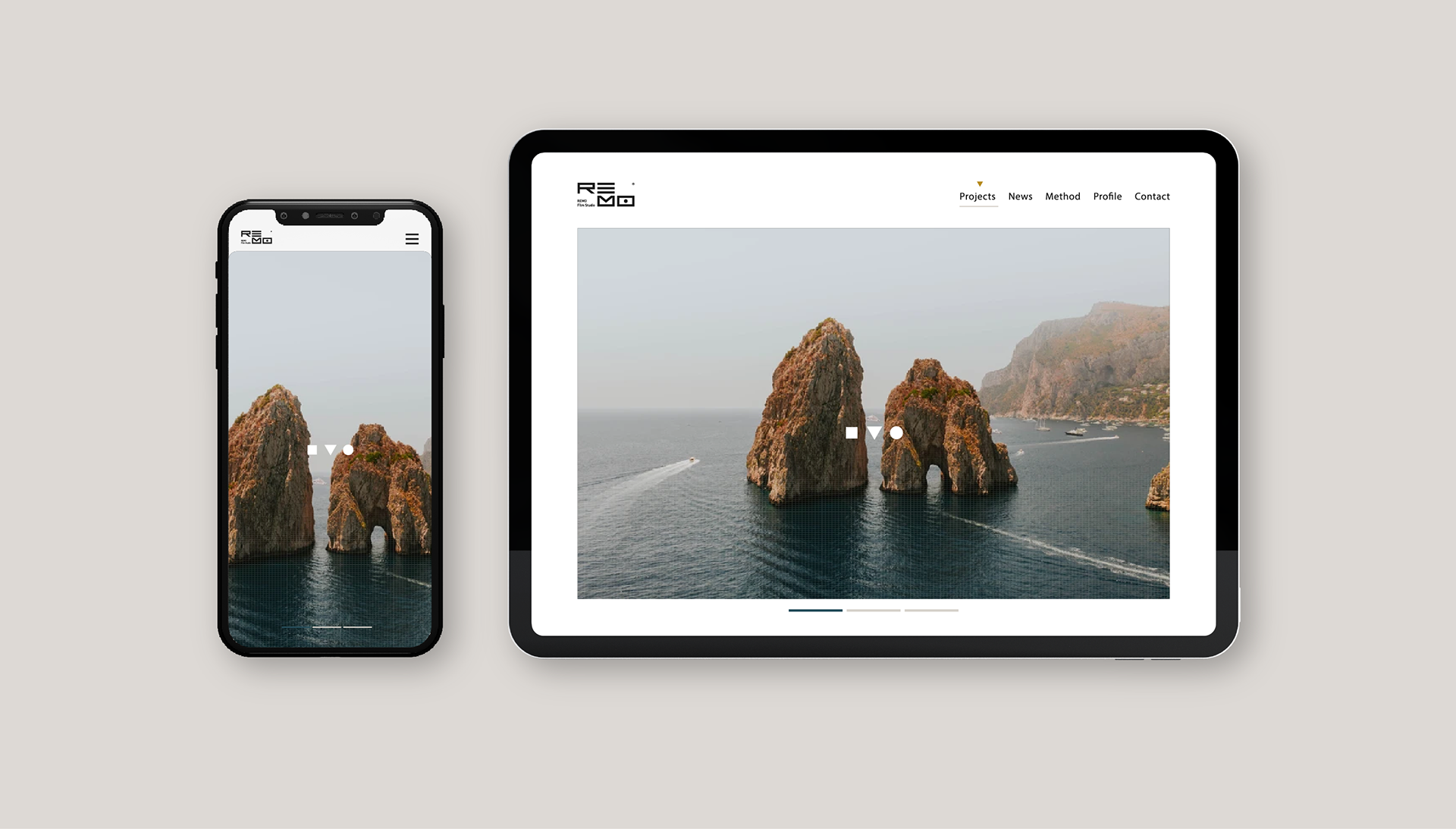
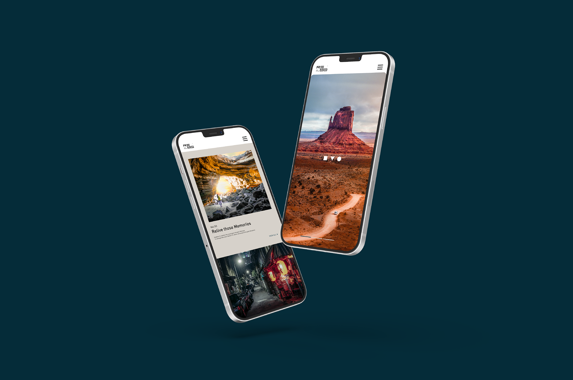
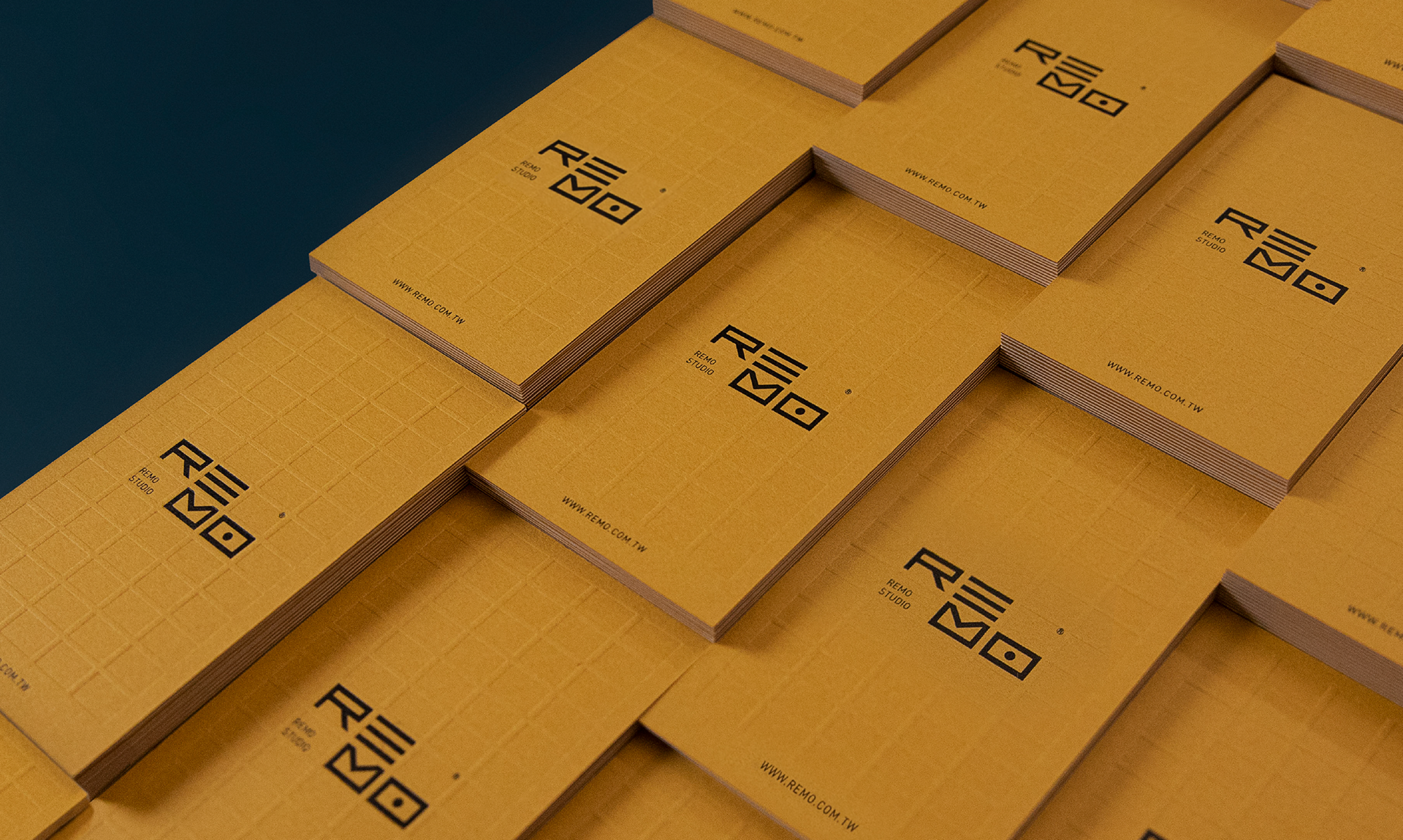
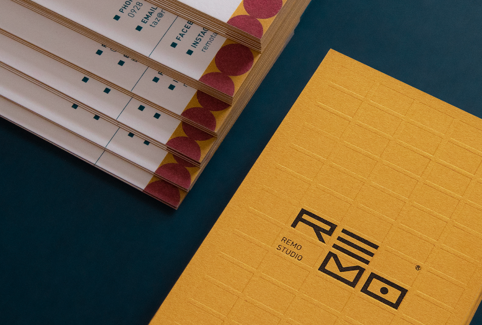
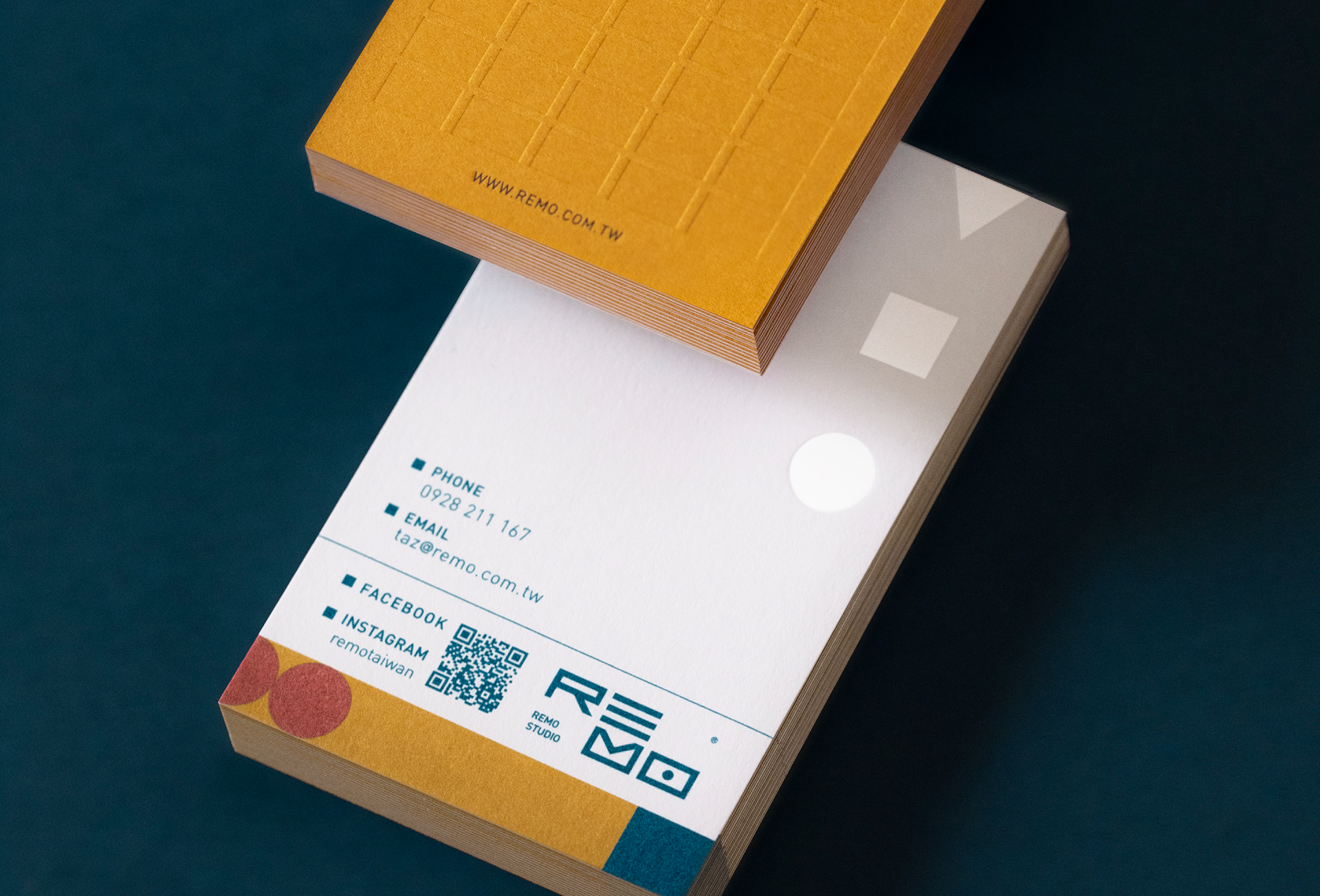
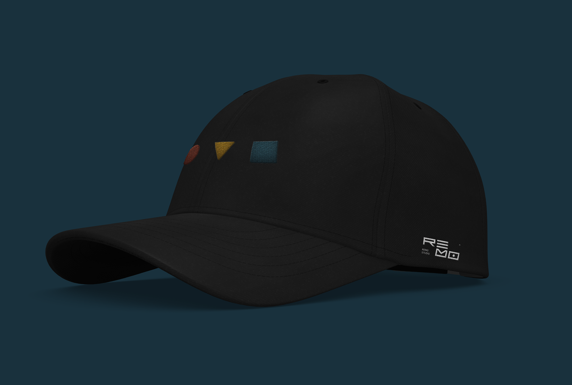
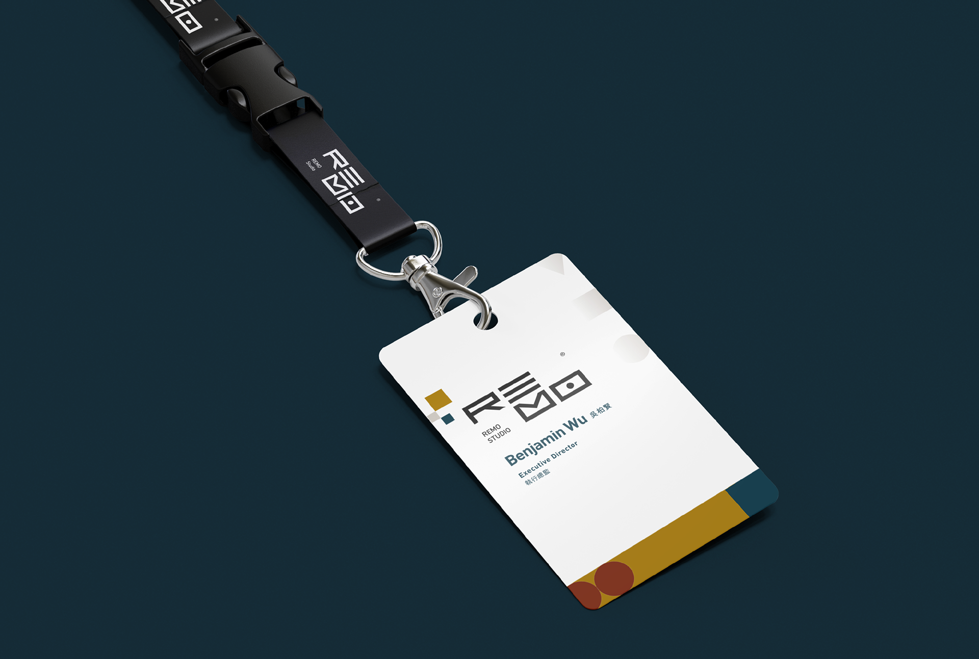
品牌名稱以「Recapture those Moments、Rethink those Motives、Relive those Memories」組合而成,LOGO設計將這四個英文字母意象化,並與影像捕捉的品牌概念連結,分別代表「Re」、「Catch Light」、「Save In」、「Memorise」,挑選藍綠、芥末黃、磚紅作為標準色,結合「STOP」、「SAVE」、「REC.」icon,運用至各種延伸設計中,將影像紀錄的聯想發揮到最大化,呈現REMO為你儲存記憶永不褪色。
Remo is a creative integration team made up of a group of filming phanatics, gifted in capturing life’s moments into frames.
Remo is named after it’s motto, "Recapture those Moments, Rethink those Motives, Relive those Memories". Each letter symbolizes a core brand belief: R with “Re-”, E with “Catch Light”, M with “Save”, and O with “Memorize”.
For the brand color, we selected peacock blue, mustard yellow, and brick red to reference the camera icons of stop, save, and record. With our identity system in place, Grandvity maximizes the idea of image capturing, and presents Remo to store your memories forever.

Credits
Type | Branding
Year | 2021
Client | REMO
Year | 2021
Client | REMO
Production | Grandvity Design
Art Director | Noodlemaker
Project Manager | Sarah Peng/Grape Chiu
Logotype Designer | Noodle Wang
Visual System Designer | Si Jia Sun
Print | 九水印刷 游大緯
Paper | 方越貿易 世界的進口紙 日本 絕代風華 250g/聯美紙業 Inter-States Paper 義大利新環保粉面彩柔紙 250g
Art Director | Noodlemaker
Project Manager | Sarah Peng/Grape Chiu
Logotype Designer | Noodle Wang
Visual System Designer | Si Jia Sun
Print | 九水印刷 游大緯
Paper | 方越貿易 世界的進口紙 日本 絕代風華 250g/聯美紙業 Inter-States Paper 義大利新環保粉面彩柔紙 250g