Jodo! | Branding
Jodo!唸起來就是日文的「ちょっと 等等」,提醒著人們在繁忙快速的步調下,不要忘了暫時停下休息,將健康融入生活的細節中,撫慰現代大眾因忙碌而痠痛的身體。
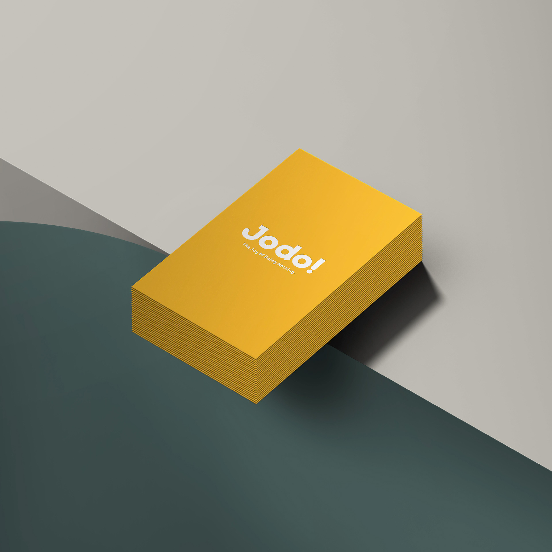
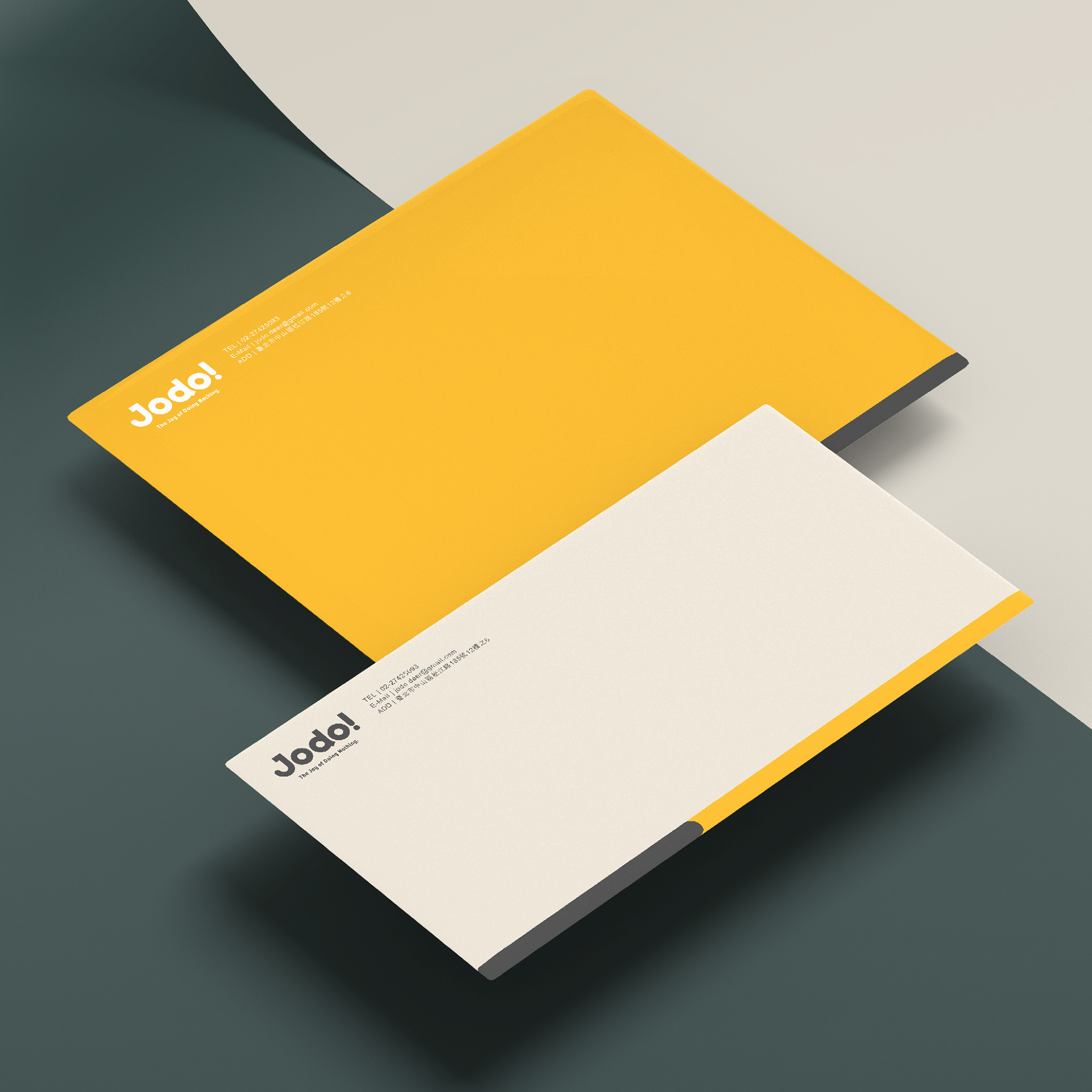
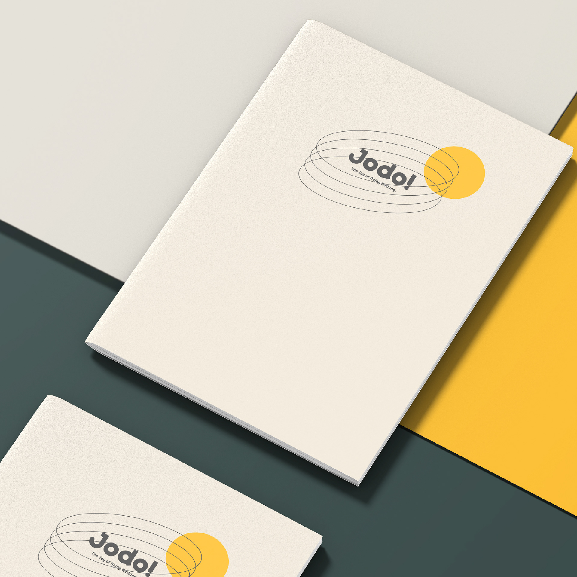
字體設計了圓潤的黑體,將 Q 彈、輕柔的意象融入 LOGO 中,有如按摩肌膚時溫柔而舒適的觸感;配色則從產品延伸,多元的色彩計畫增加品牌彈性,讓 Jodo!的服務橫跨不同年齡層,讓人人都能輕鬆享受功能與美感兼具的健康體驗。
Jodo! is a lifestly product brand that aims to integrate healthy habits into everyday lifestyle to soothe the busy and sore bodies of the modern public. Products they design include massage guns, oil, and pillows.
Their name, “Jodo!” is the Japanese word for “hold on (ちょっと )”, to remind people to pause and take a break from the fast paced city life. For the logo, we designed a rounded sans serif to echo with the comfortable and elastic materials of the products. In addition, their colorfulness inspired us to incorporate a wide range of colors to diversify the color scheme and increase brand flexibility. Jodo!’s service spans across different age groups, allowing everyone to easily enjoy a healthy experience with both function and beauty.


Credits
Type | Branding
Year | 2021
Client|Jodo!
Year | 2021
Client|Jodo!
Production | 物以類聚視覺整合 Grandvity Design
Art Director|Noodlemaker
Project Manager|Sarah Peng / Grape Chiu
Designer Director|Si Jia Sun
Logotype Designer|Noodlemaker
Visual System Designer|Jasmine Lin / Si Jia Sun
Designer|Show Yen / Claire Jen
Art Director|Noodlemaker
Project Manager|Sarah Peng / Grape Chiu
Designer Director|Si Jia Sun
Logotype Designer|Noodlemaker
Visual System Designer|Jasmine Lin / Si Jia Sun
Designer|Show Yen / Claire Jen
