
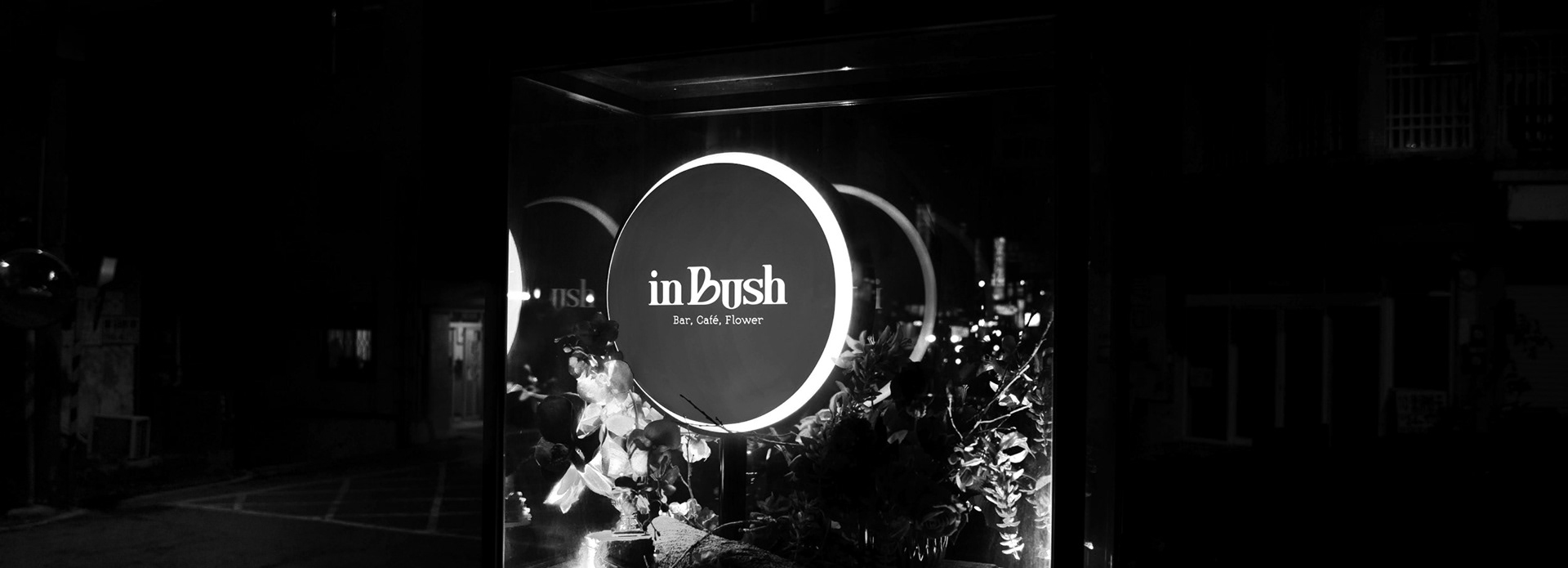
inBush | Branding
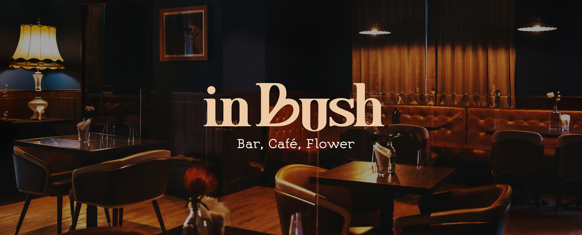
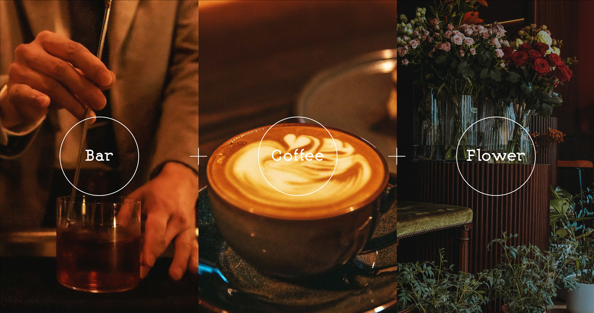
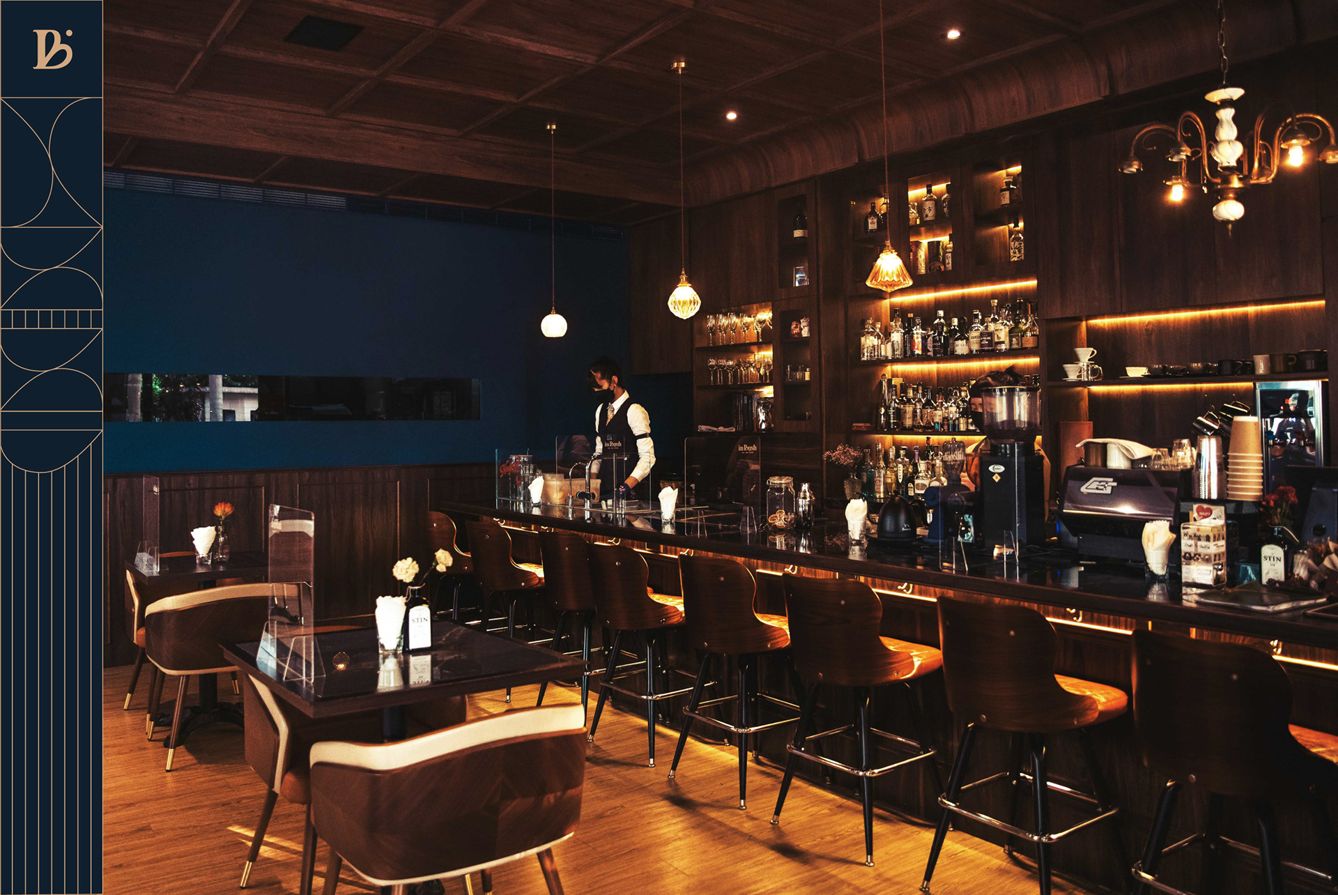
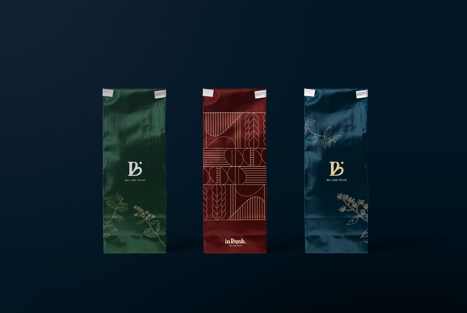
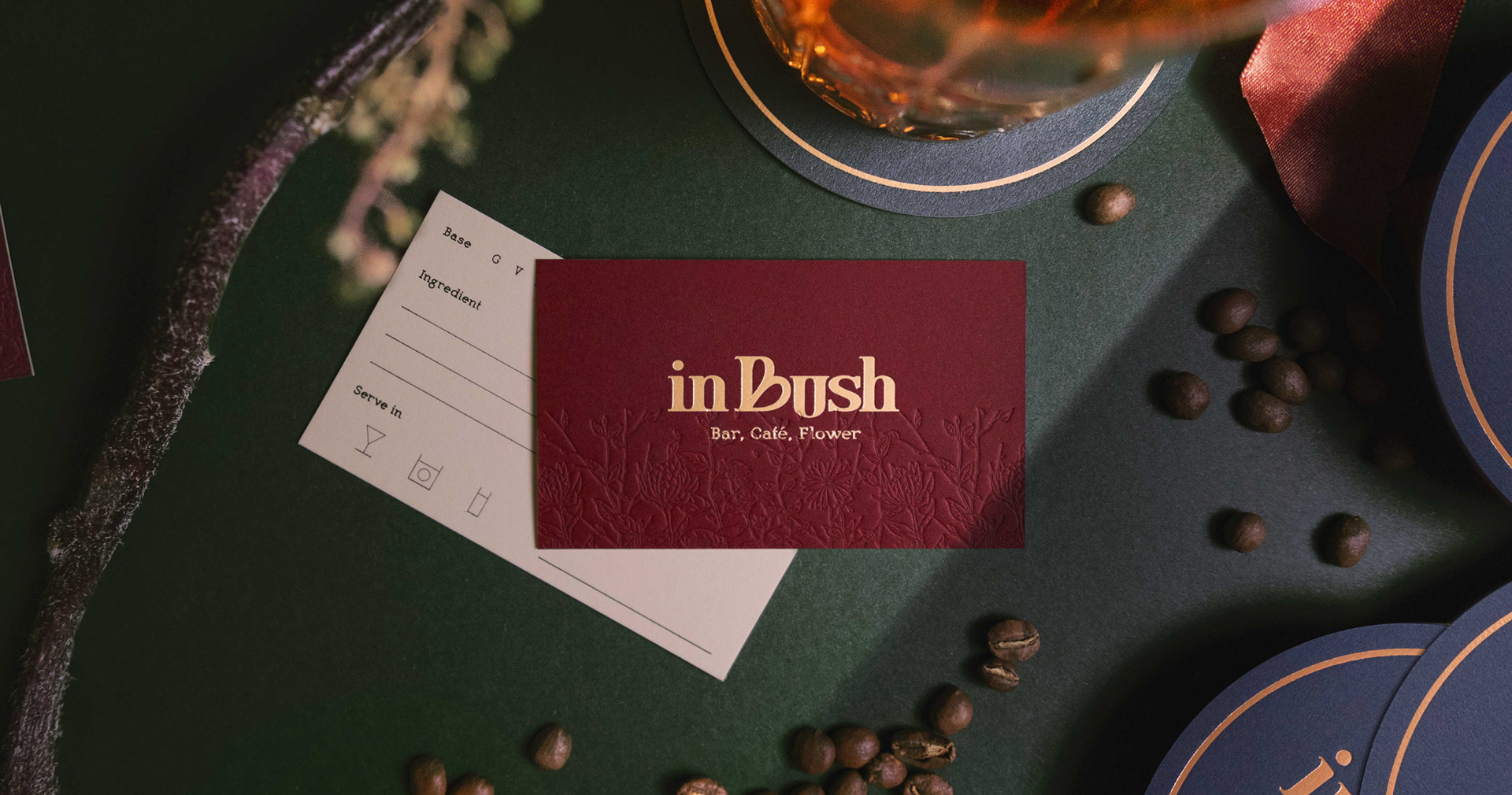
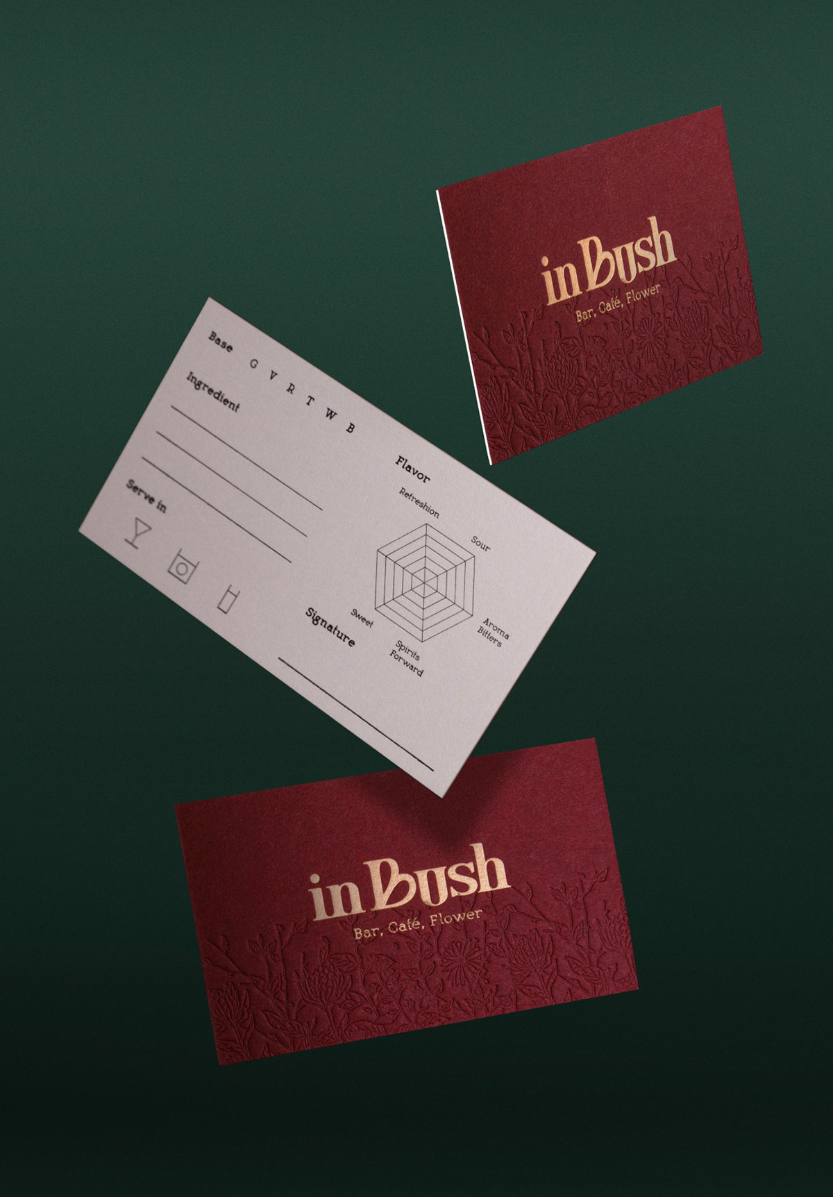
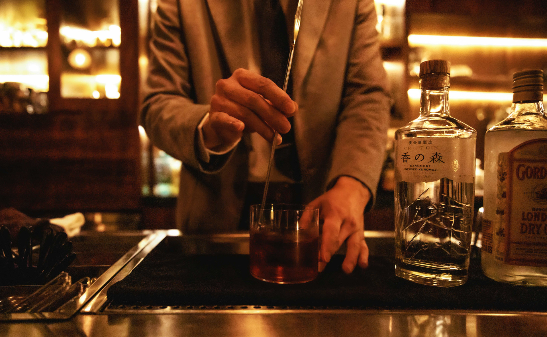
inBush is a flower shop and cafe during the day and a bar at night located in the Hsinchu Science Park. Its visual identity combines German floral art, coffee, and Japanese bartending to provide city goers a temporary shelter.
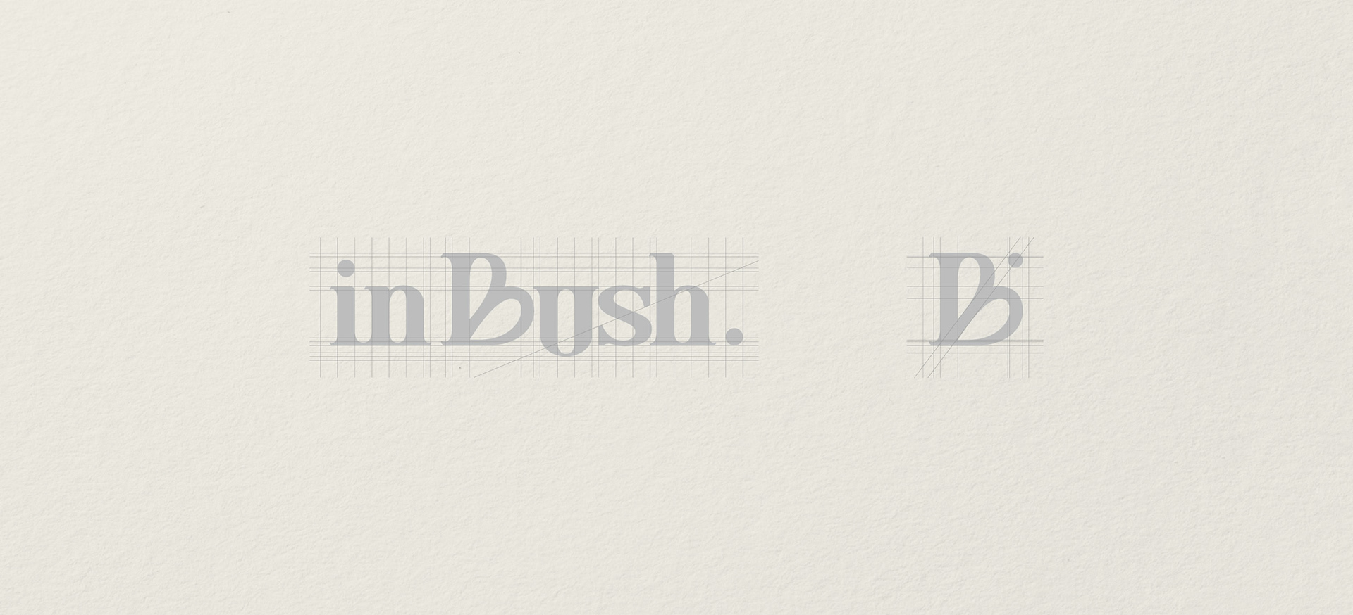
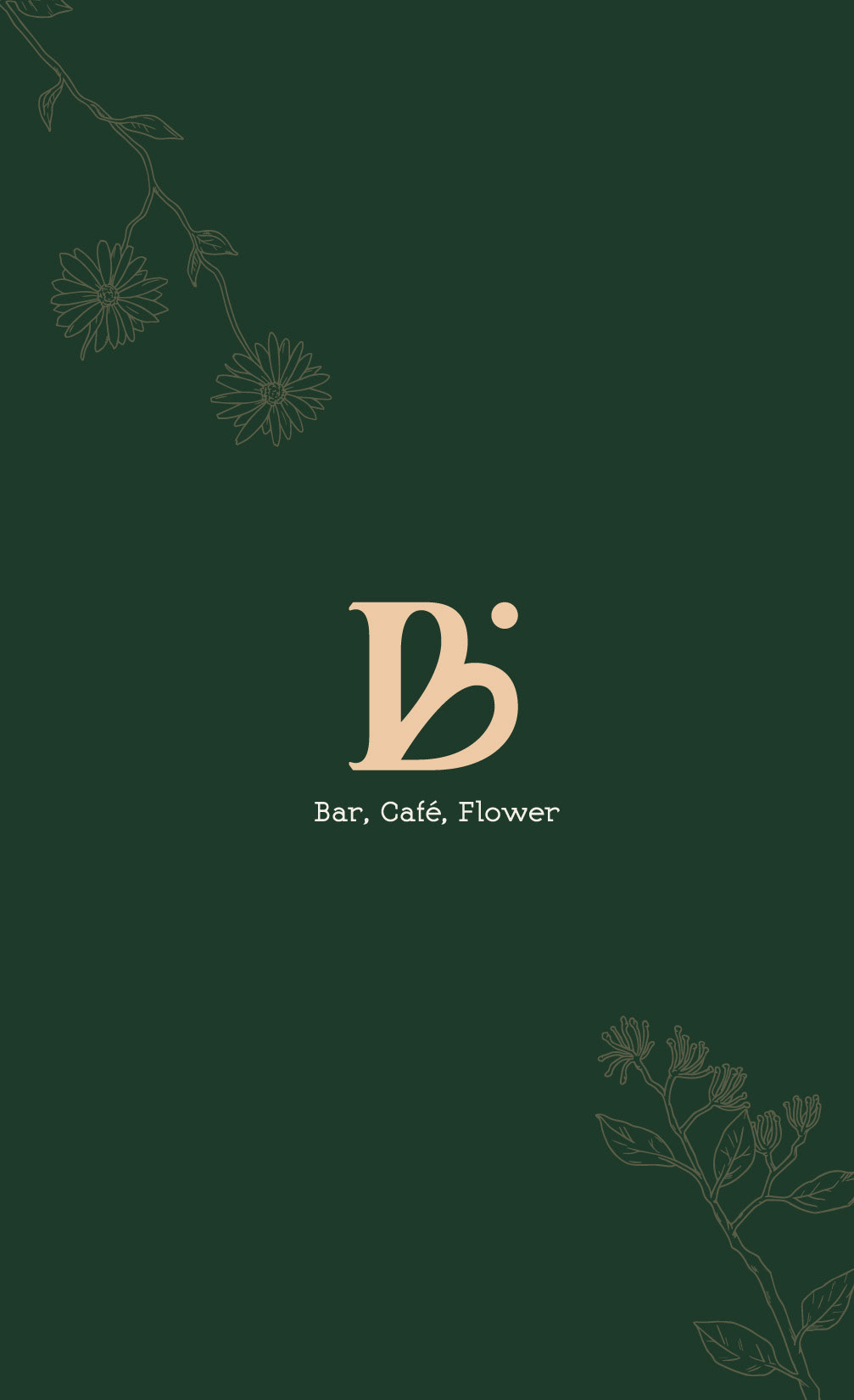
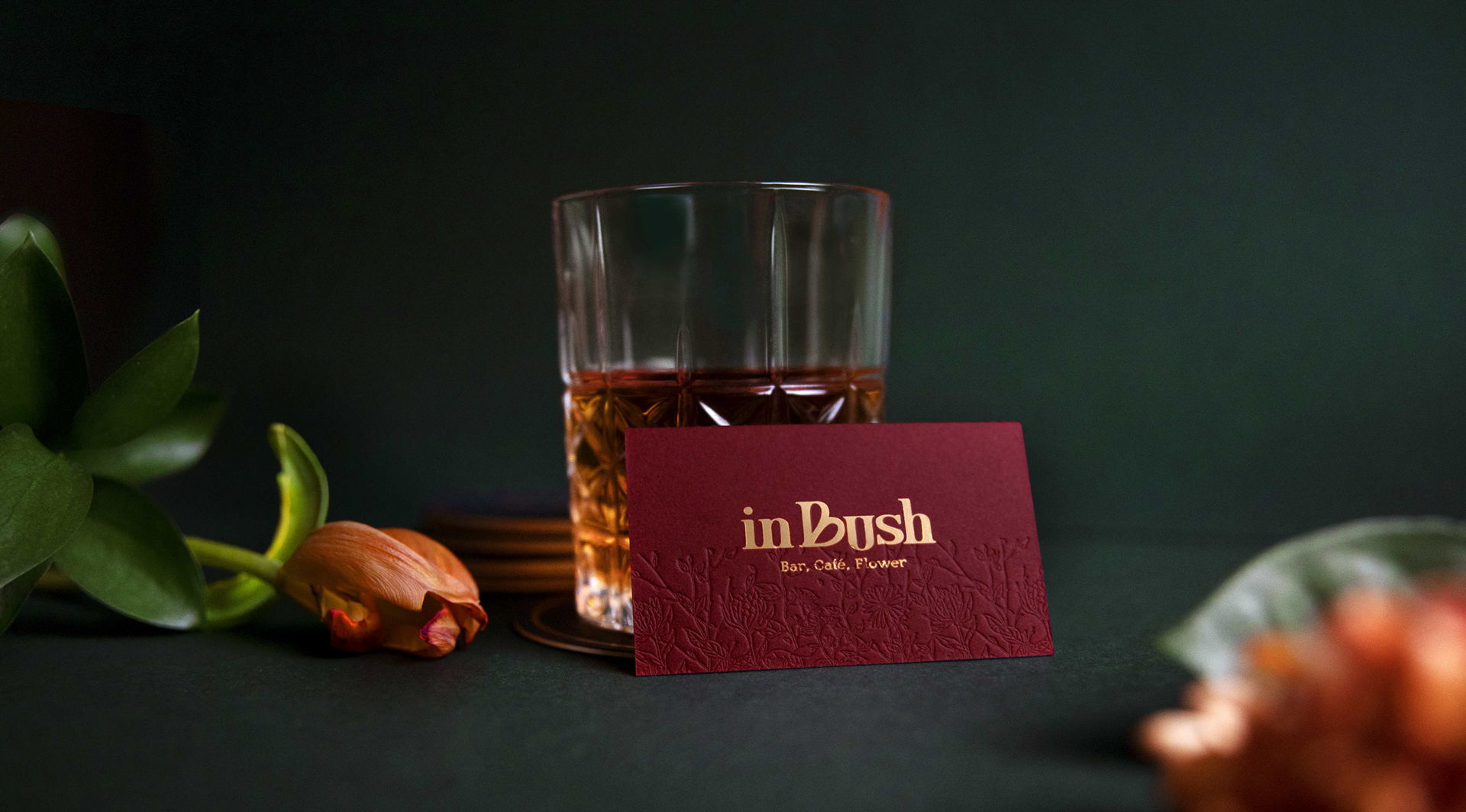
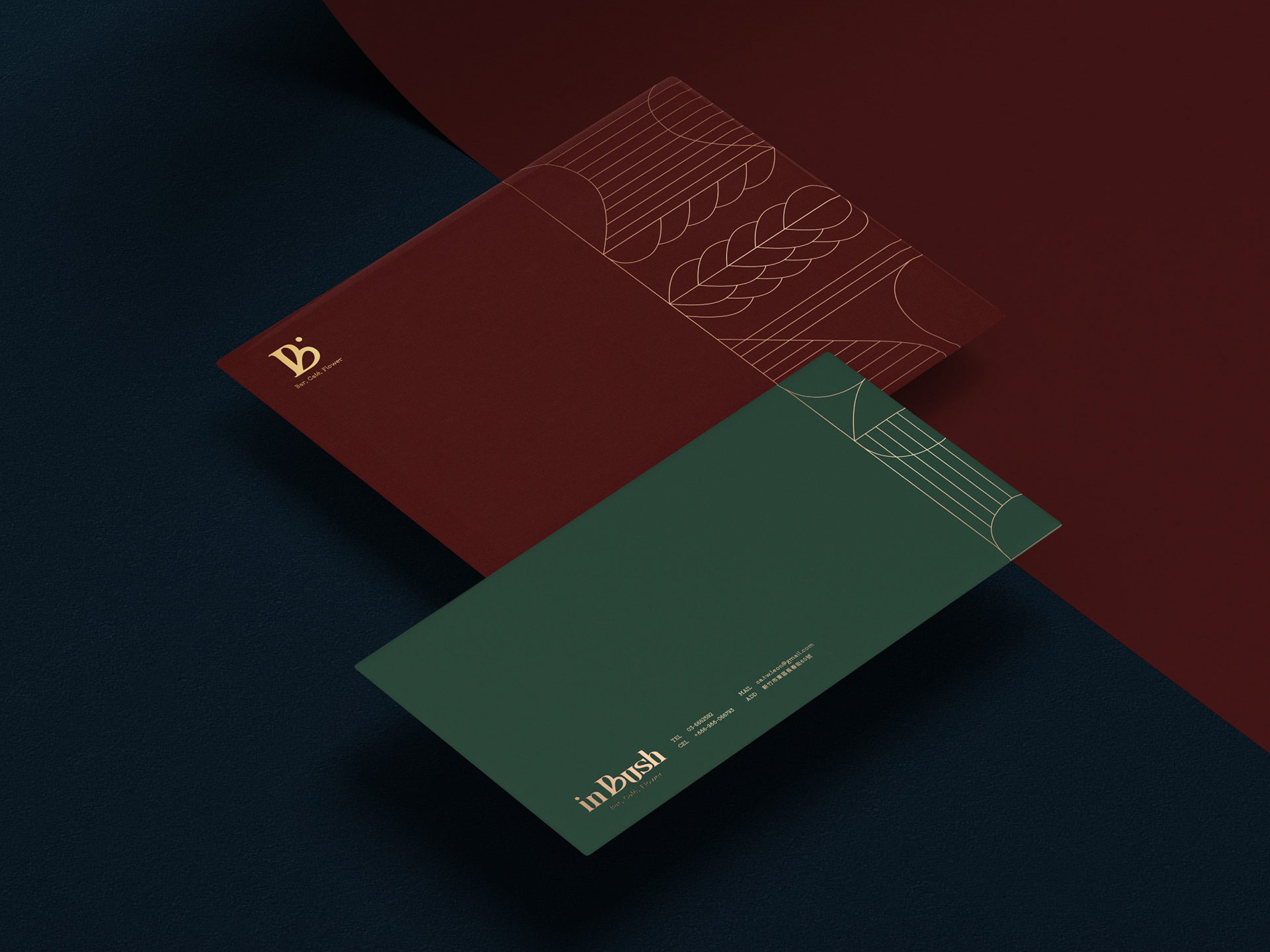
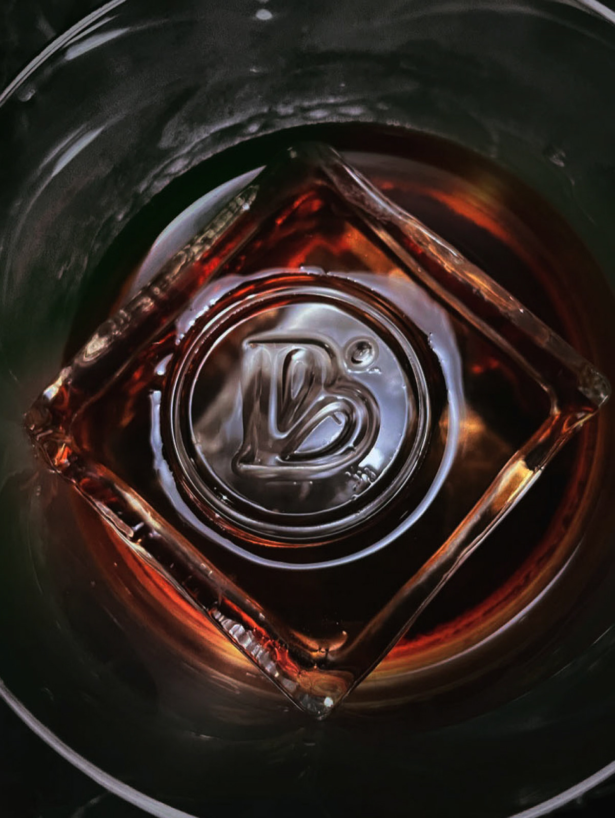
inBush means "hide in the bush''. The "U" of the logo represents the soft curves of the seat that can bear the weight of your day's boredom and stress. It also symbolizes the flow between the interchanging spaces of flower art, coffee and bartending. Additionally, the "B" mimics the image of the handle and latte art.
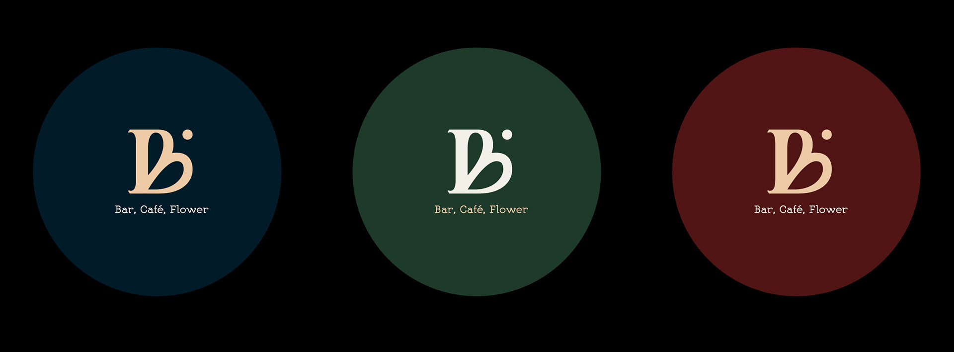
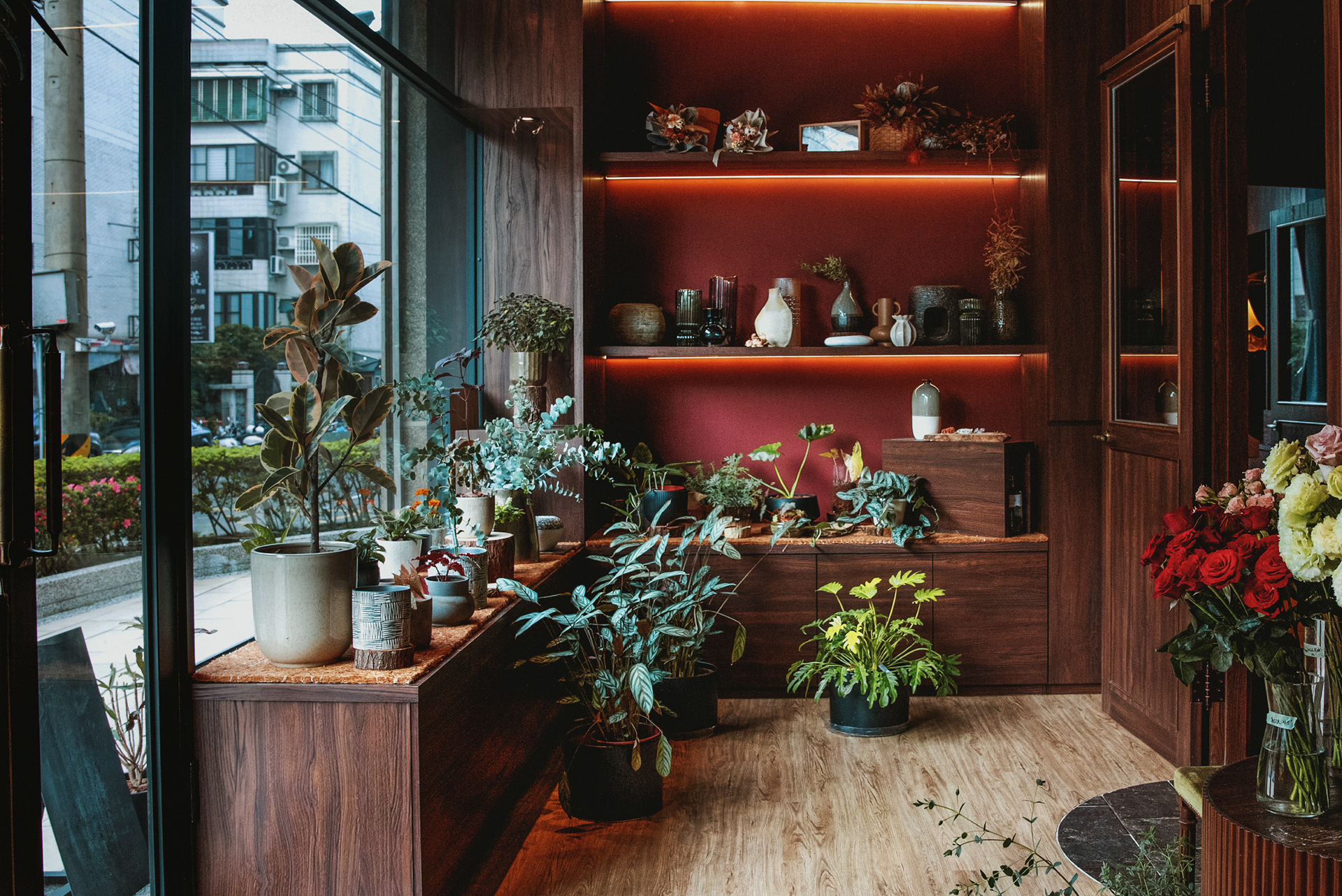
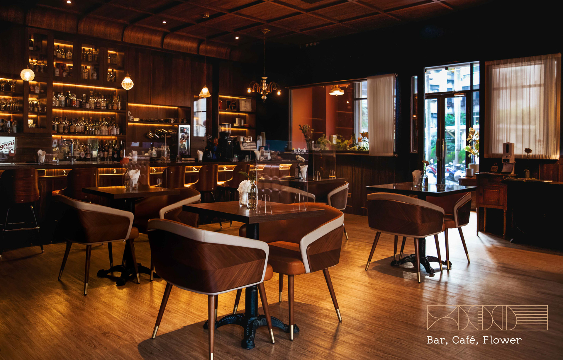
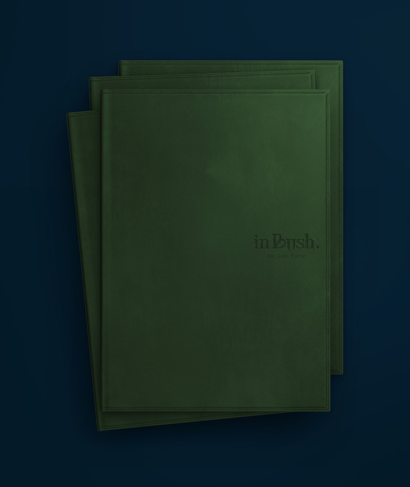
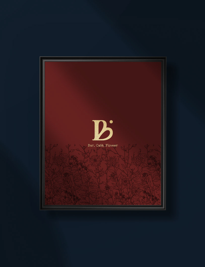
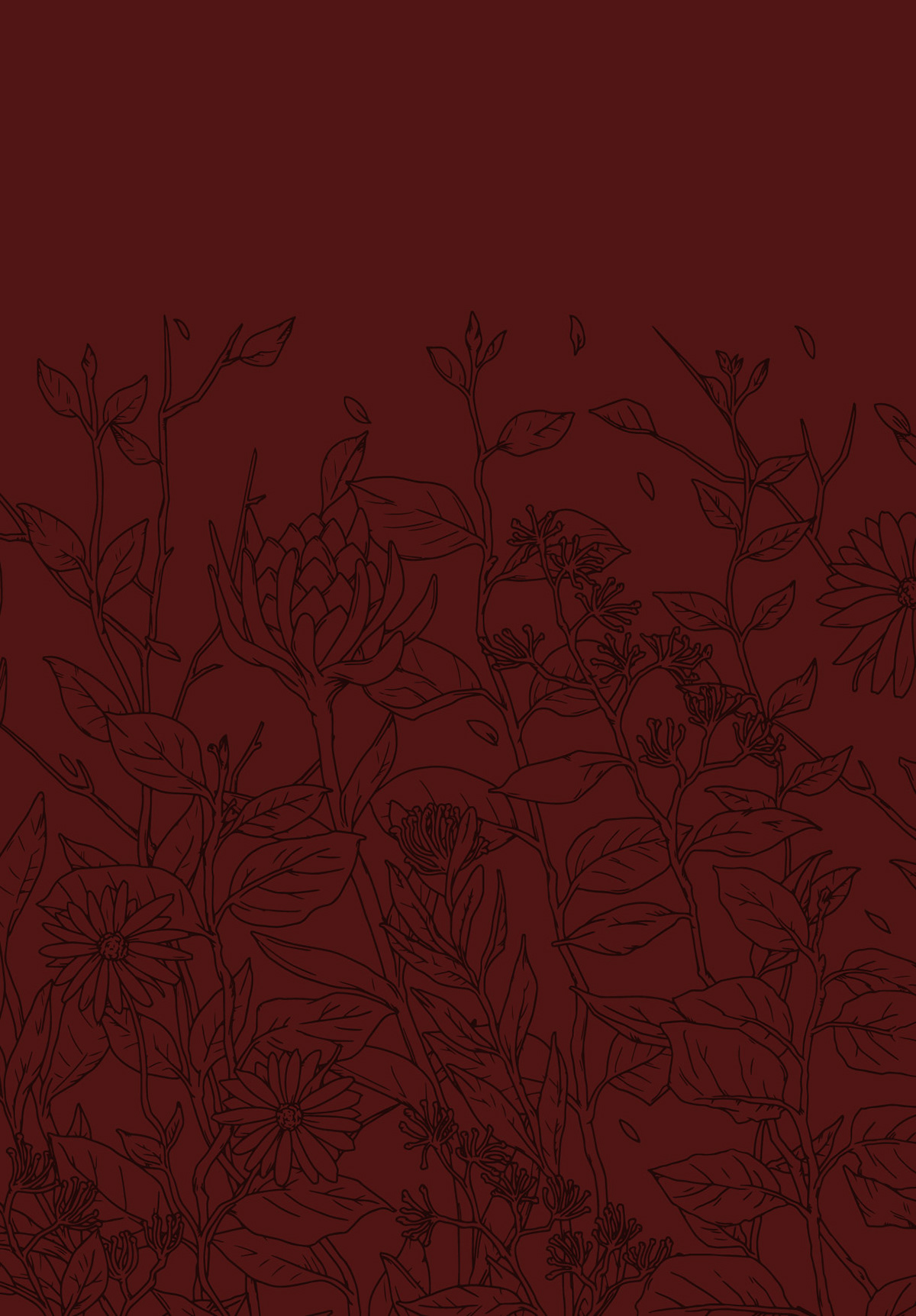
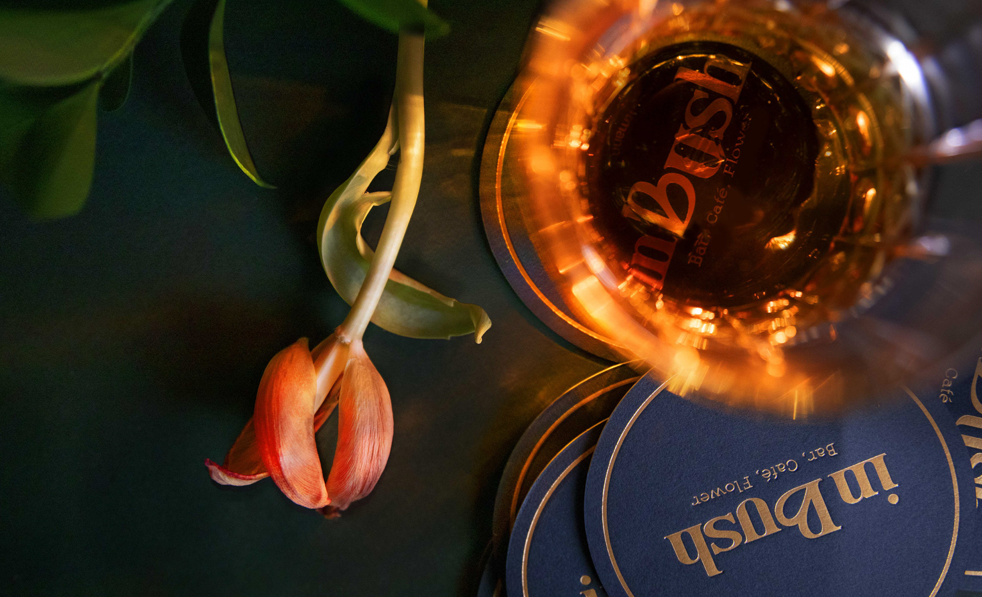
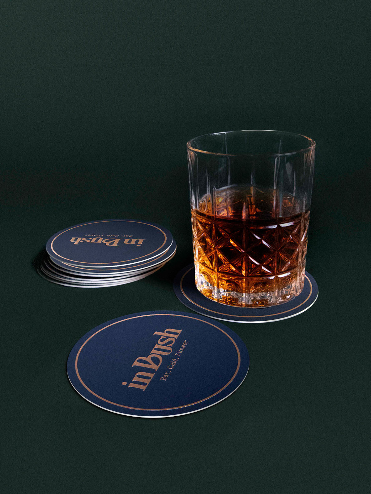
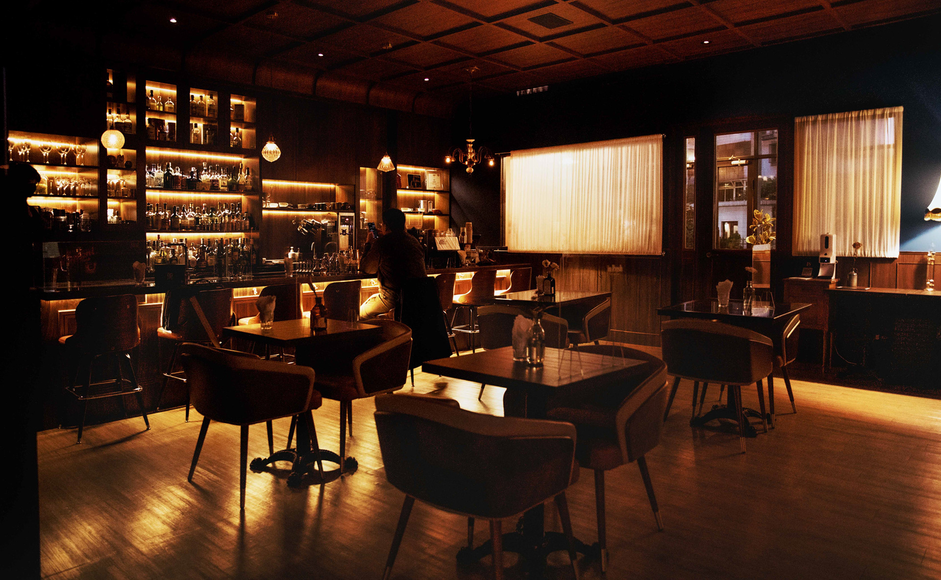
As you enter inBush, you experience a whole new classic elegance and timeless atmosphere created by the plant totems, arc line patterns, matched with the Midnight Blue, Forest Green, and Mahogany Red.
Credits
Type|Branding
Year|2021
Year|2021
Client|inBush
Art Director|Noodlemaker
Project Manager|Sarah Peng / Grape Chiu
Designer Director|Si Jia Sun
Logotype Designer|Noodle Wang
Designer|Jasmine Lin / Patricia Ho
Illustrator | Tai Jiang Lin