

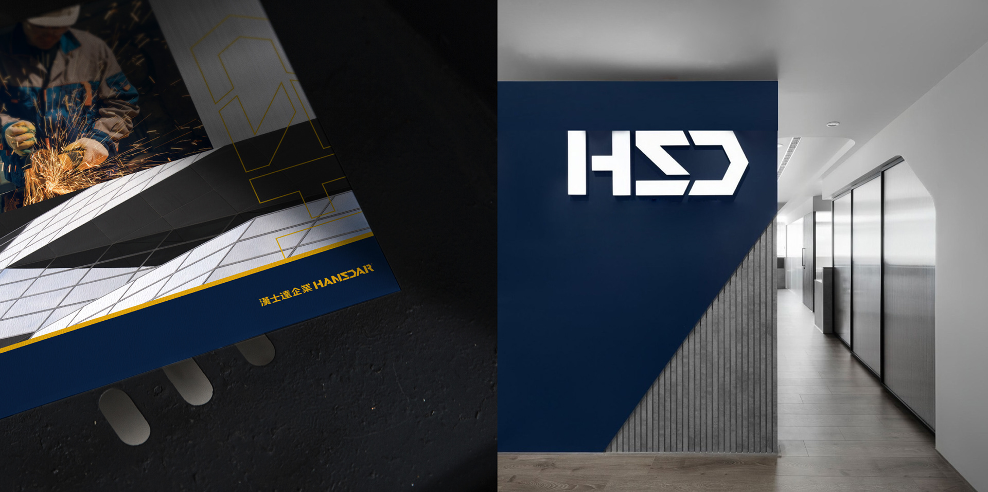
Hansdar|Branding
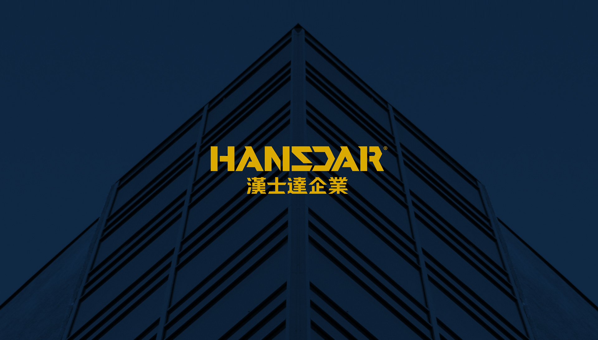
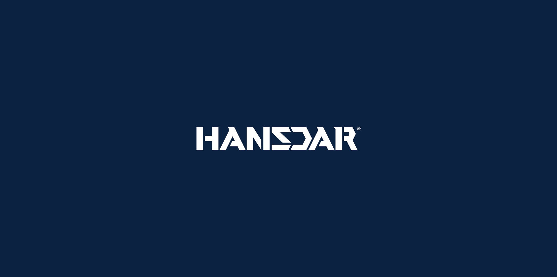
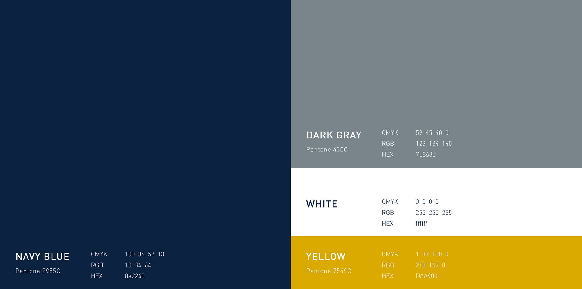
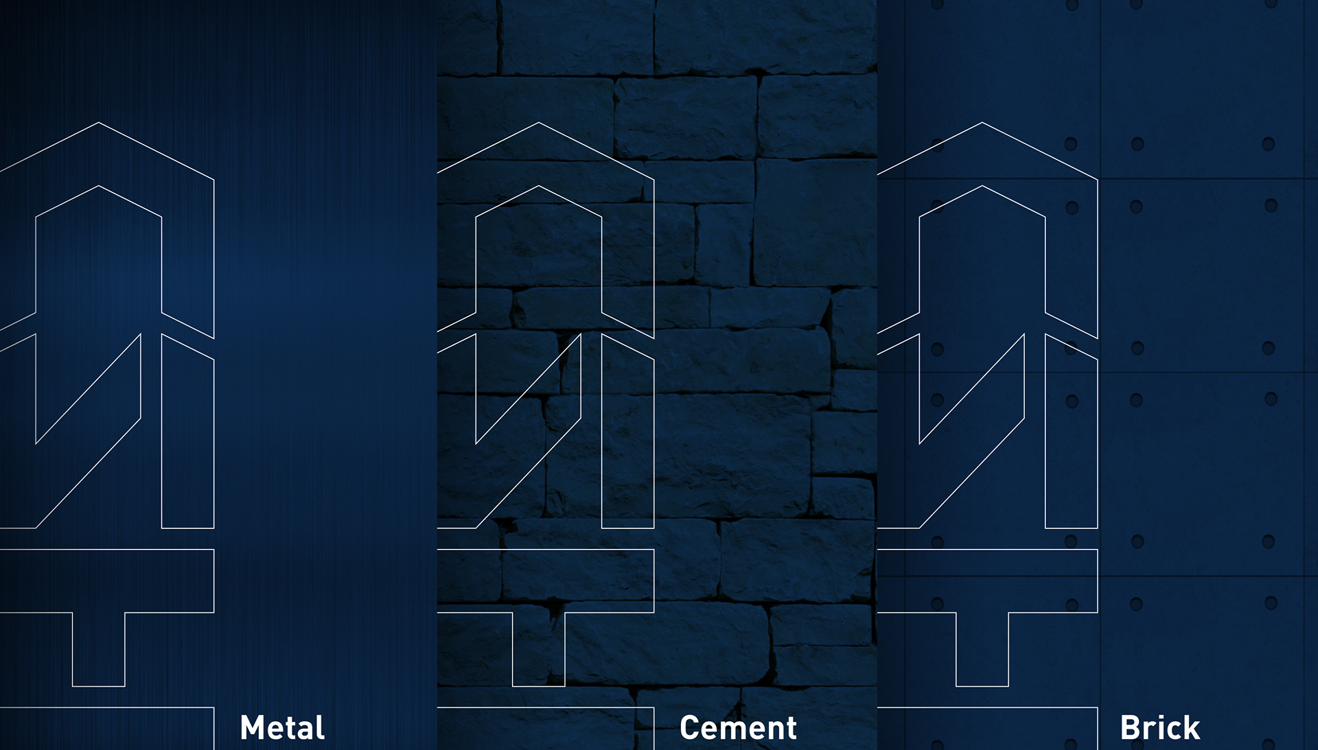
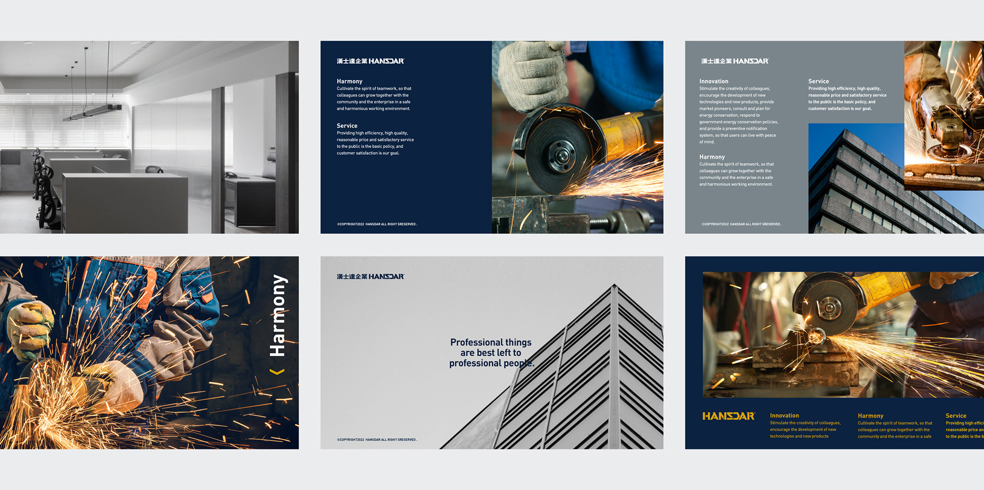
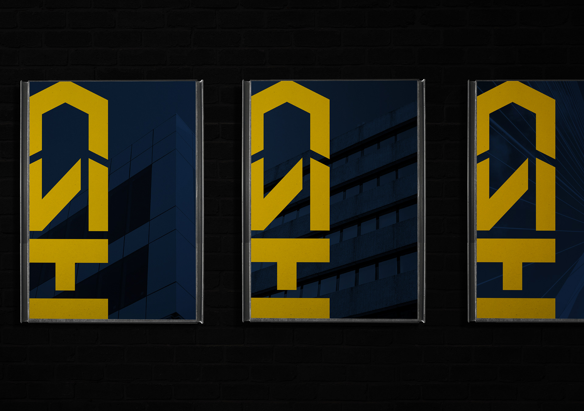
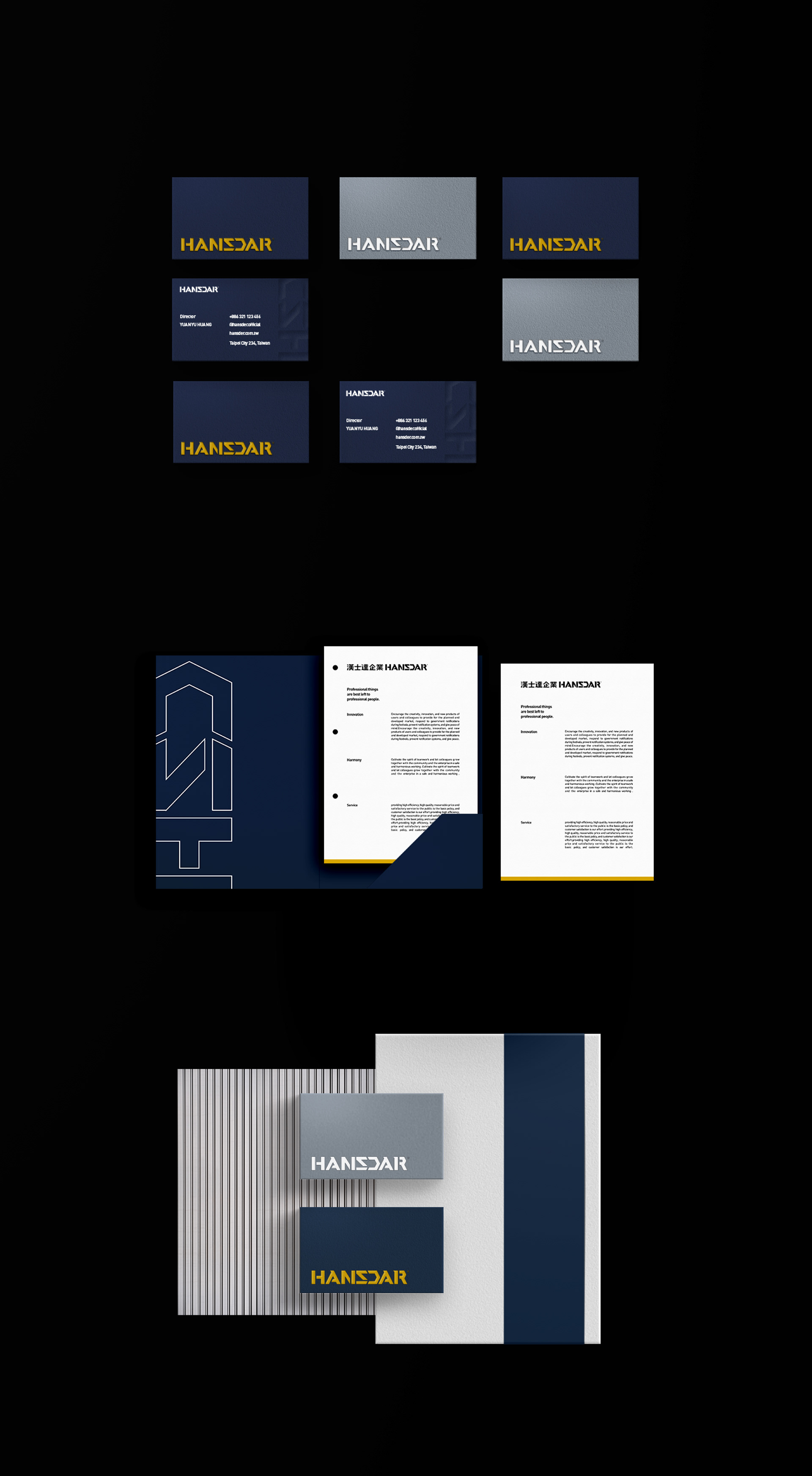
Hansdar Enterprise has been established for more than 20 years. They are committed to safe and durable building maintenance. The main concept behind the logo is combining the letters "HSD" from "Hansdar" to build an architectural symbol. With precise guidelines that represent engineering technology, the logo becomes a building when turned vertically. This symbolizes the range of services Hansdar provides. The brand palette features a marine blue with the original brand color: yellow, which not only carries on the original spirit, but also strengthens their professional image.
Through brand recognition and reconstruction, Hansdar subverts the public's stereotype of traditional industries. The use of youthful color choices enhance the public's attention to building maintenance.


Credits
Type|Branding
Year|2021
Client|Hansdar Enterprise Co., Ltd.
Year|2021
Client|Hansdar Enterprise Co., Ltd.
Art Director|Noodlemaker
Project Manager|Sarah Peng / Grape Chiu
Design Director|Si Jia Sun
Typography Designer|Noodle Wang
Visual System Designer|Jasmine Lin
Portfolio Designer|Show Yen
Project Manager|Sarah Peng / Grape Chiu
Design Director|Si Jia Sun
Typography Designer|Noodle Wang
Visual System Designer|Jasmine Lin
Portfolio Designer|Show Yen