
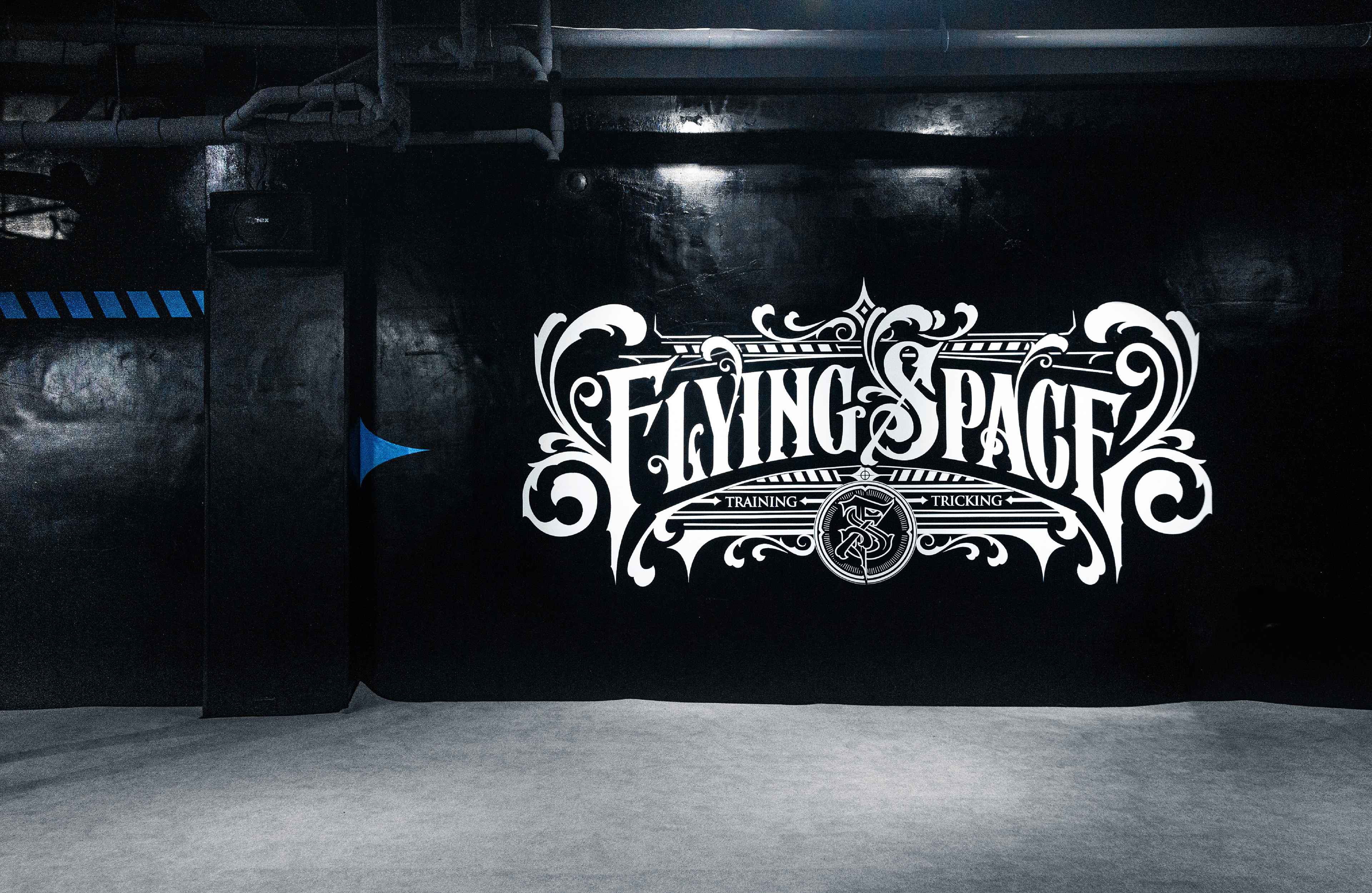
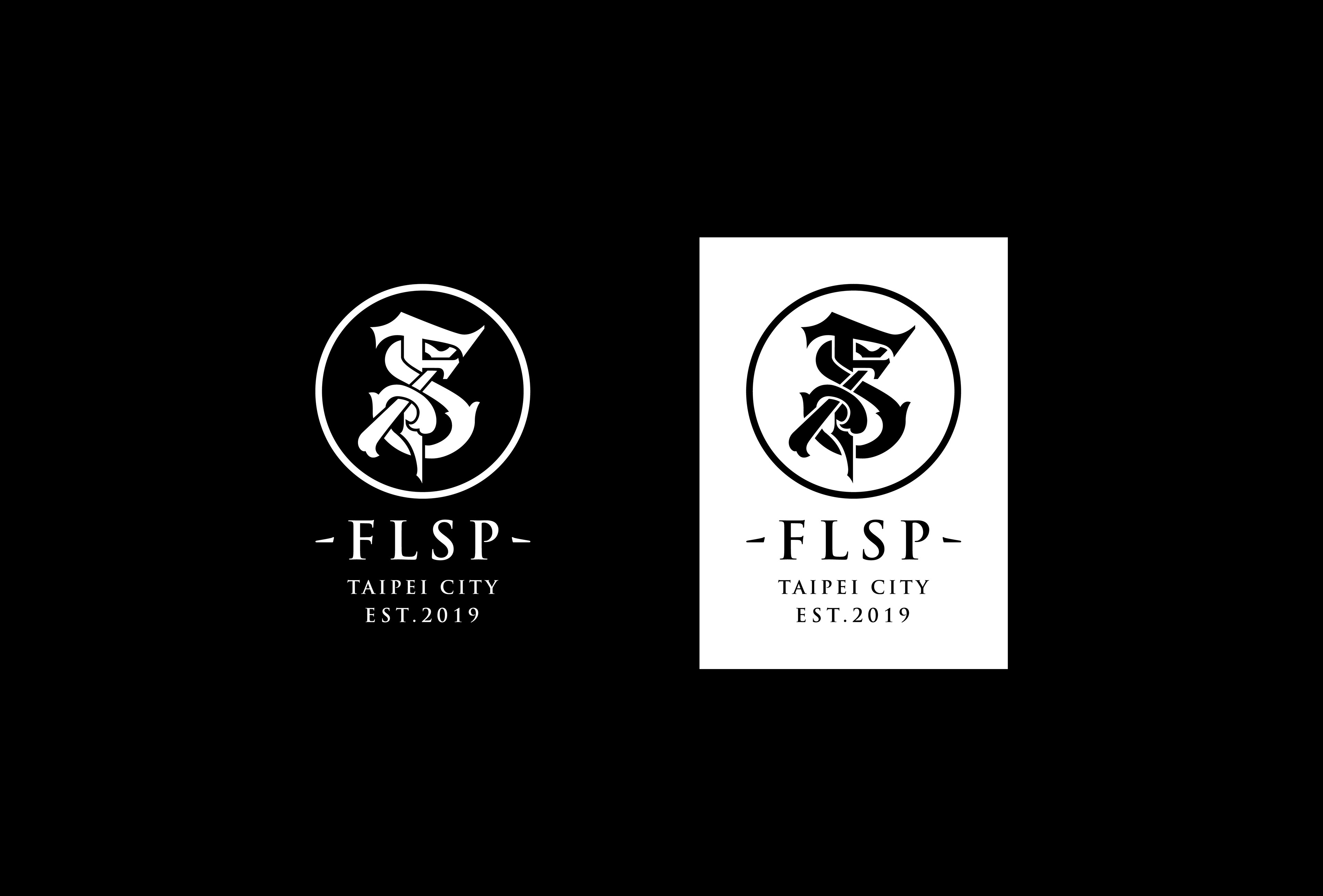
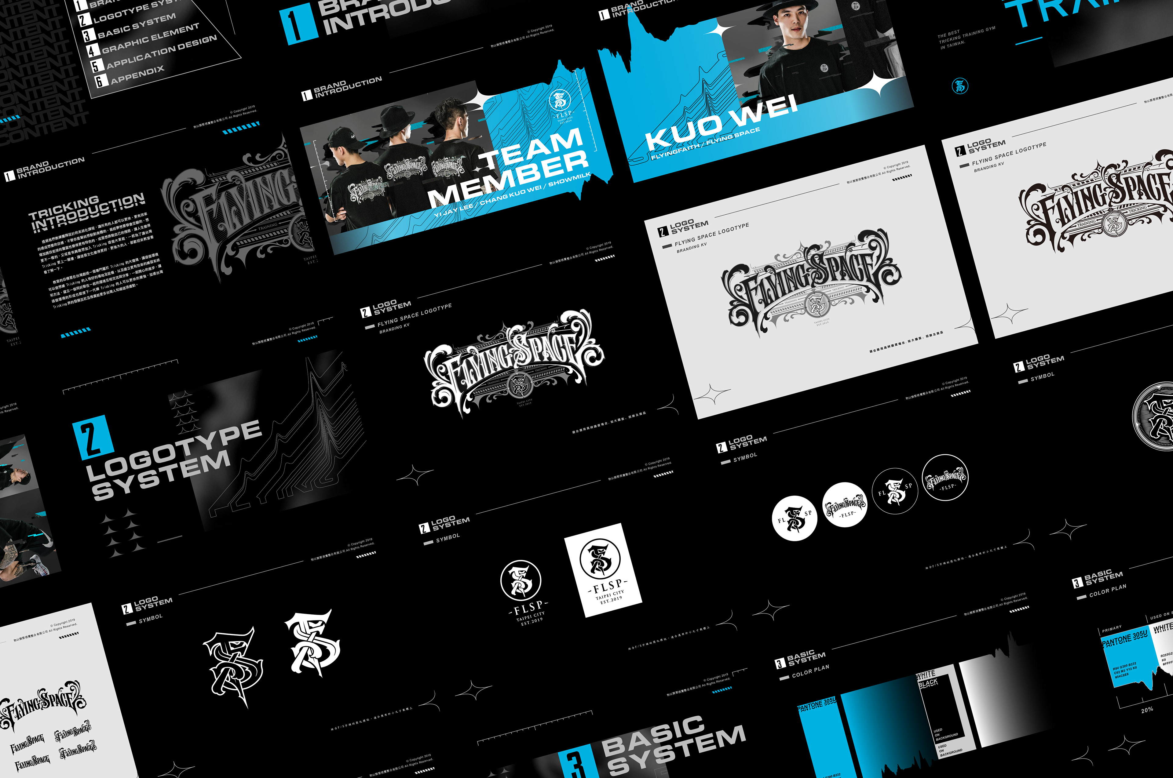
飛翔空間極限運動教室 Flying Space | BRANDING
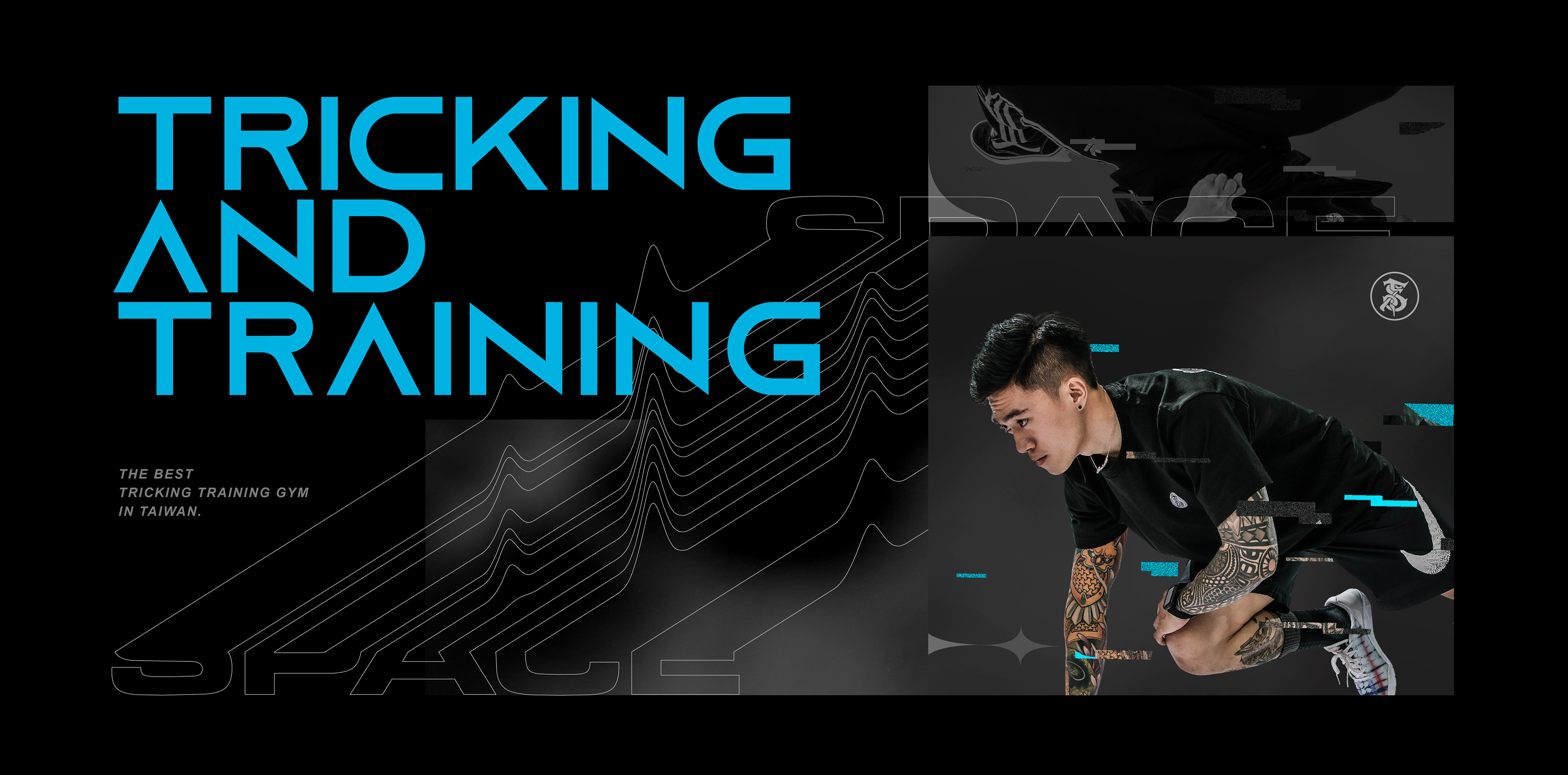
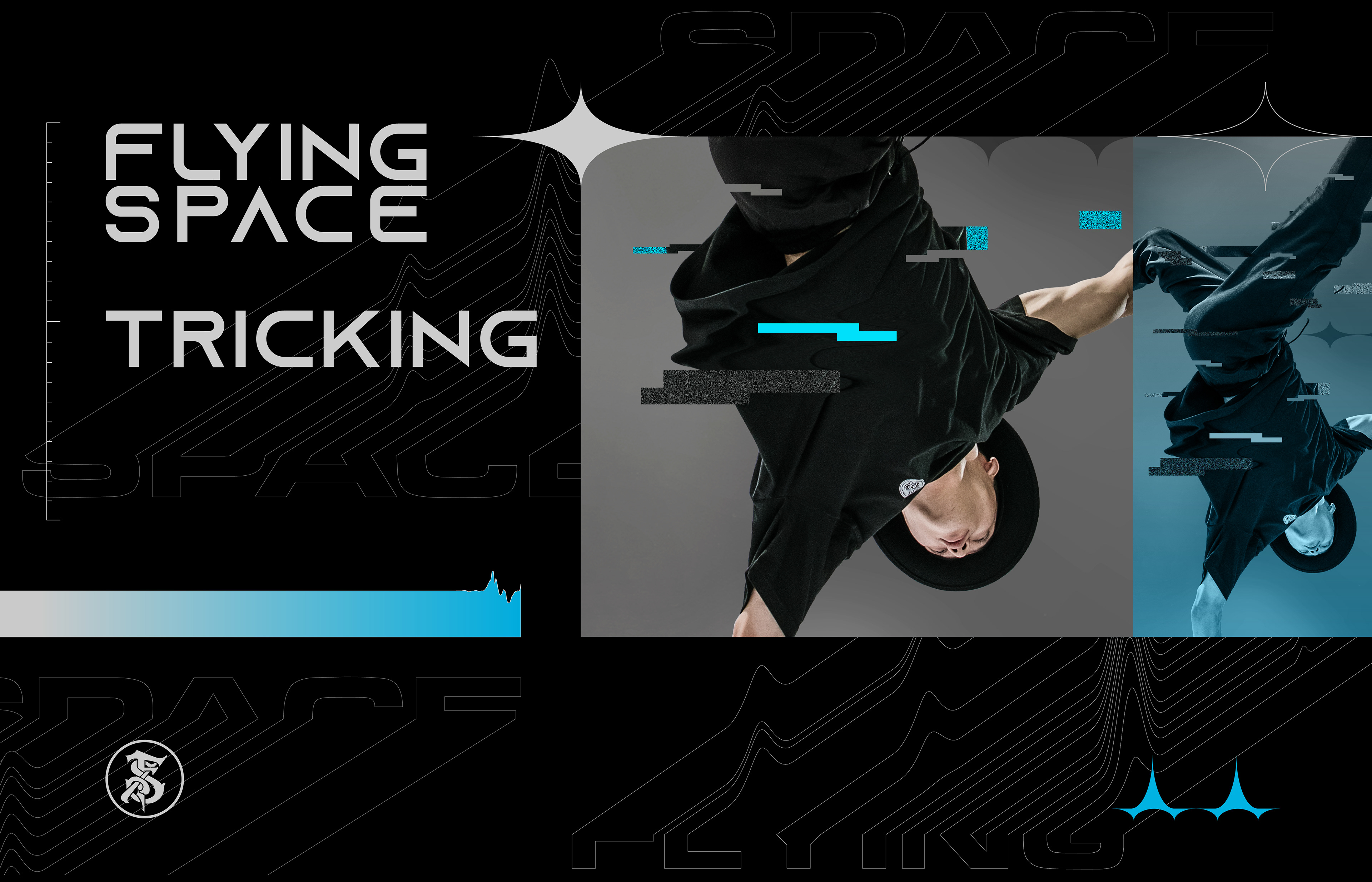
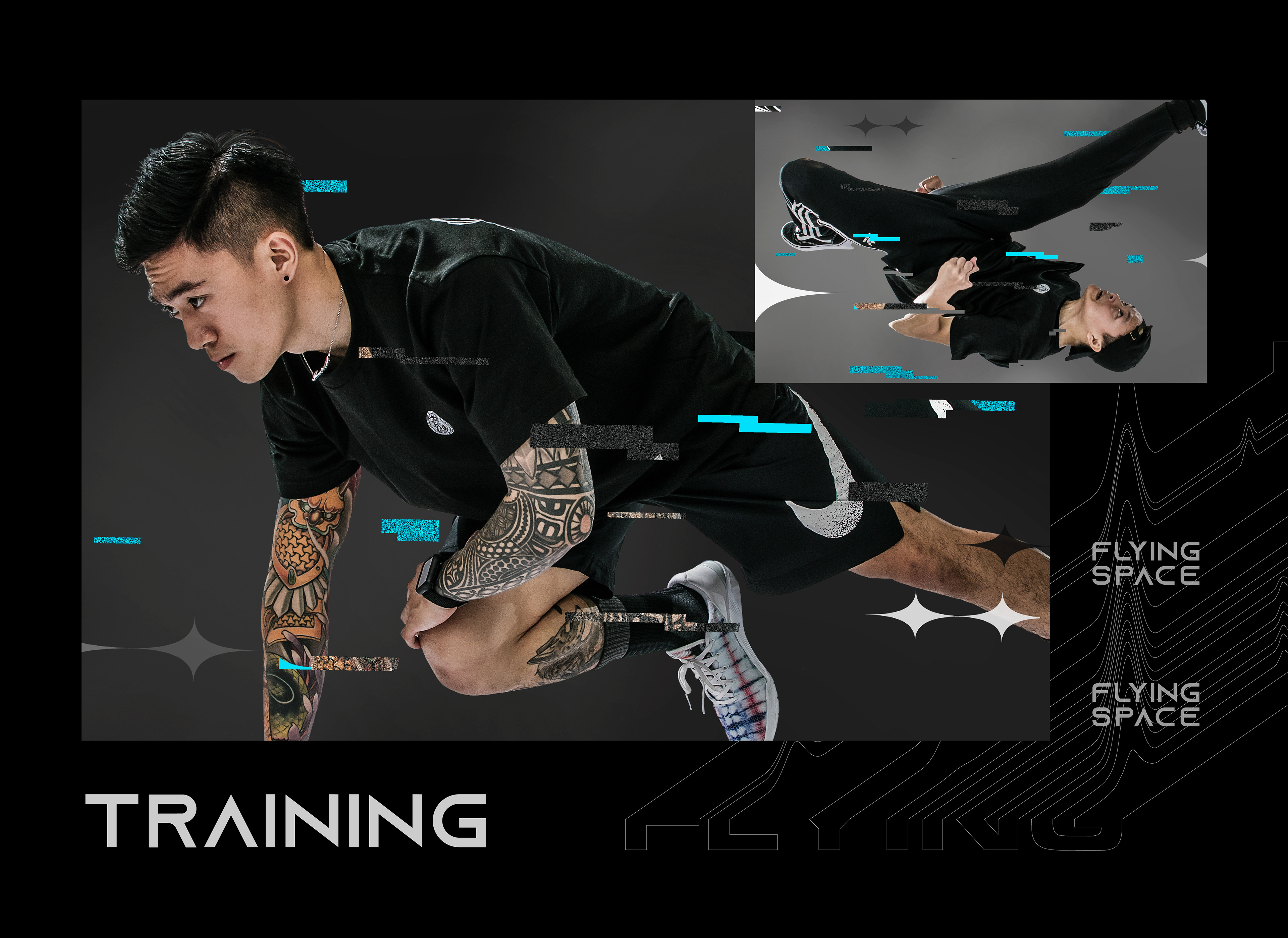
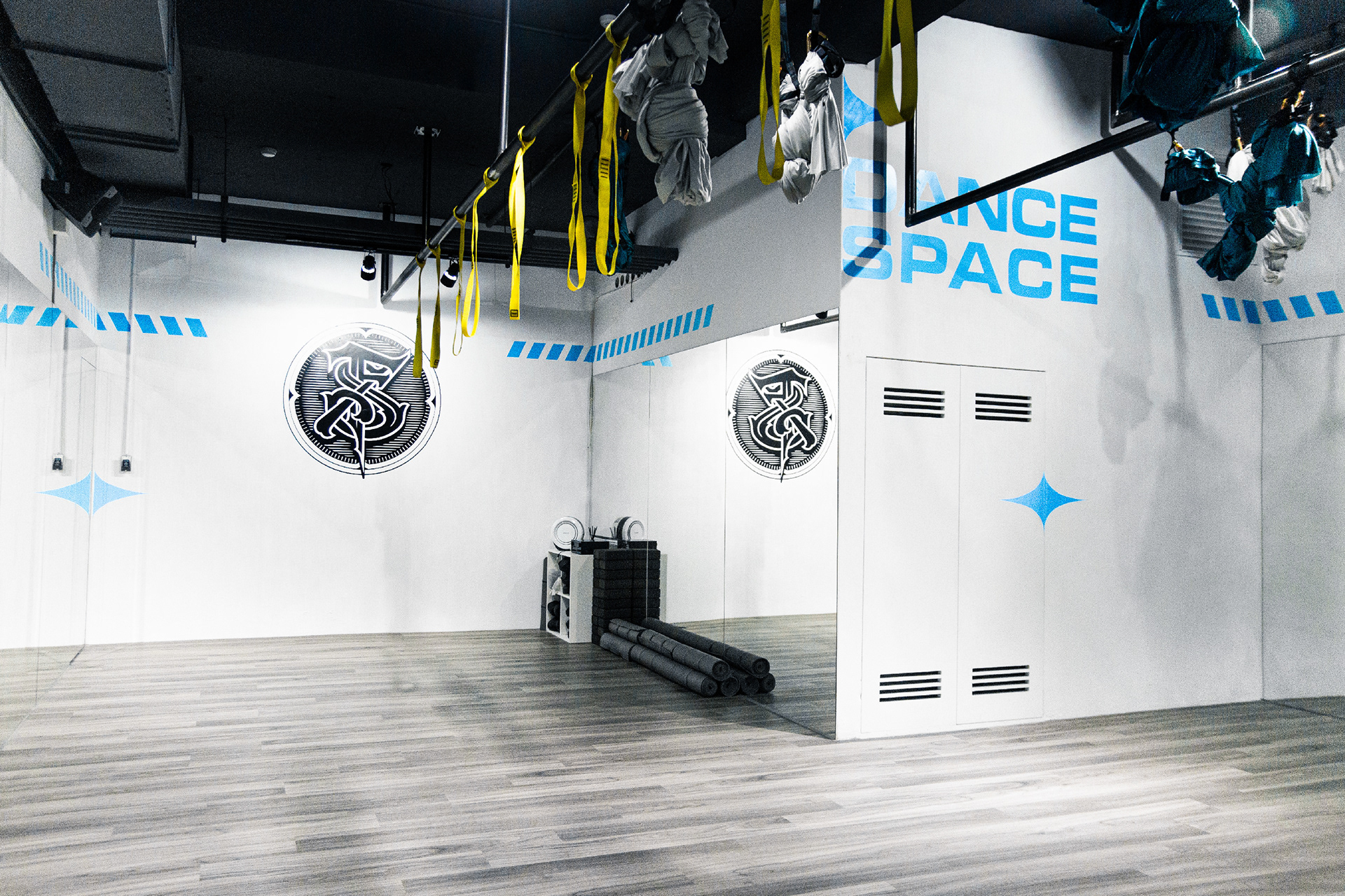
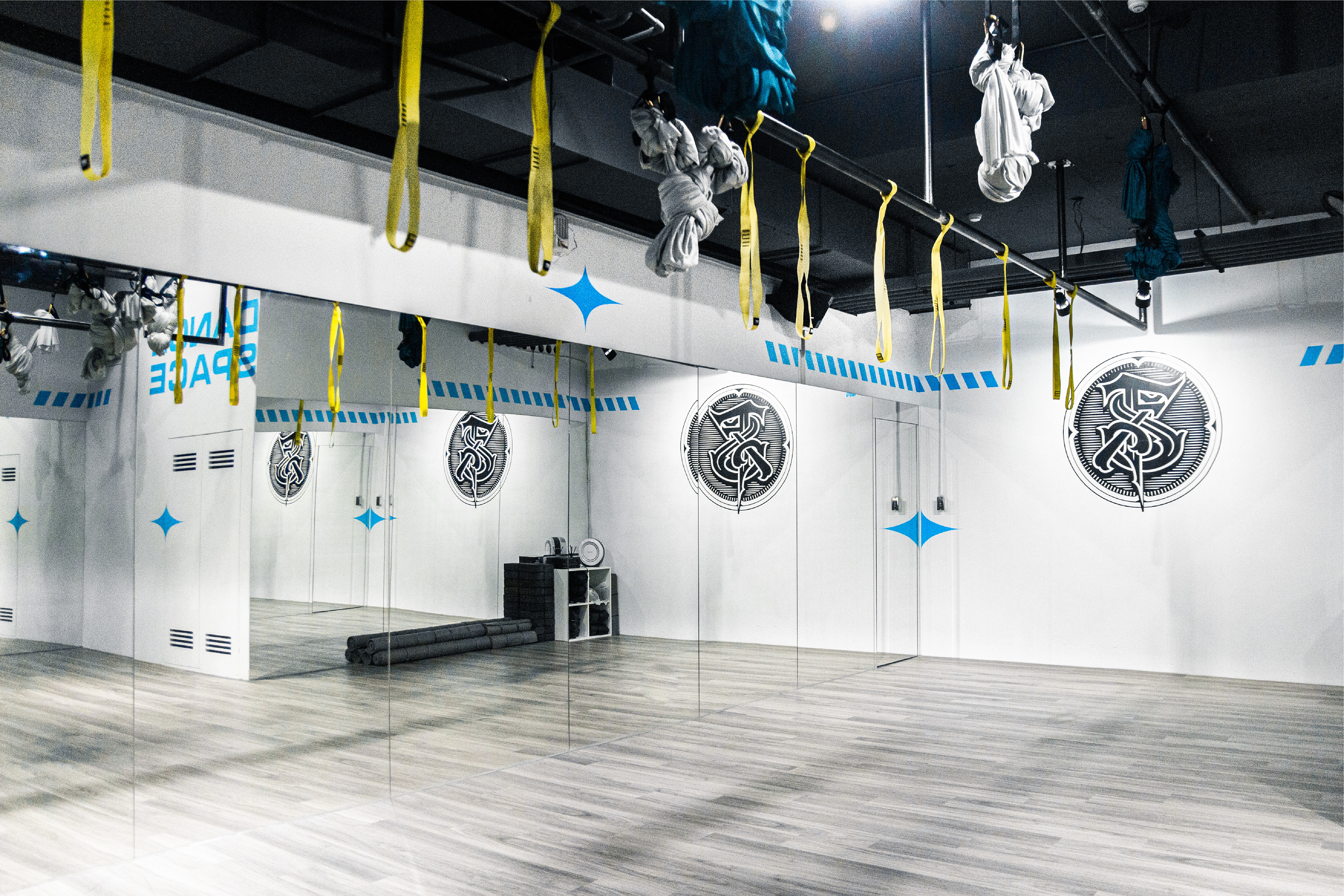
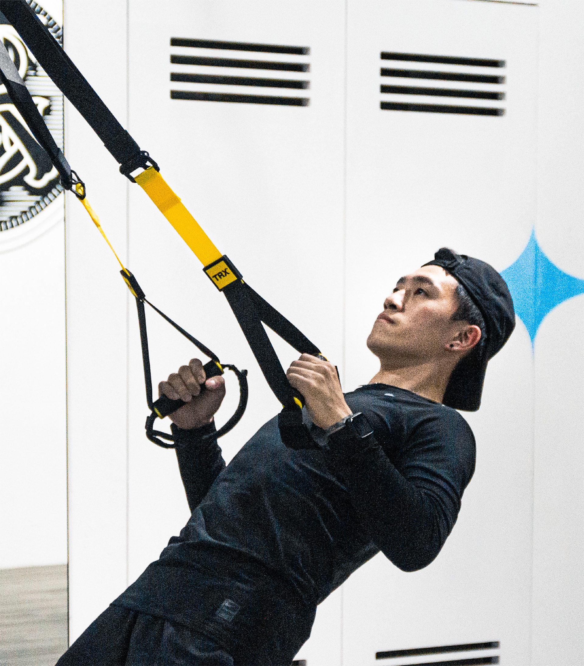
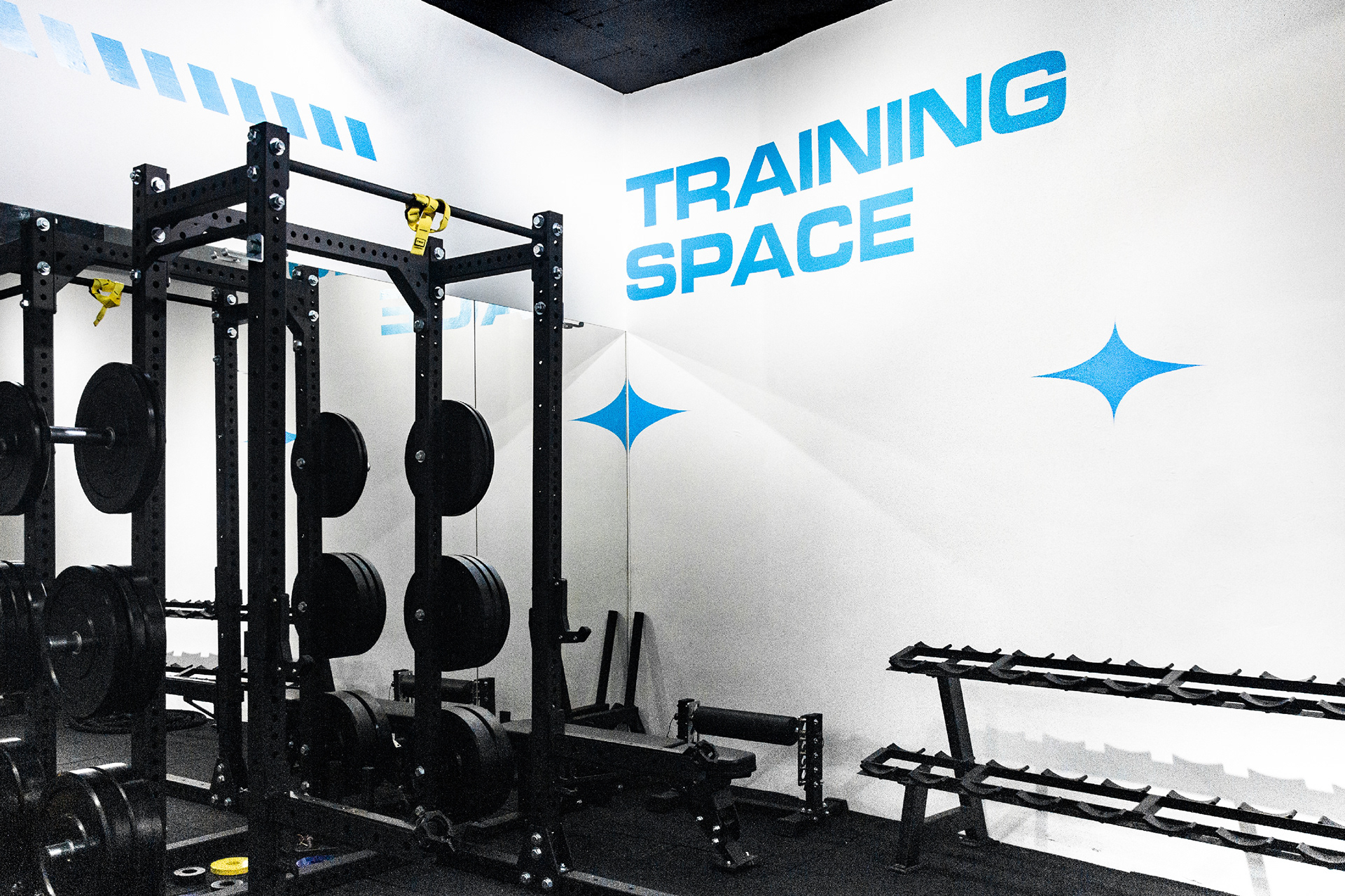
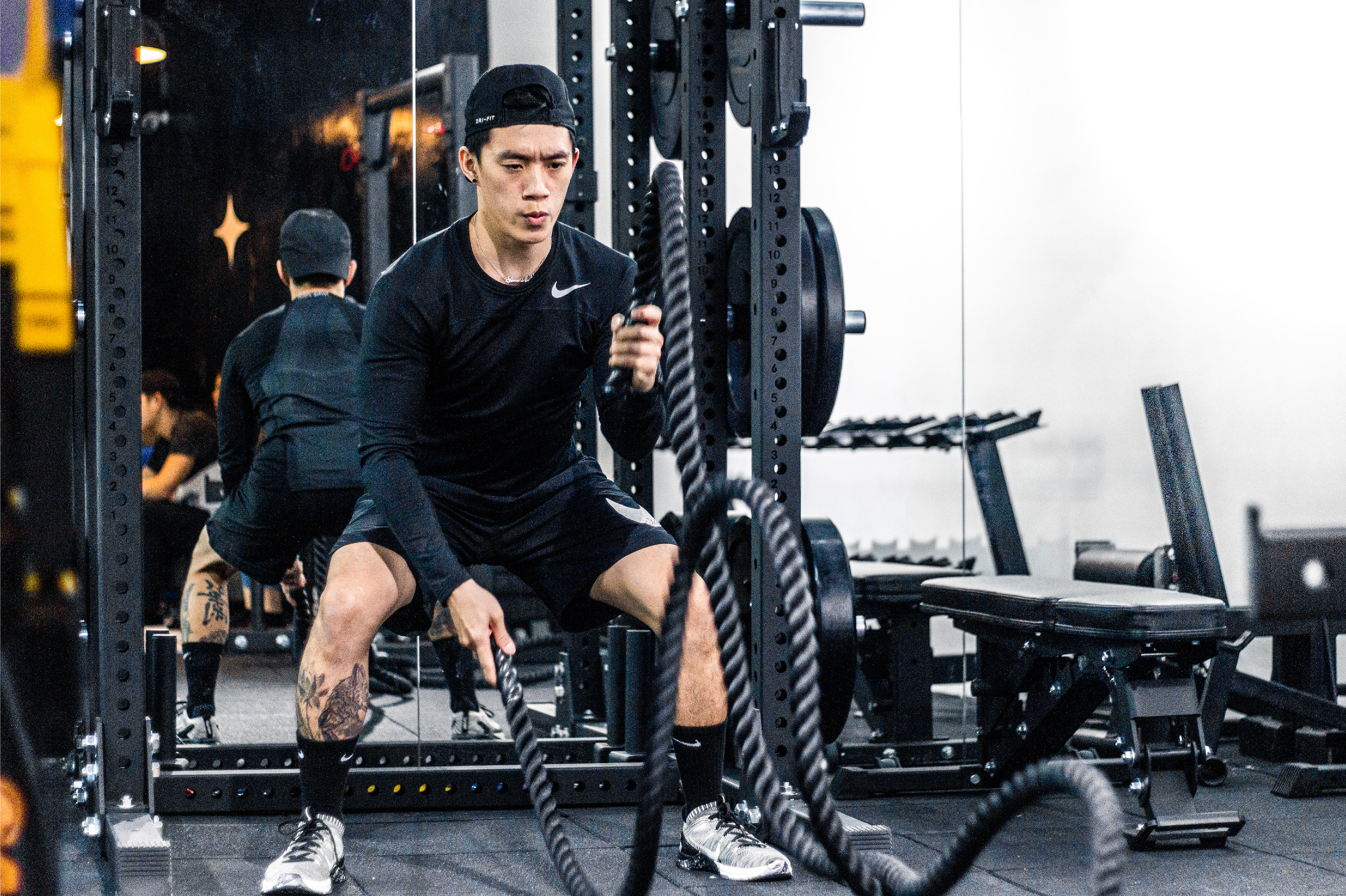
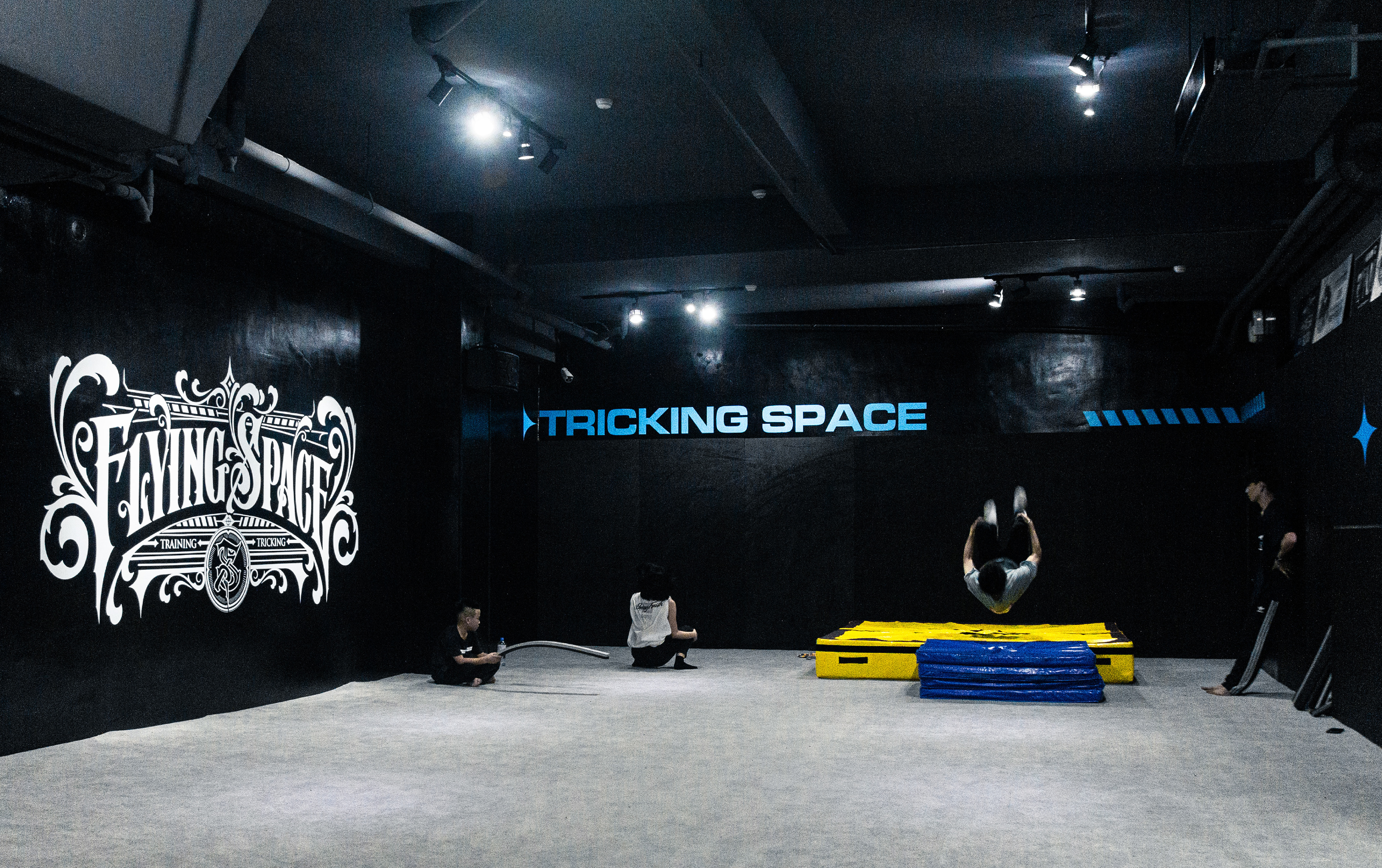
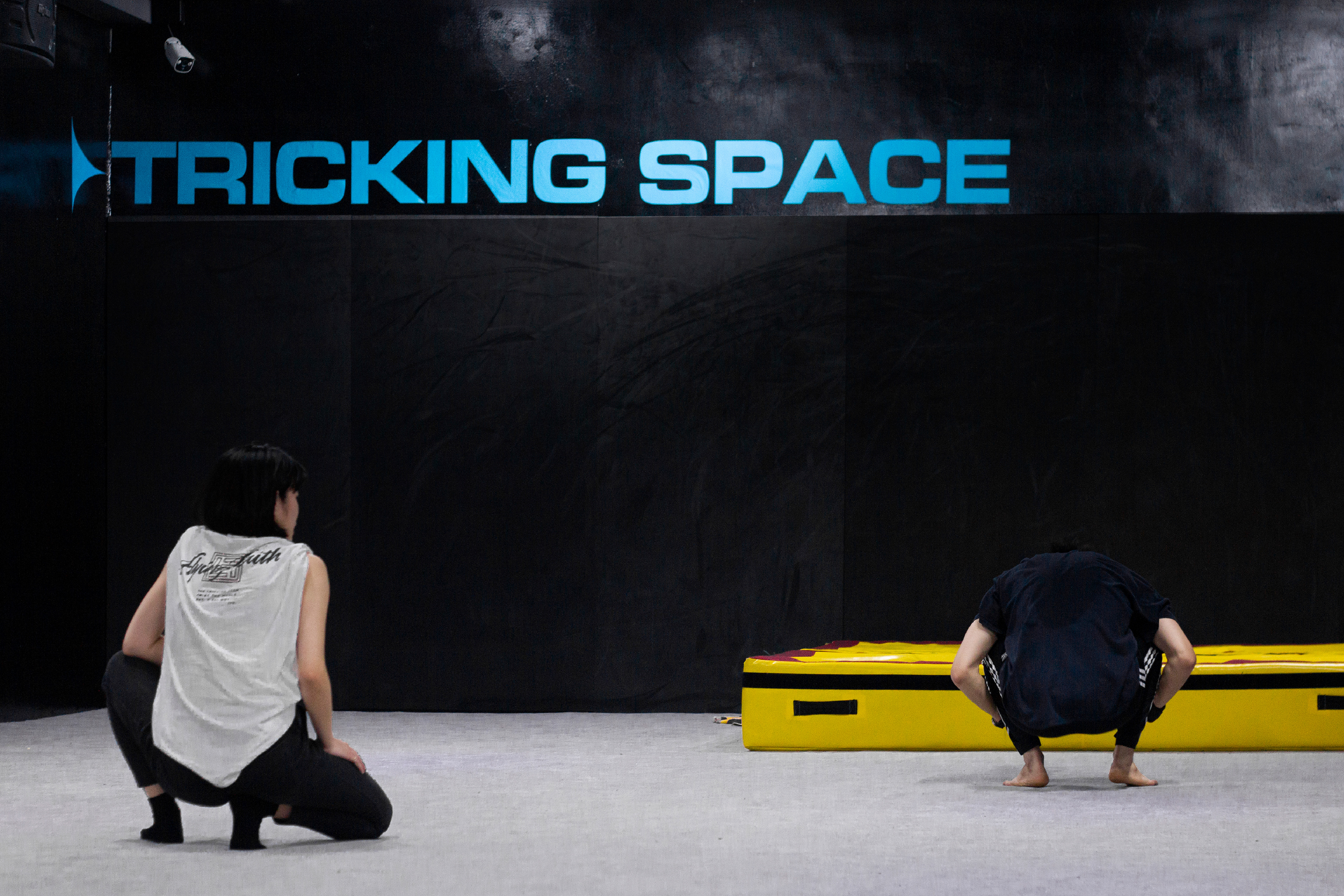
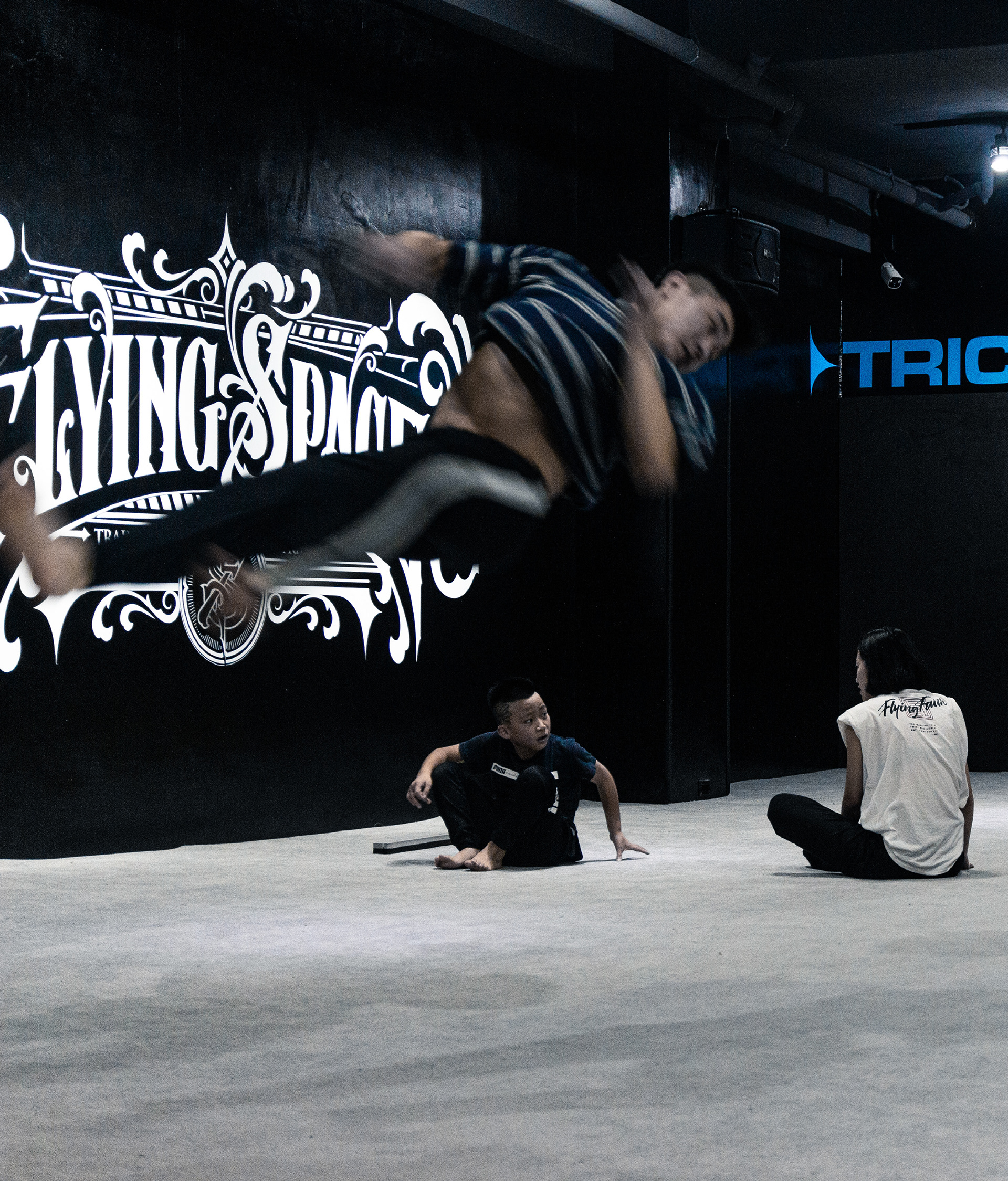
Flying Space 是位於台灣台北市的極限運動空間,提供特技空翻(Tricking)、體適能、重訓及舞蹈等多元化課程推廣,擁有完善的設備及專業的師資團隊,帶你一起飛翔!
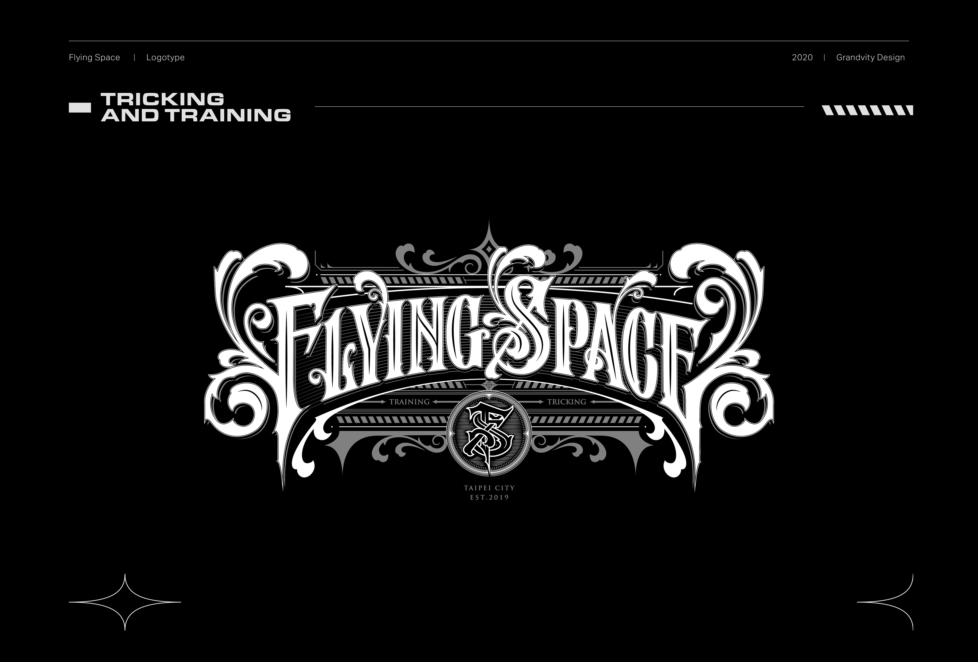
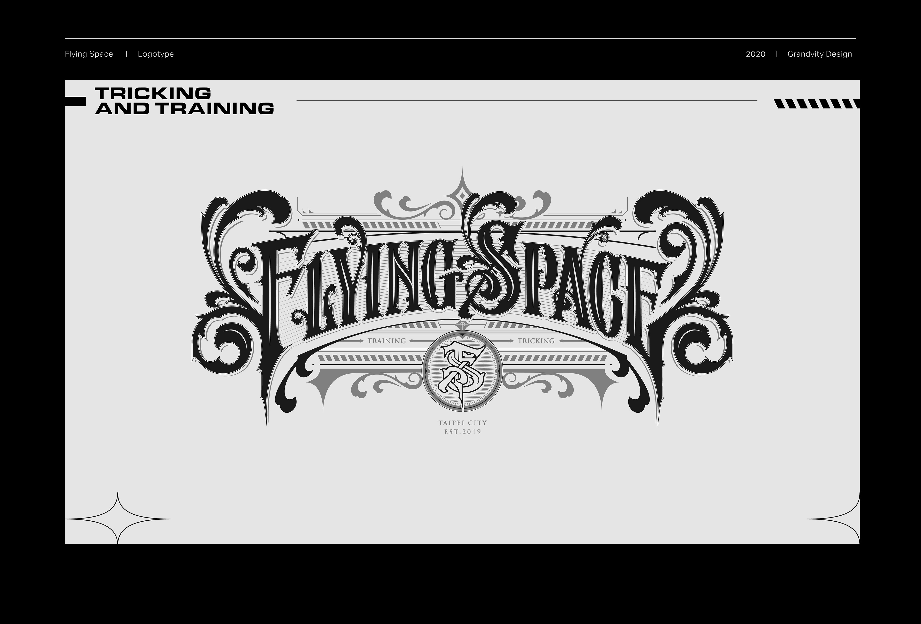
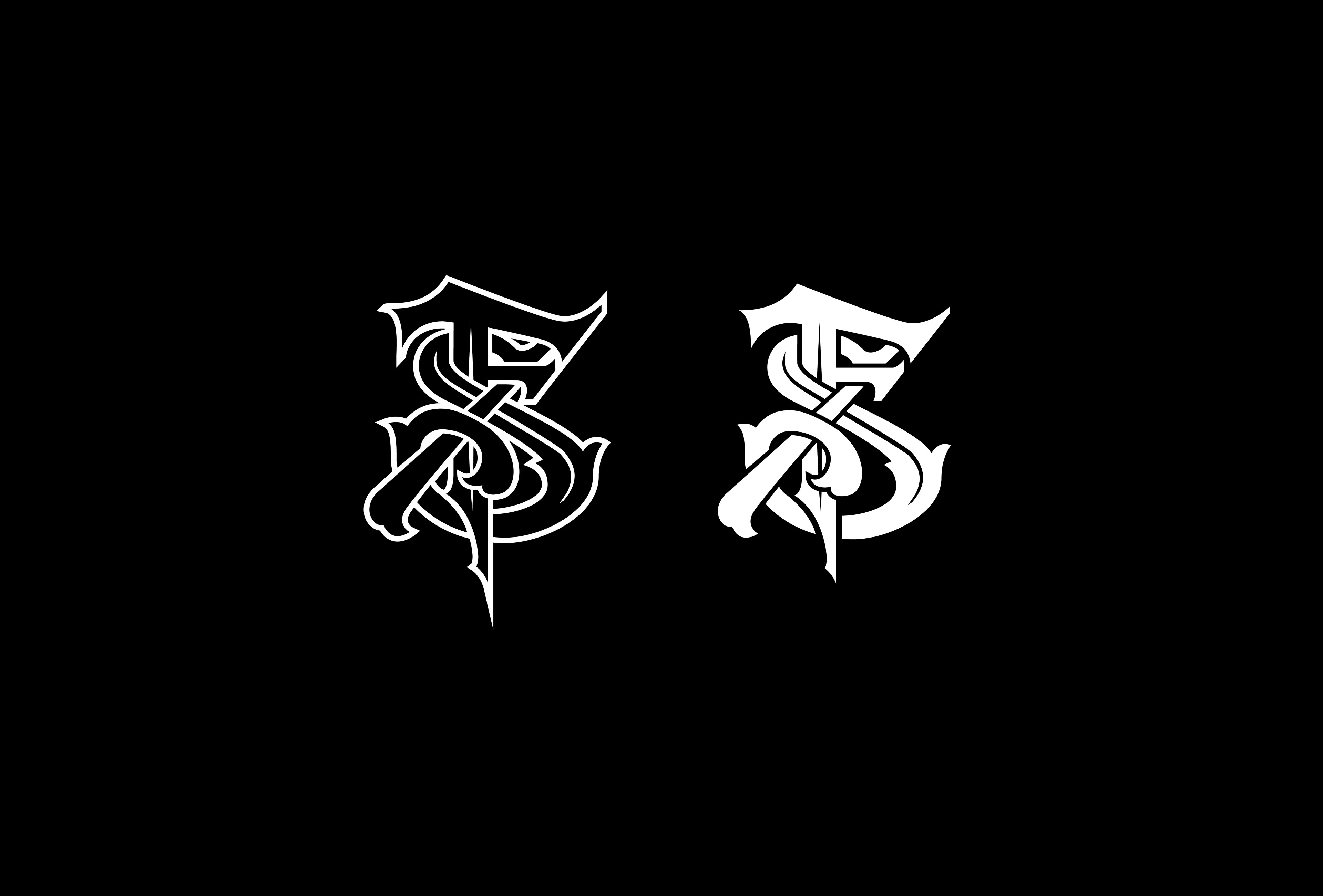
LOGOTYPE設計嘗試華麗的 「VICTORIANTYPE」風格,表現出極限運動的華麗與率性。字體的左右側螺旋造型表現出渦輪轉動的意象,而向下拖曳的字尾則象徵著噴射機直衝天際、突破極限的意念,留下一道飛翔軌跡。
Flying Space is an extreme sports center located in Taipei, Taiwan. It offers diversified courses such as tricking, fitness, weight training, dancing, as well as great equipment and professional teachers.
By incorporating Victorian Typography, the logotype conveys the magnificence and recklessness of extreme sports. The spiral shape on both sides of the logotype shows an image of turbine rotation. The trailing suffix symbolizes the idea of a jet going straight to the sky and breaking limits, leaving a flying trajectory.
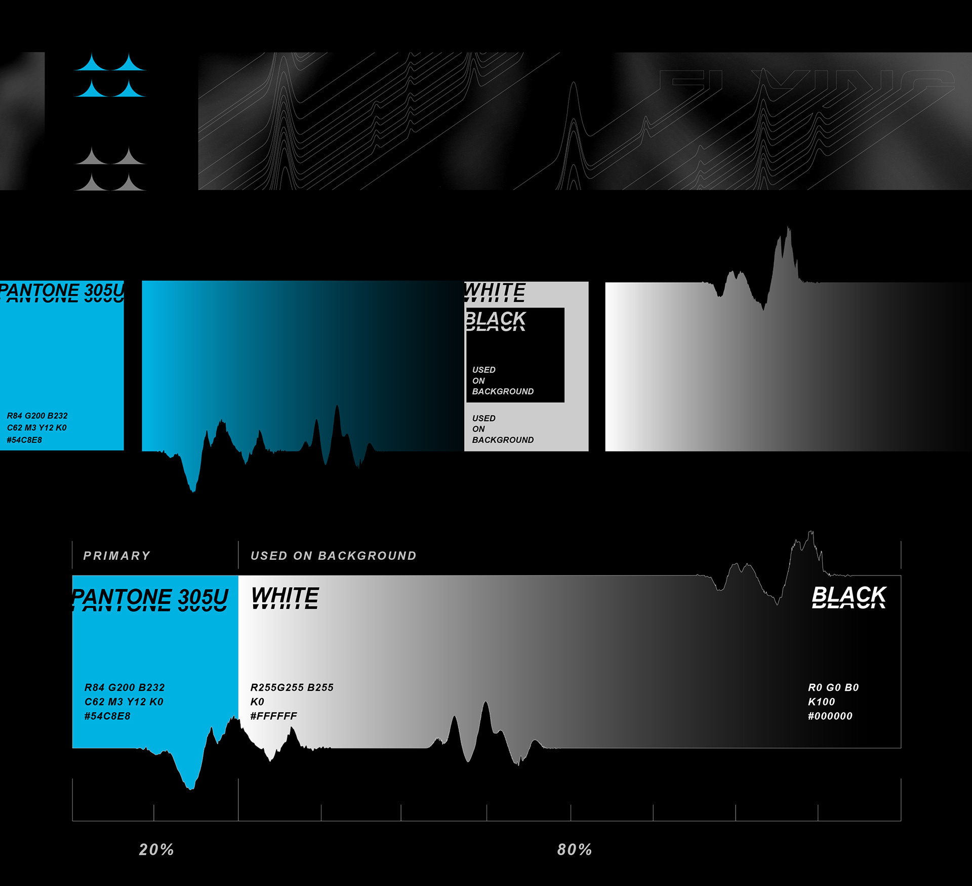
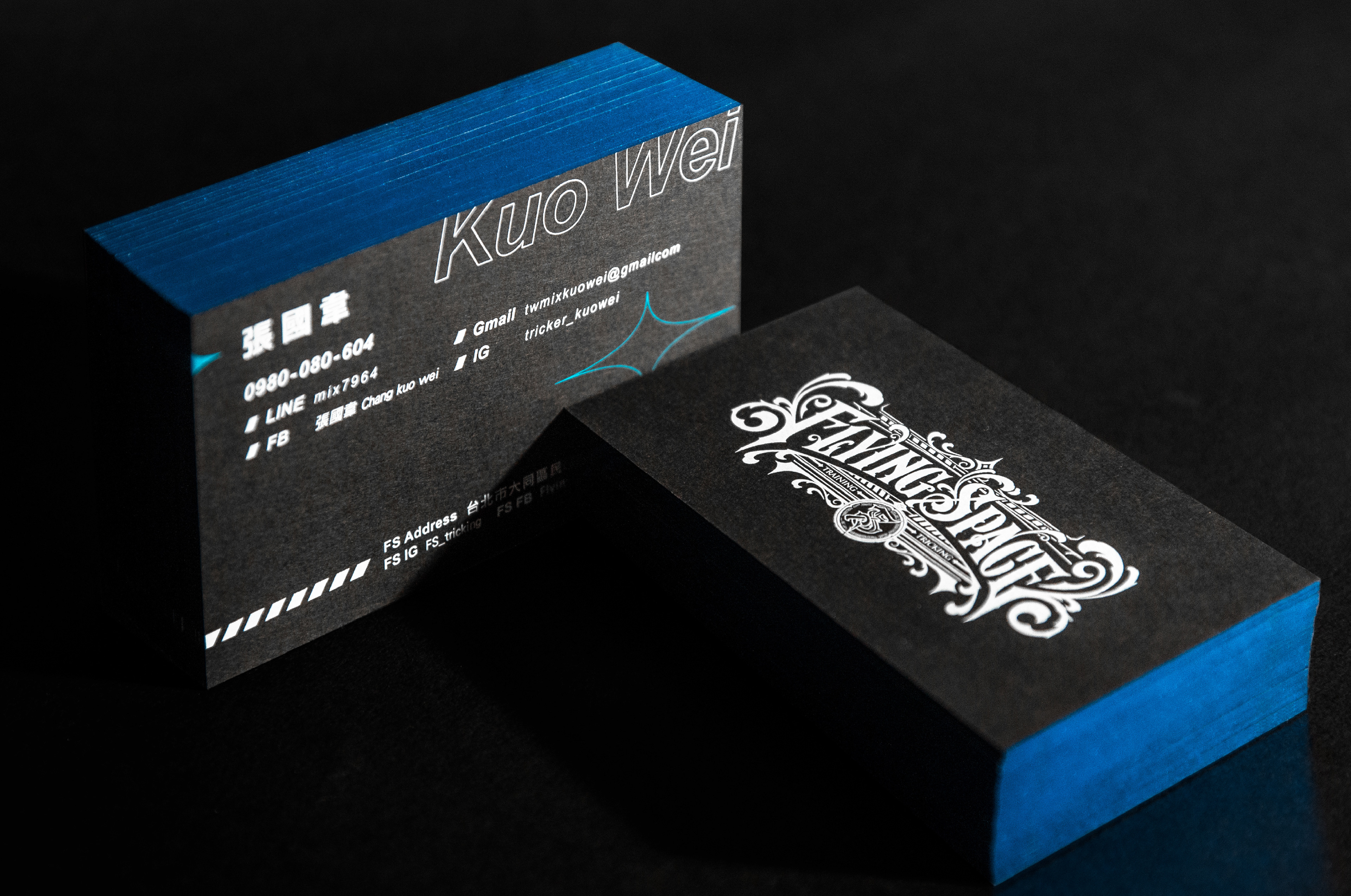
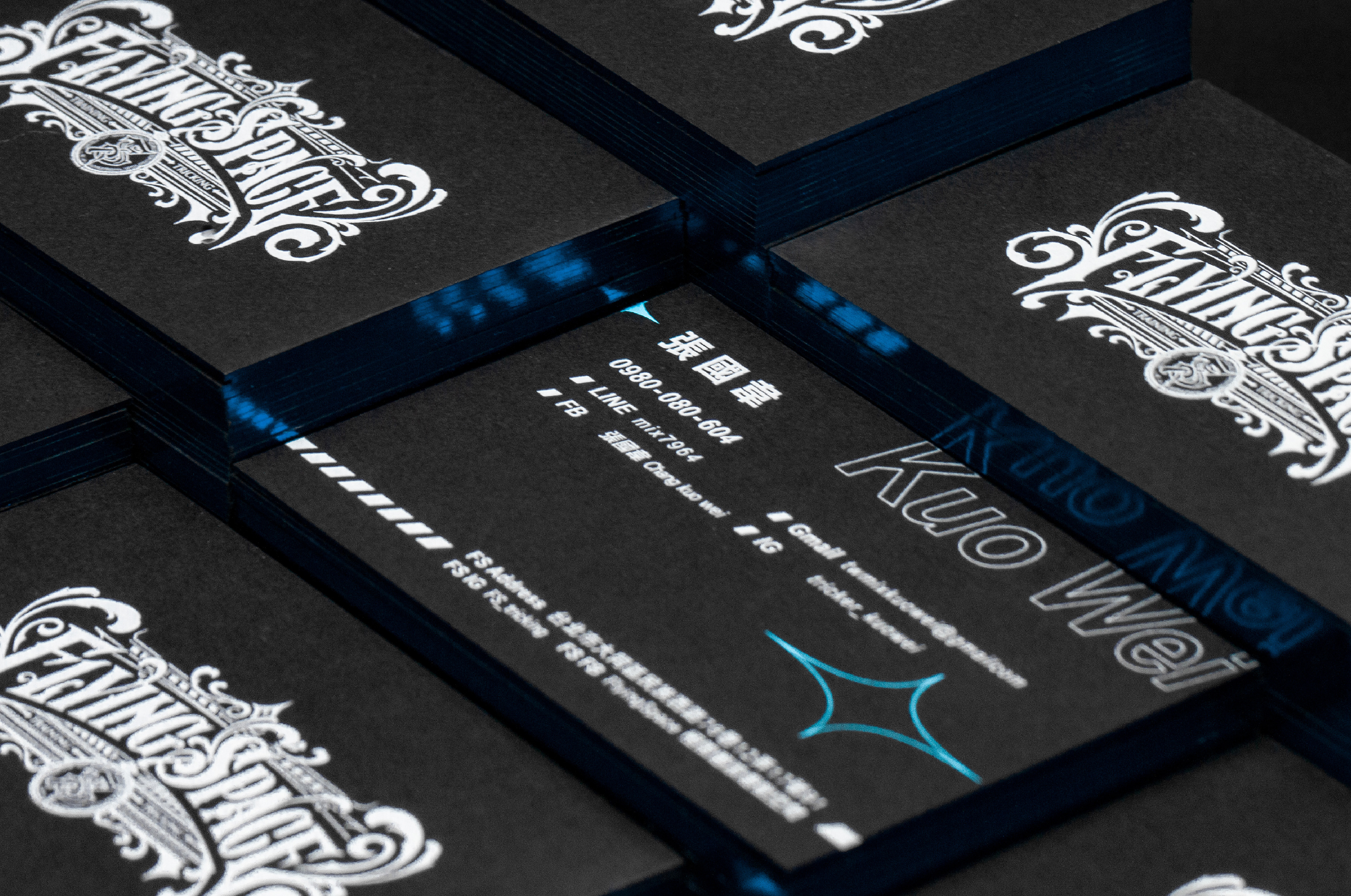
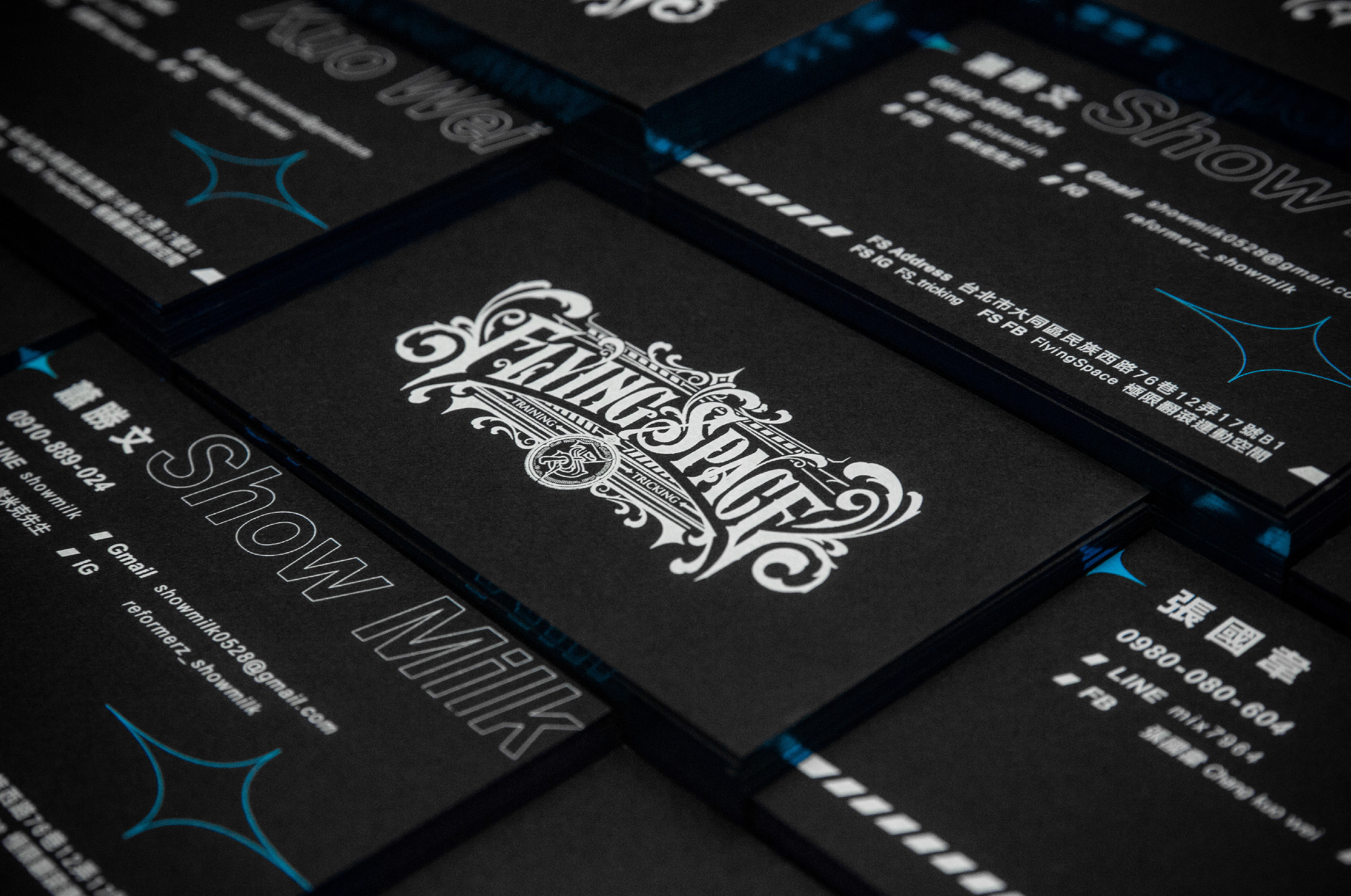
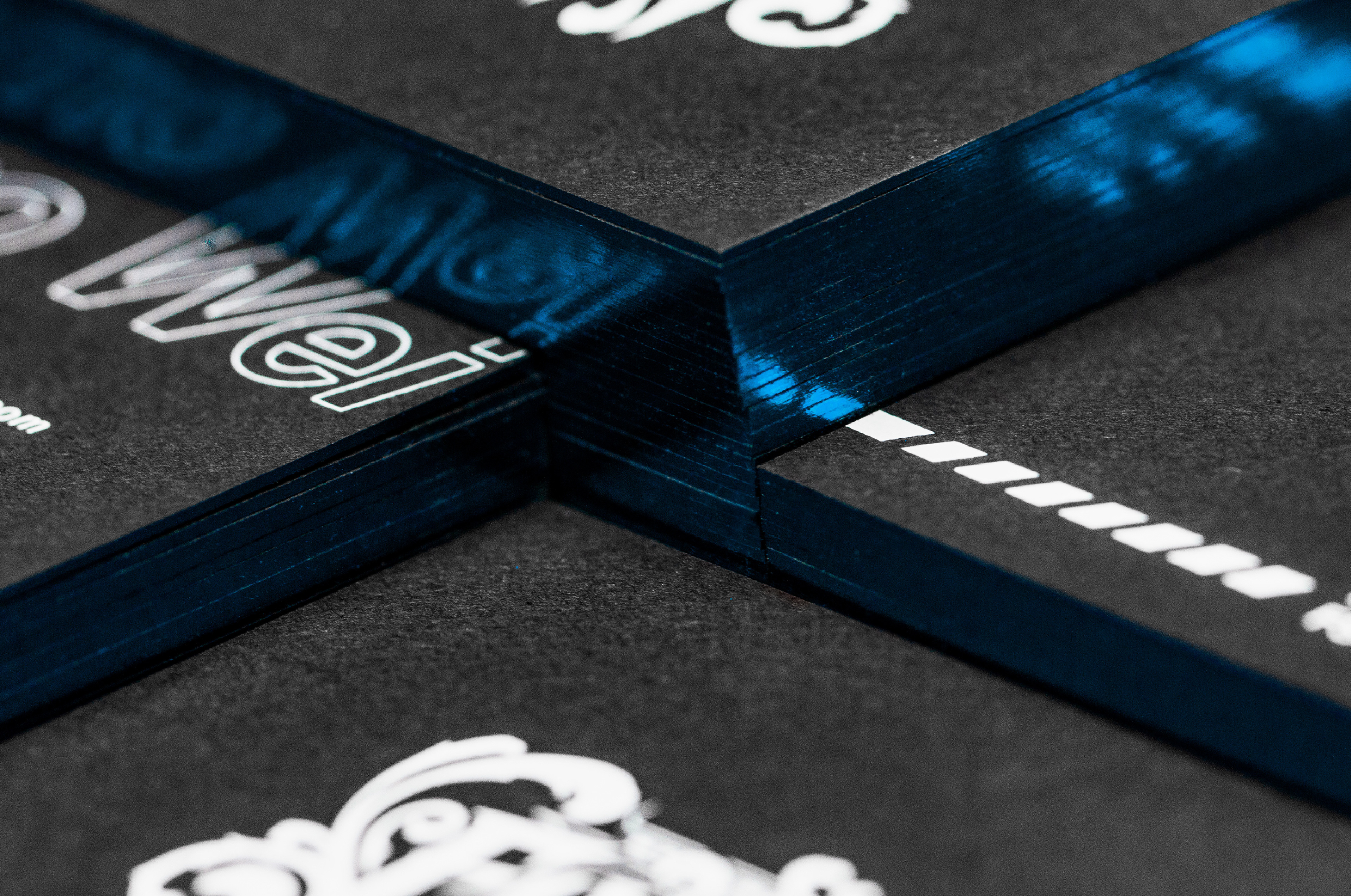
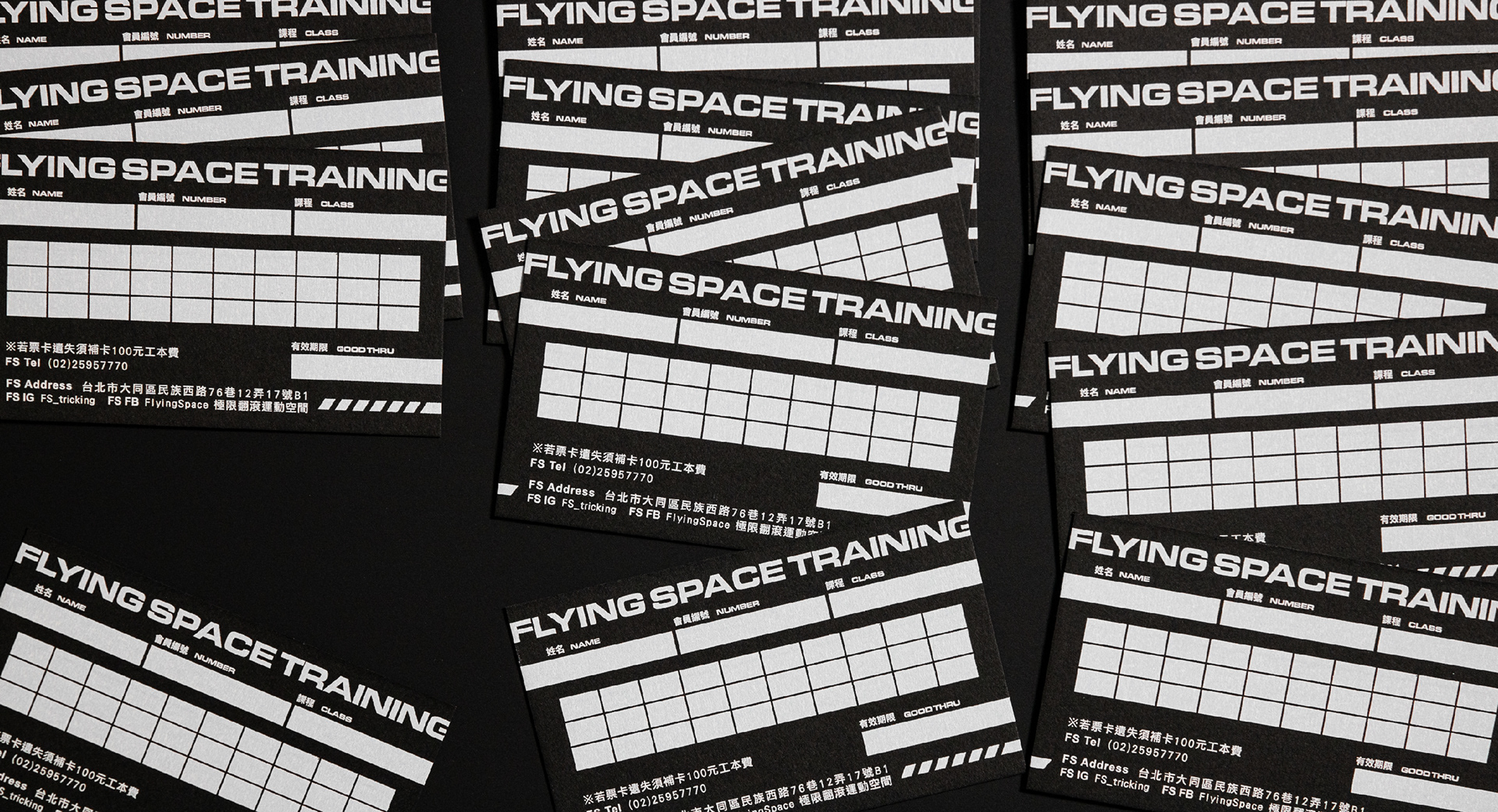
名片排版沿用規範的色彩設定外,更在沉穩地黑卡邊緣上大膽地燙上一圈藍色雷射膜,呼應品牌特色外,也更能表現團隊年輕、專業的魅力。
In addition to the standard color settings for business card layout, a sky blue laser film is boldly embossed on the edge of black card, which is consistent with the brand's characteristics and also reflects the young and professional charm of the team.

Credits
Type | Branding
Year | 2018
Client | Flying Space
Year | 2018
Client | Flying Space
Production | Grandvity Design
Art Director | Noodlemaker
Project Manager | Grape Chiu
Typography Designer | Noodle Wang
Visual System Designer | Si Jia Sun
Portrait Photography | GoodGun
Interior Photographer | Si Jia Sun/Kaizer Zhuang
Namecard Photographer | Si Jia Sun
Interior Design | 多龍工務設計所
Art Director | Noodlemaker
Project Manager | Grape Chiu
Typography Designer | Noodle Wang
Visual System Designer | Si Jia Sun
Portrait Photography | GoodGun
Interior Photographer | Si Jia Sun/Kaizer Zhuang
Namecard Photographer | Si Jia Sun
Interior Design | 多龍工務設計所